

At Bina Homes, design is more than building structures it’s about crafting living experiences. Every home tells a story through architecture, light, texture, and most importantly, color. The art of home color palette selection influences how your space feels, functions, and flows. The right hues can make your rooms more welcoming, evoke calm, and even influence how large or small a space appears.
Whether you’re planning a complete home remodeling project, considering additions, or focusing on a kitchen remodel, understanding color psychology and design harmony is essential to making informed, lasting choices.
Why Color Holds Power in Home Design
Color is far more than decoration it’s a design language. The tones you choose directly influence how you experience each room. Warm colors can energize and stimulate conversation, while cool tones can soothe and ground your senses.
Psychologists and interior designers agree that colors evoke emotions. For instance, a calm blue bedroom may lower stress, while a bright yellow kitchen can stimulate appetite and optimism. A cohesive palette ties these emotional experiences together, making your home feel complete and balanced.
The Emotional Impact of Color
Color connects design and emotion. Here’s how some shades influence atmosphere:
- Blue – Calming, peaceful, ideal for bedrooms or bathrooms.
- Green – Balancing, natural, perfect for living spaces.
- Yellow – Uplifting, warm, suitable for kitchens and hallways.
- Gray & Beige – Timeless, grounding, ideal for base tones.
- White – Clean, versatile, enhances light and space.
When applied thoughtfully, these colors help define how you feel and interact with each space daily.
Laying the Groundwork: Building a Color Strategy
A successful home color palette selection begins with intention. Without a guiding plan, your design can easily feel disjointed. A color strategy ensures harmony and supports the mood and purpose of each room.
1. Define the Atmosphere You Want to Create
Every home has its rhythm. Some families prefer serene, neutral environments that promote calm and clarity, while others enjoy bolder, more expressive palettes. Consider your lifestyle: do you entertain often, or is your home a quiet retreat? Your answers will shape whether you lean toward soft neutrals or vibrant contrasts.
2. Create a Cohesive Flow
A good rule of thumb in design is the 60-30-10 principle:
- 60% of your space should feature a dominant color—often used on walls or large furniture.
- 30% introduces a secondary color to complement or contrast the dominant tone.
- 10% includes accents like décor, cushions, and art pieces.
This approach keeps the visual energy balanced while giving every color its purpose.
3. Work with Natural and Artificial Light
Lighting has a dramatic impact on how colors appear. Natural light enhances brightness, while artificial light can alter tone and warmth.
For example:
- South-facing rooms receive warm sunlight, complementing cooler shades like blues or grays.
- North-facing spaces tend to be cooler and benefit from warm, earthy tones like beige, peach, or soft yellow.
Testing colors in different lighting conditions ensures your palette remains consistent throughout the day.
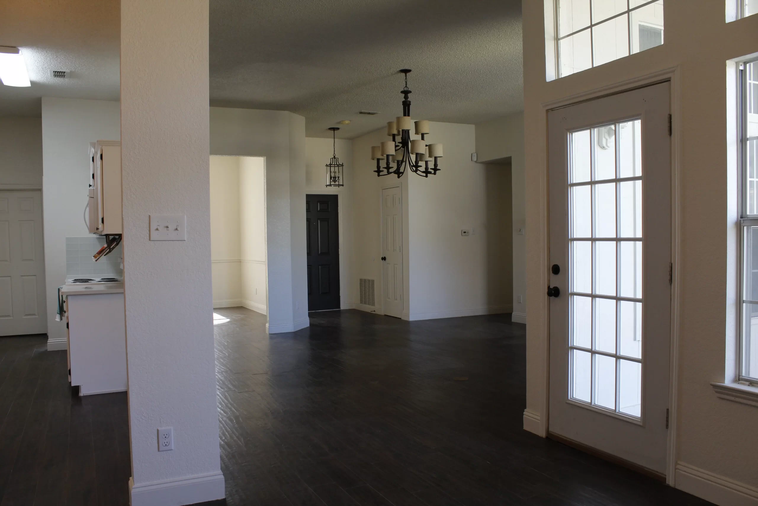
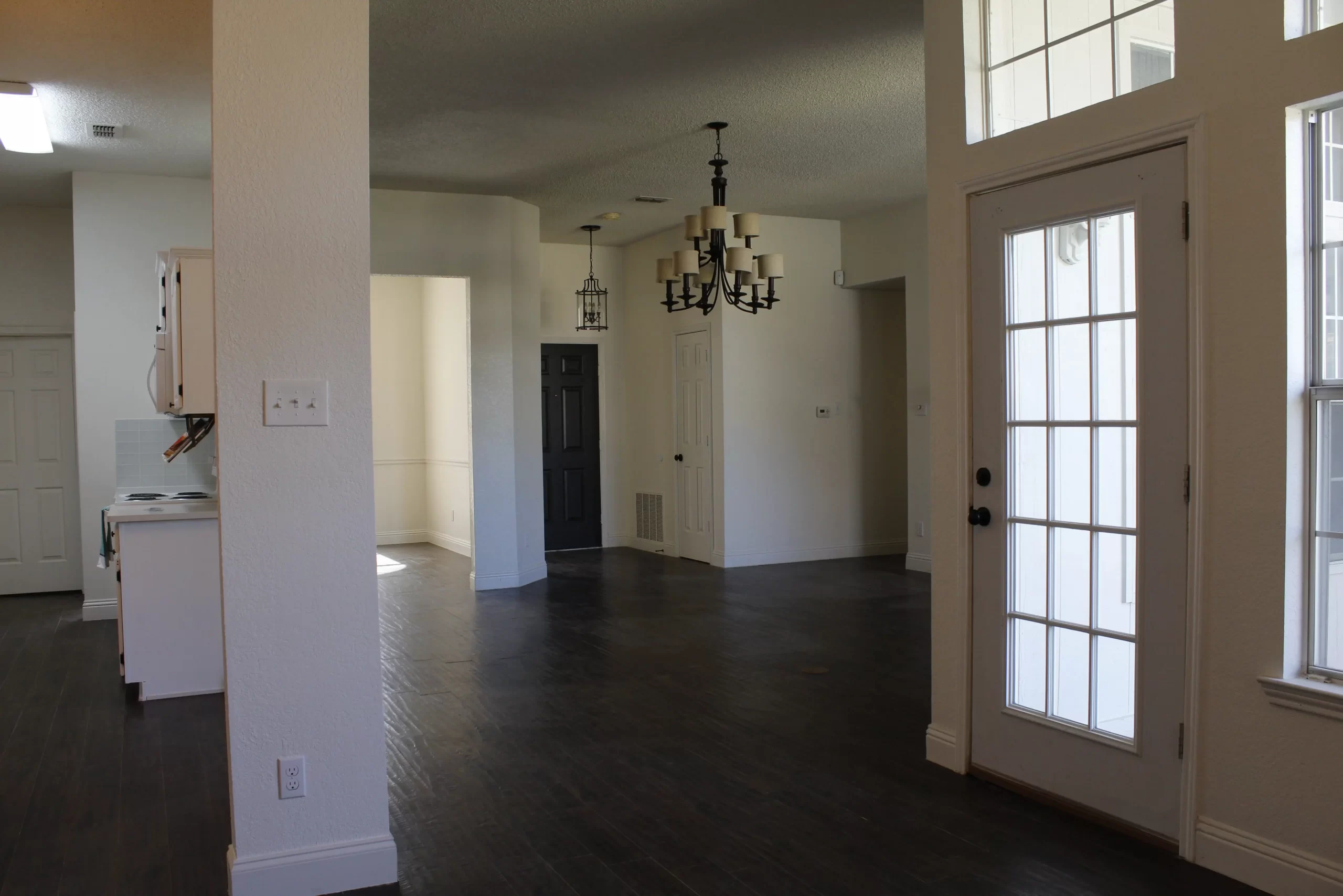
Room-by-Room Color Inspiration
Each area of your home plays a unique role. The bright colors can help define these roles while maintaining harmony between spaces.
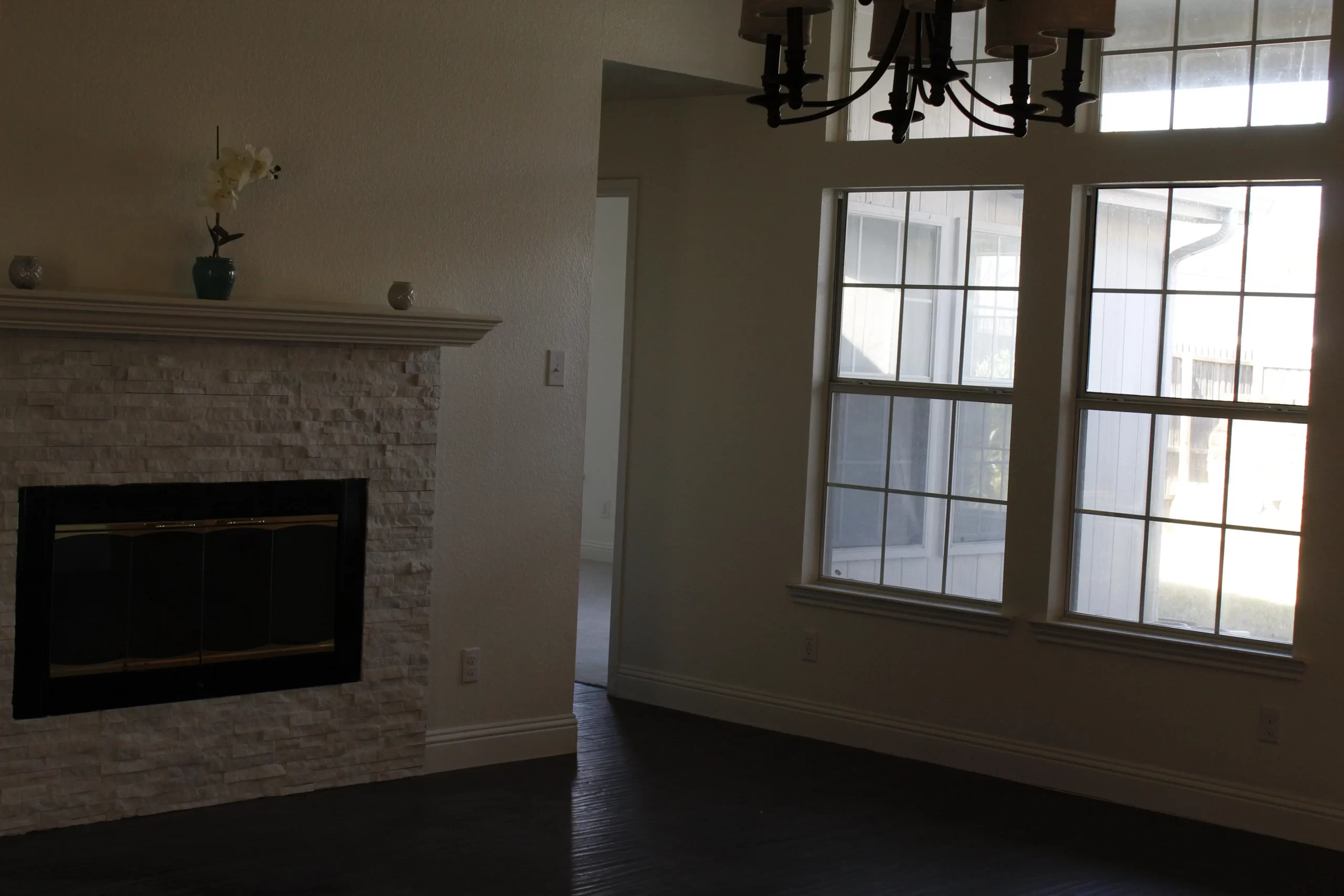
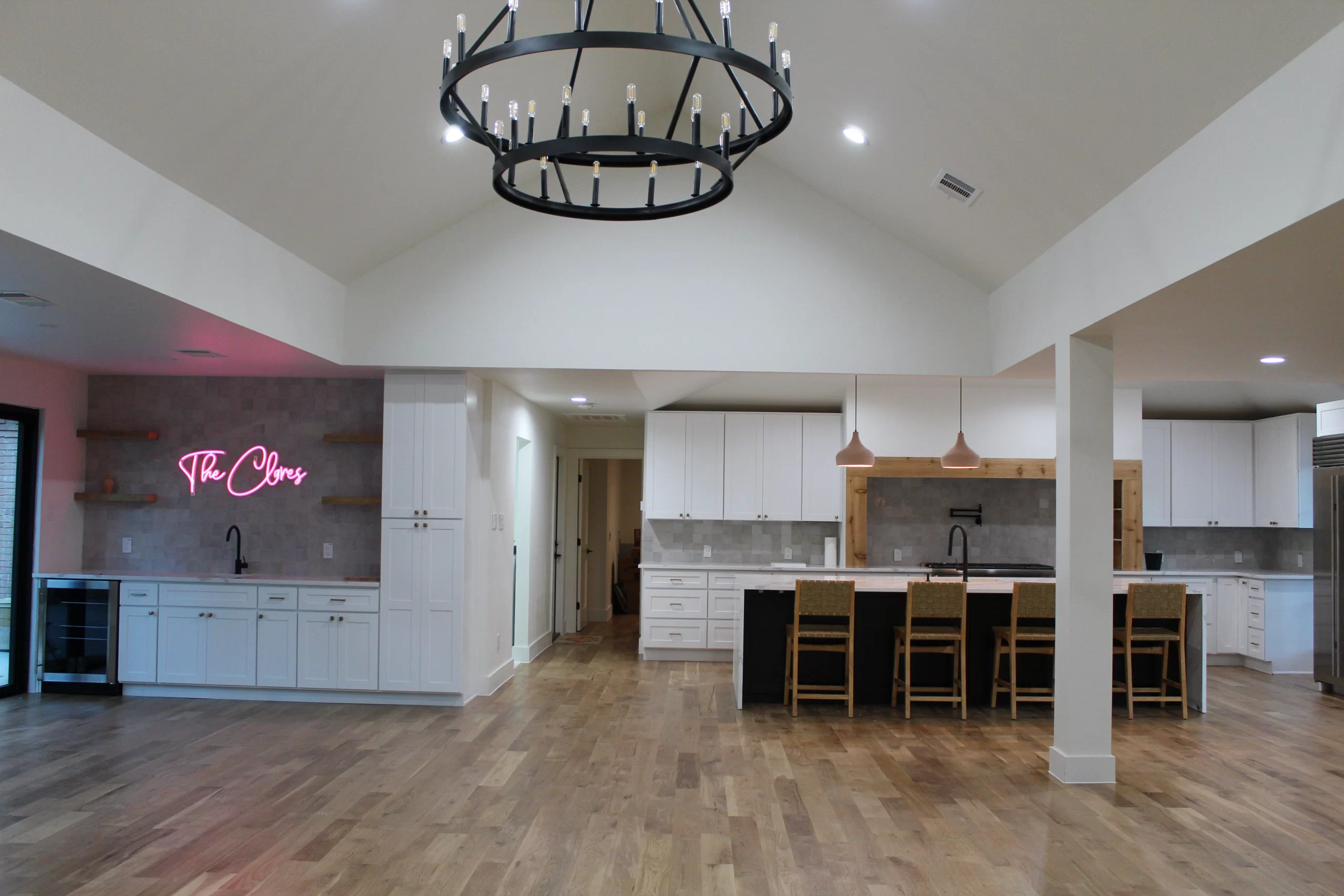
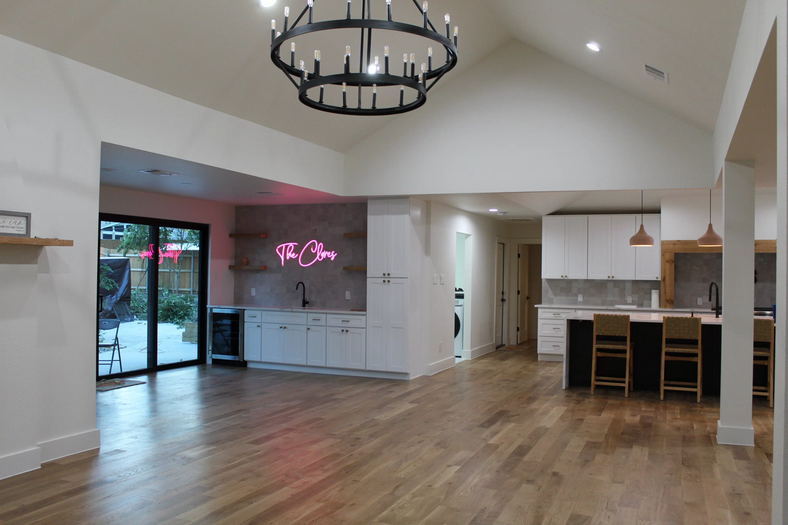
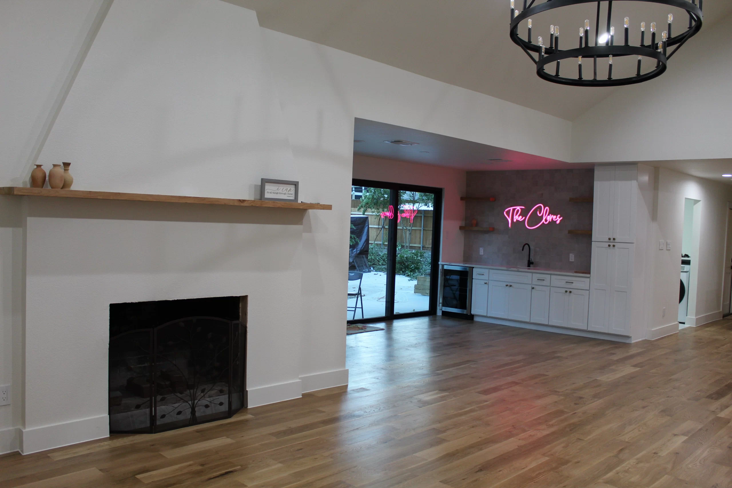
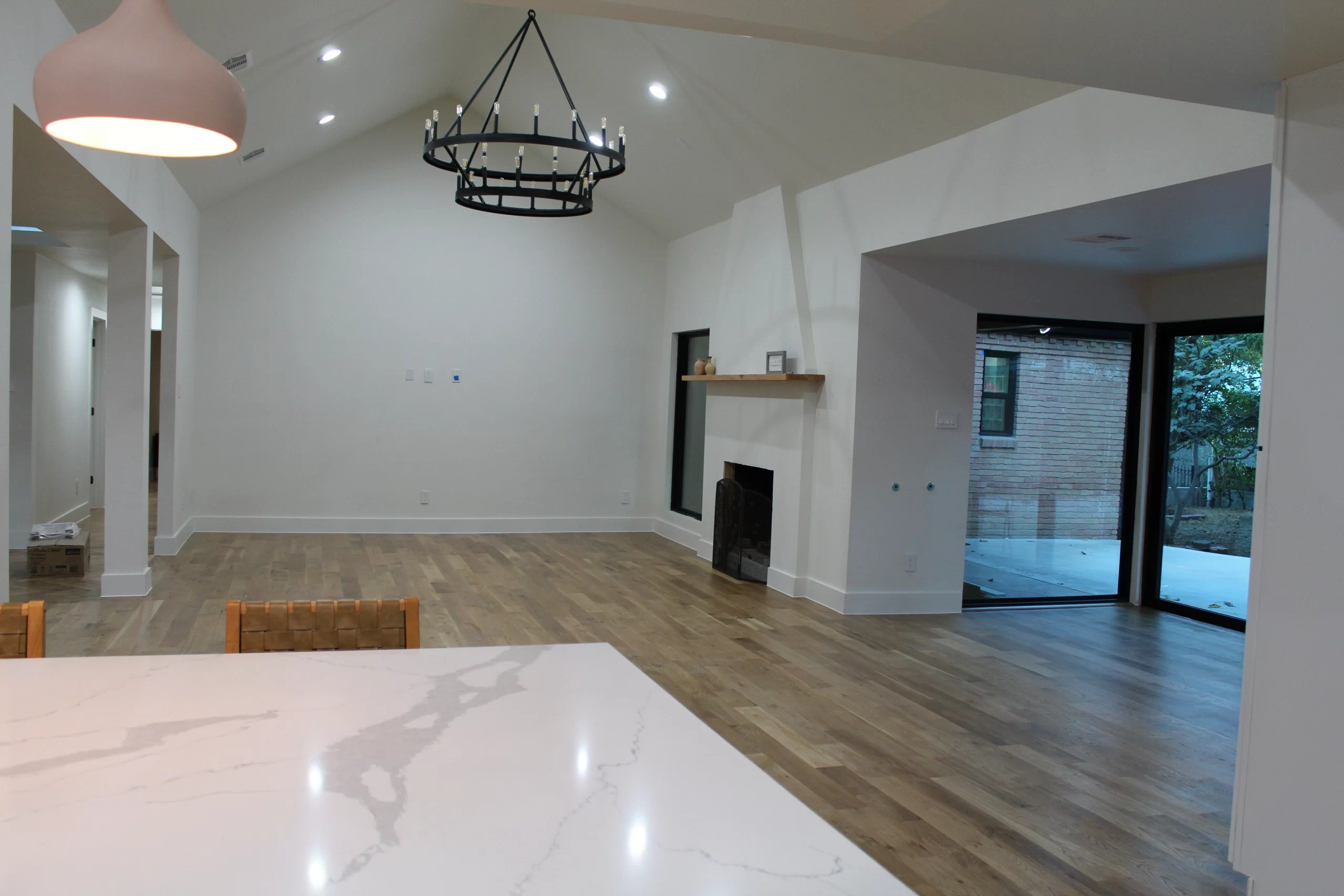
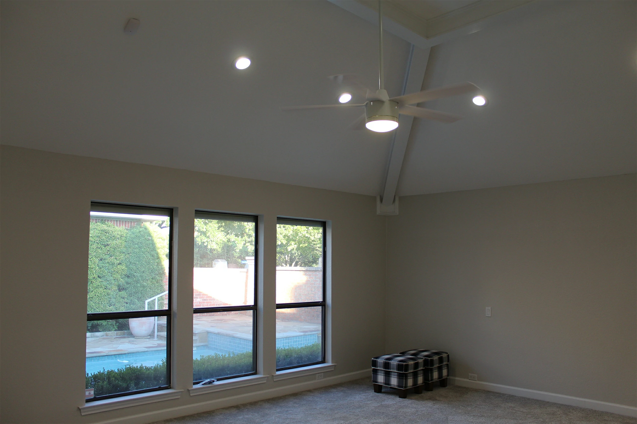
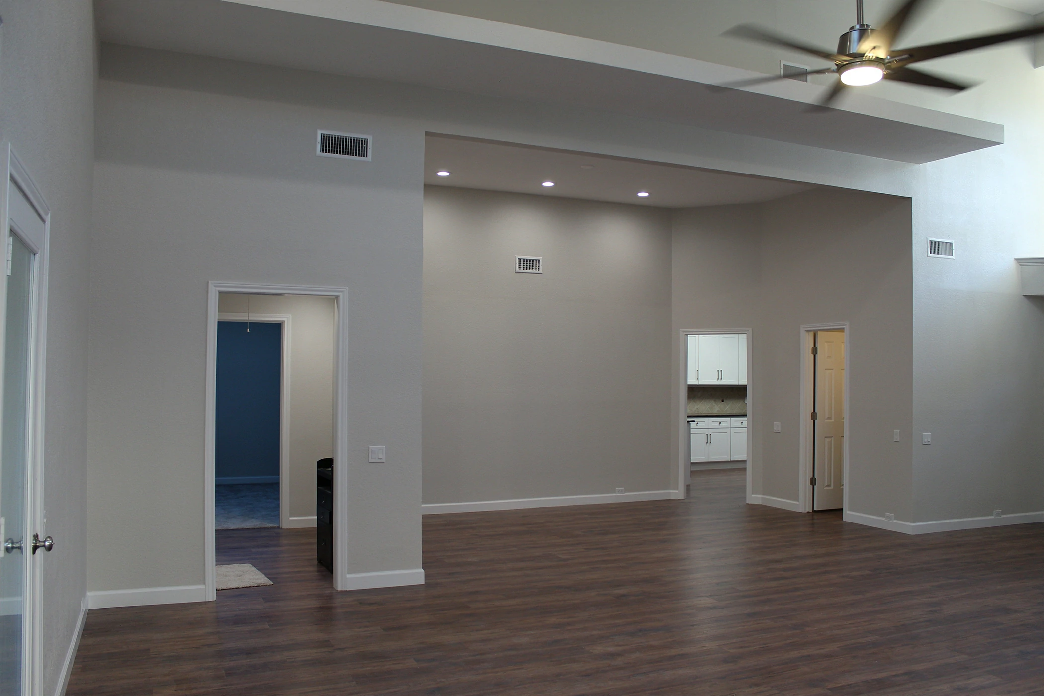
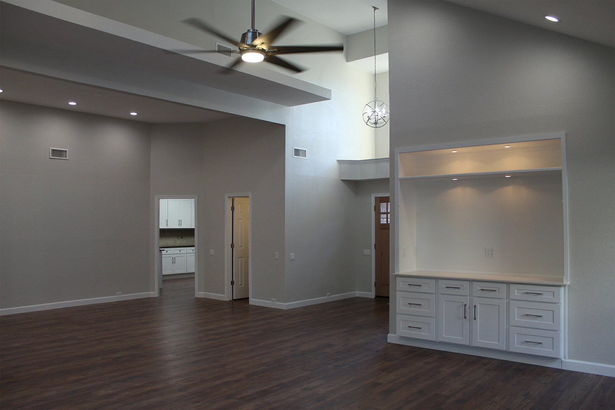
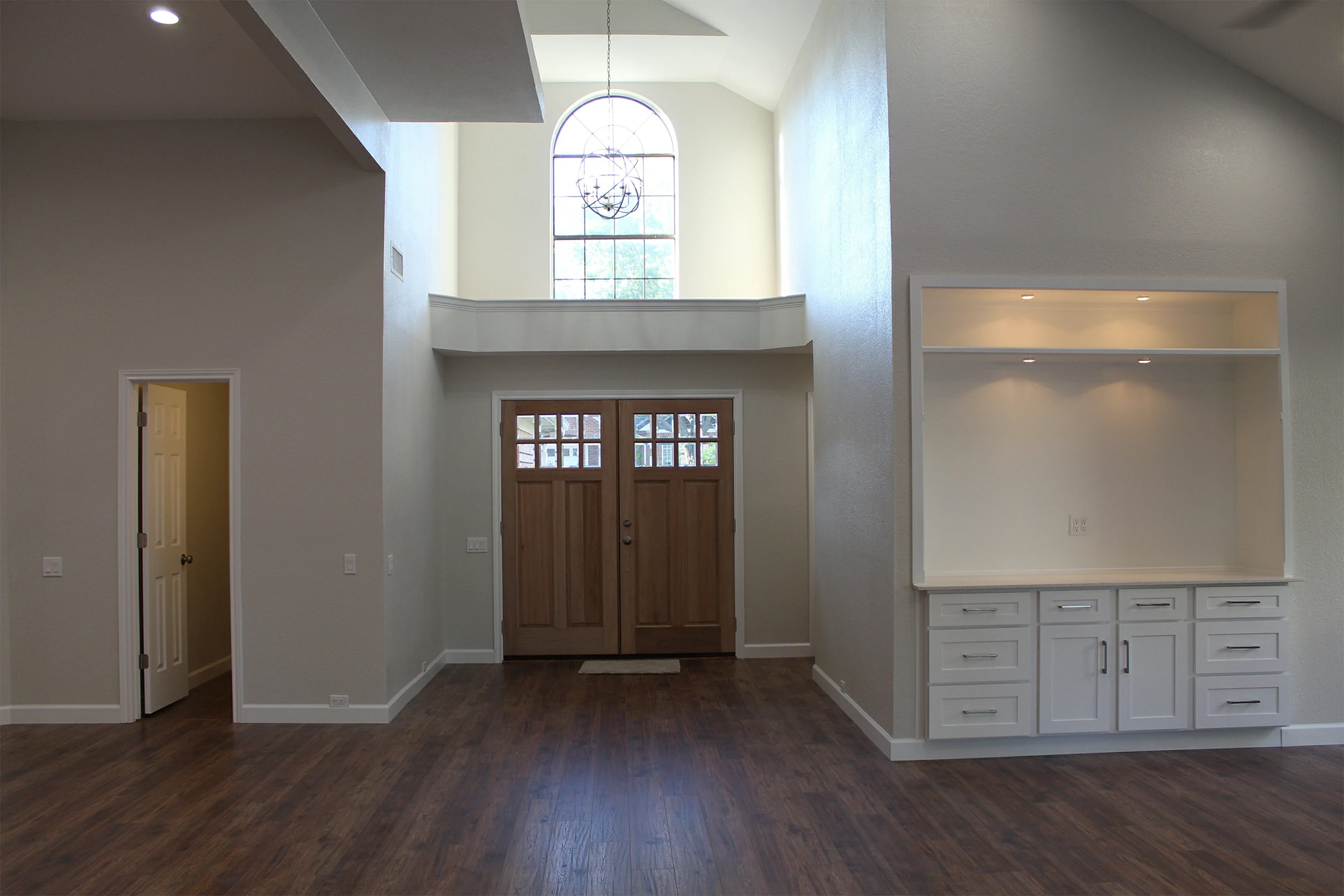
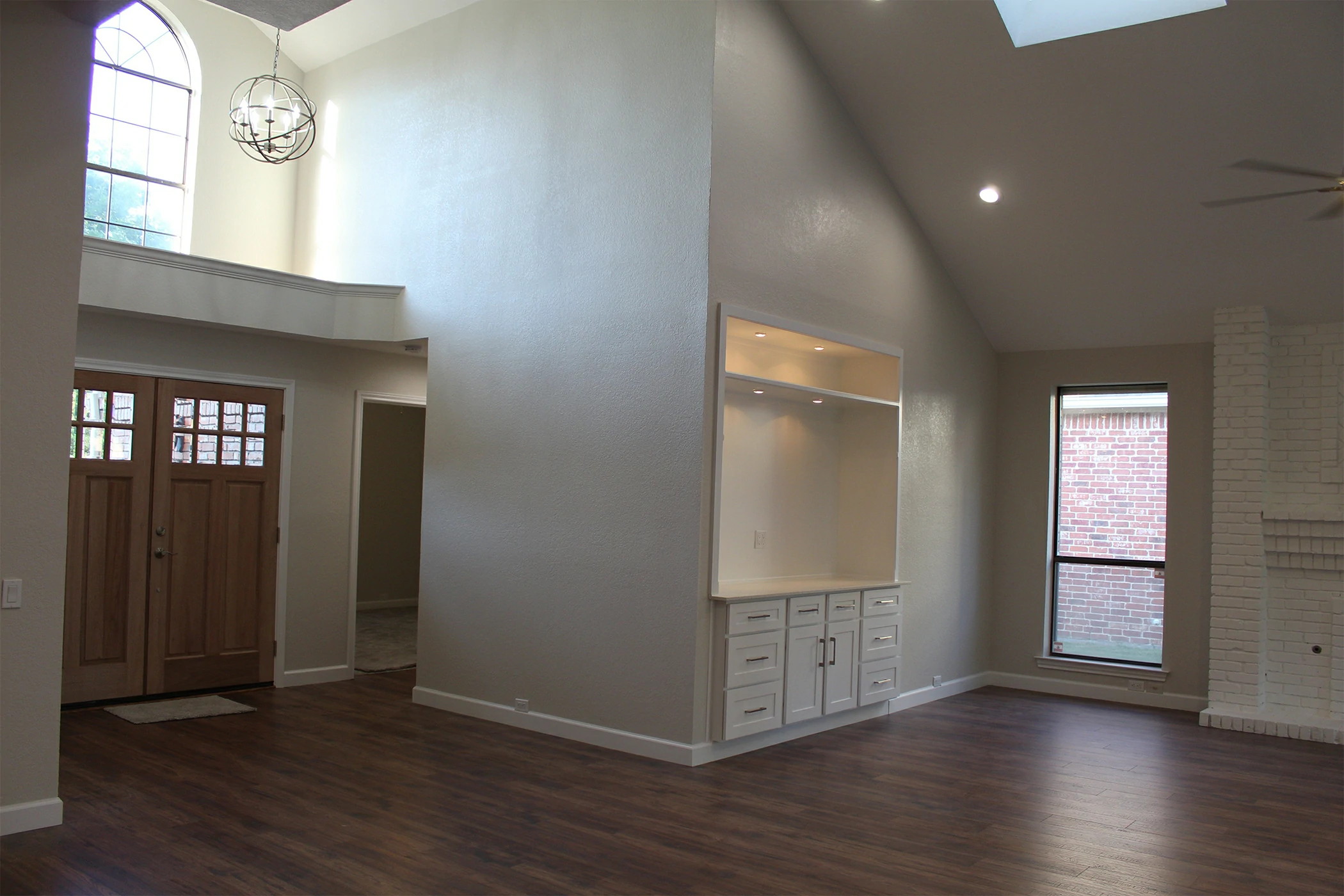
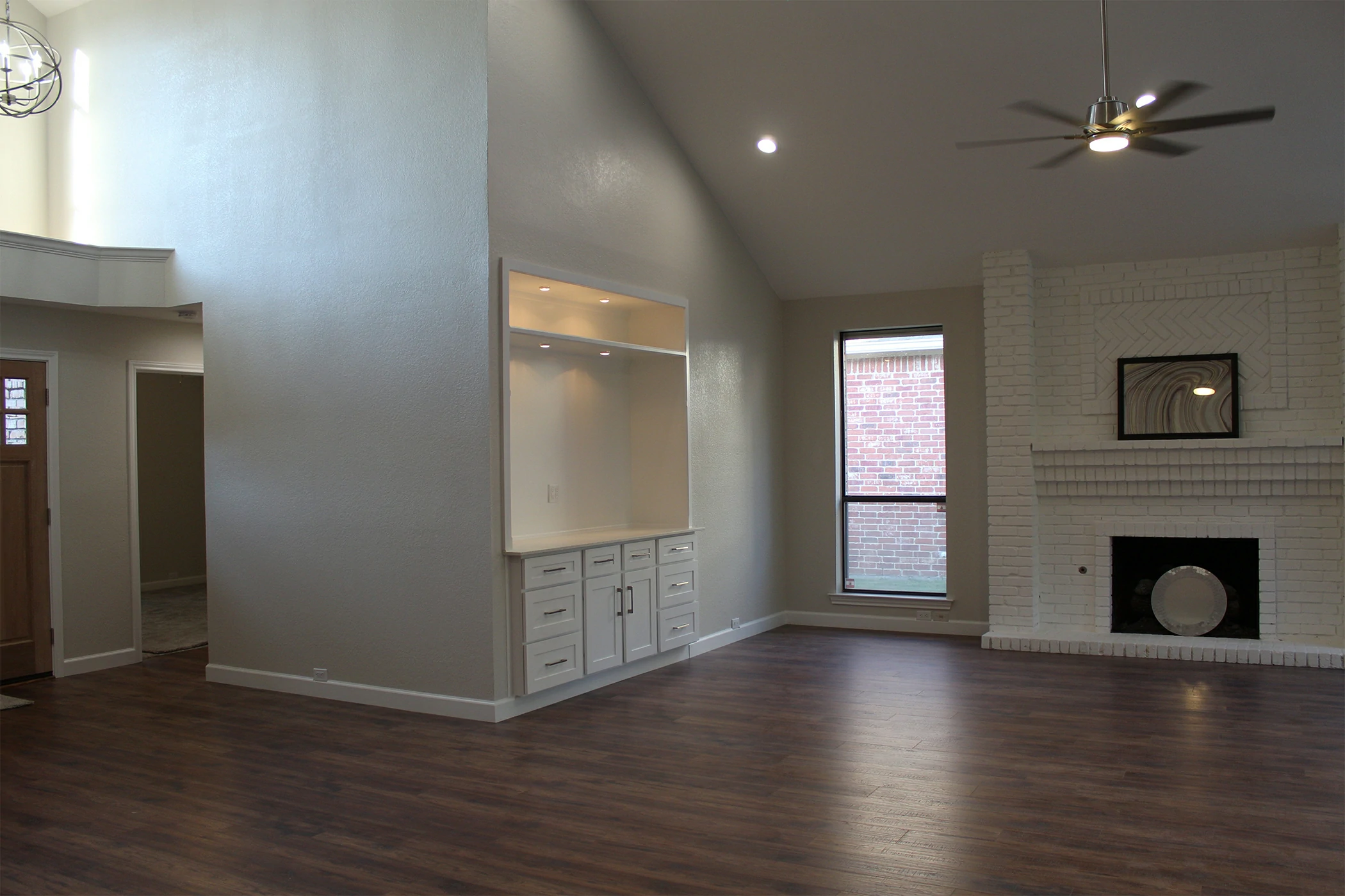
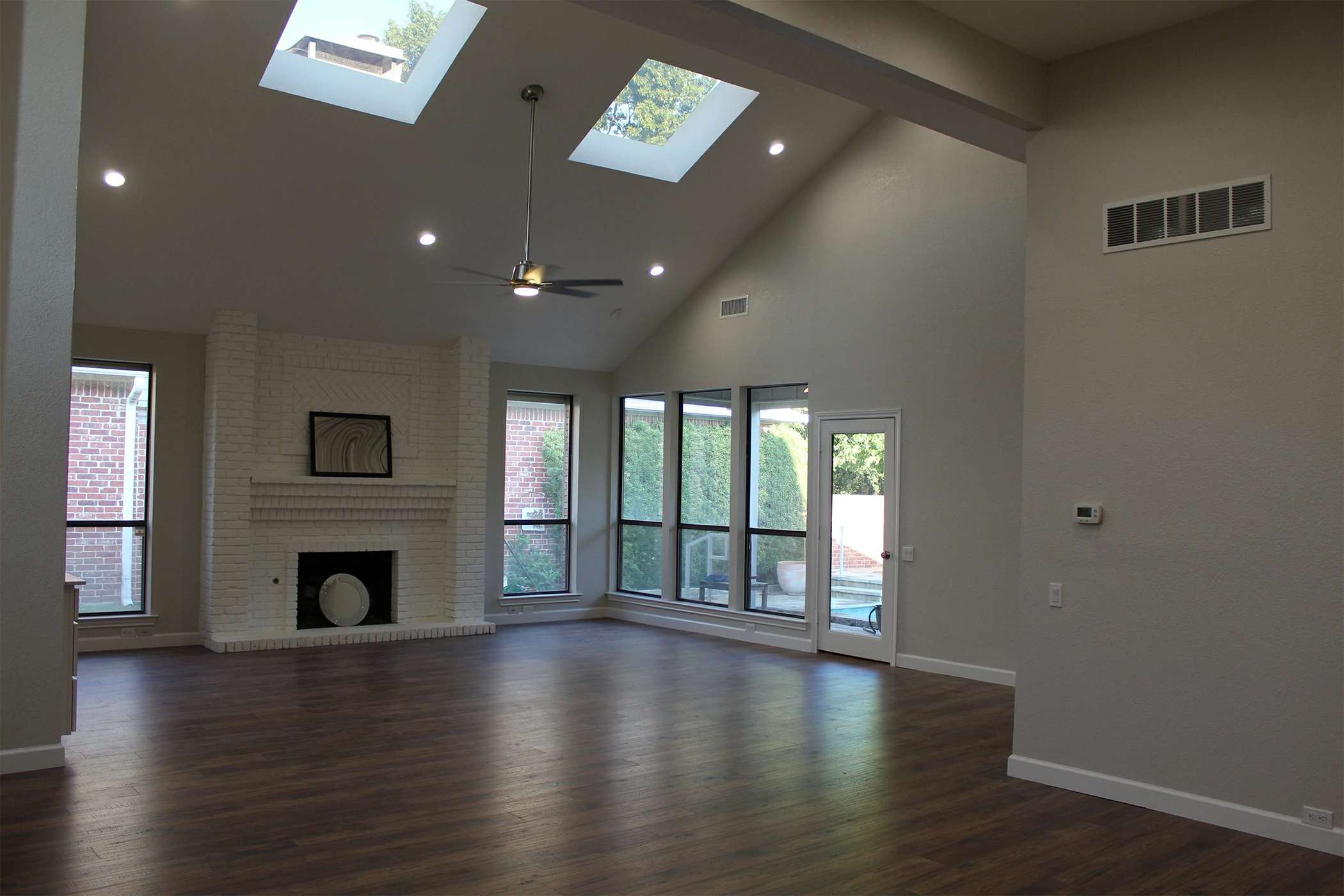
Living Room: Welcoming and Balanced
Your living room acts as the heart of your home. It’s where family gathers and guests connect, so it should evoke warmth and inclusivity. Earth tones like taupe, olive, and sand foster comfort, while subtle greens or navy accents add sophistication.
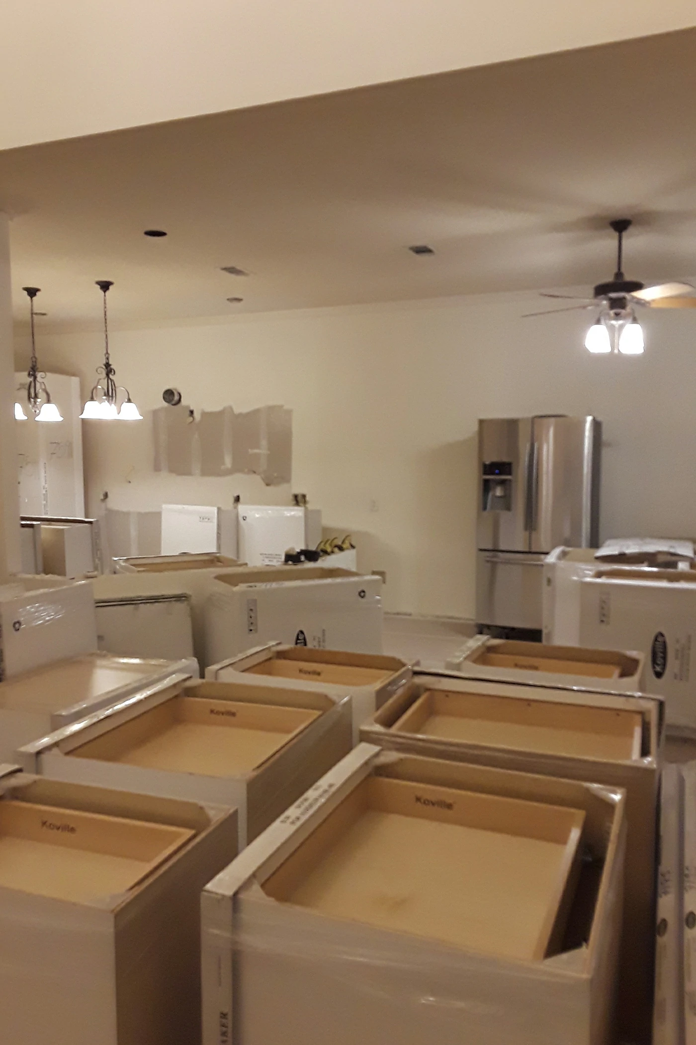
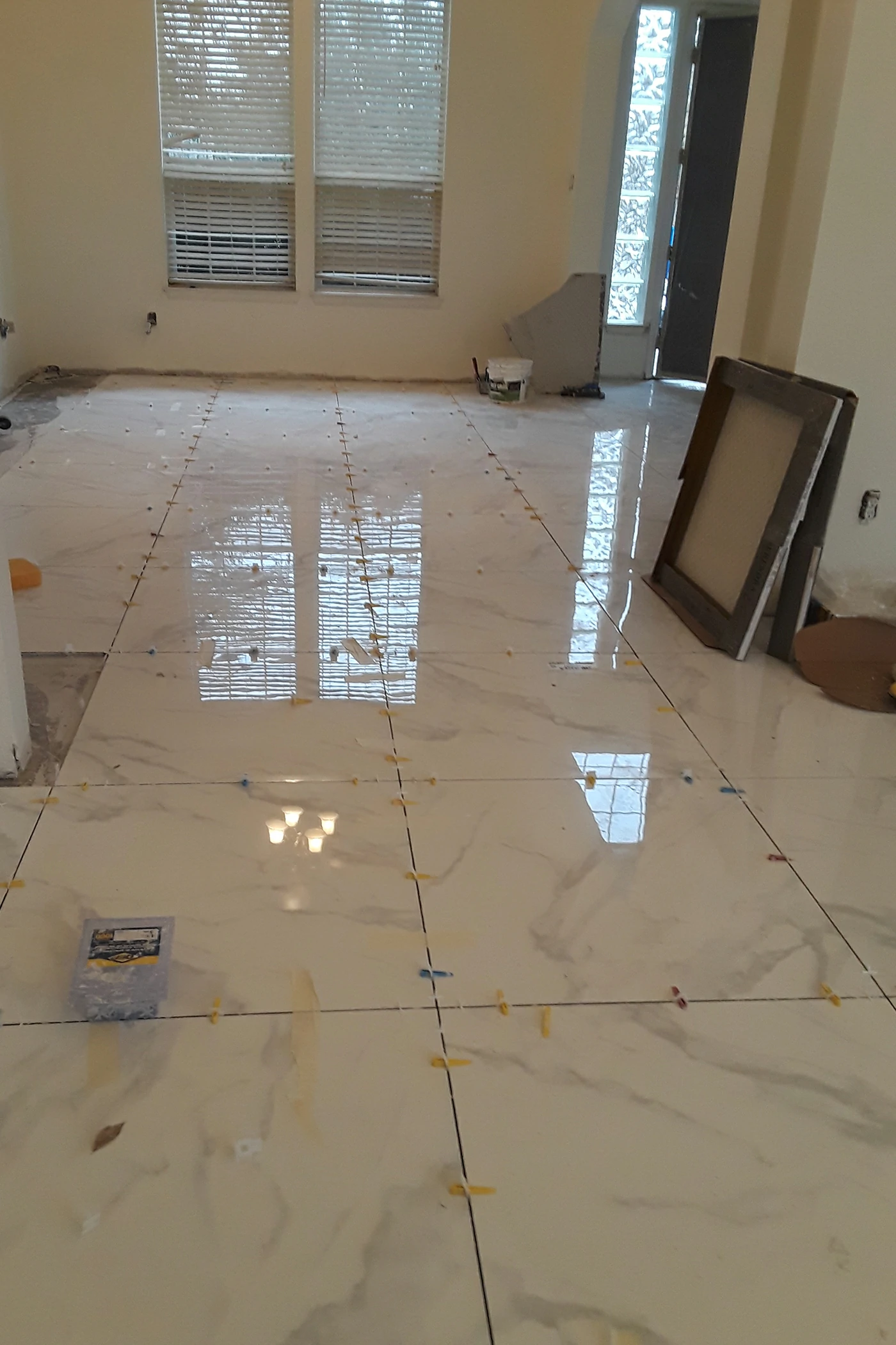
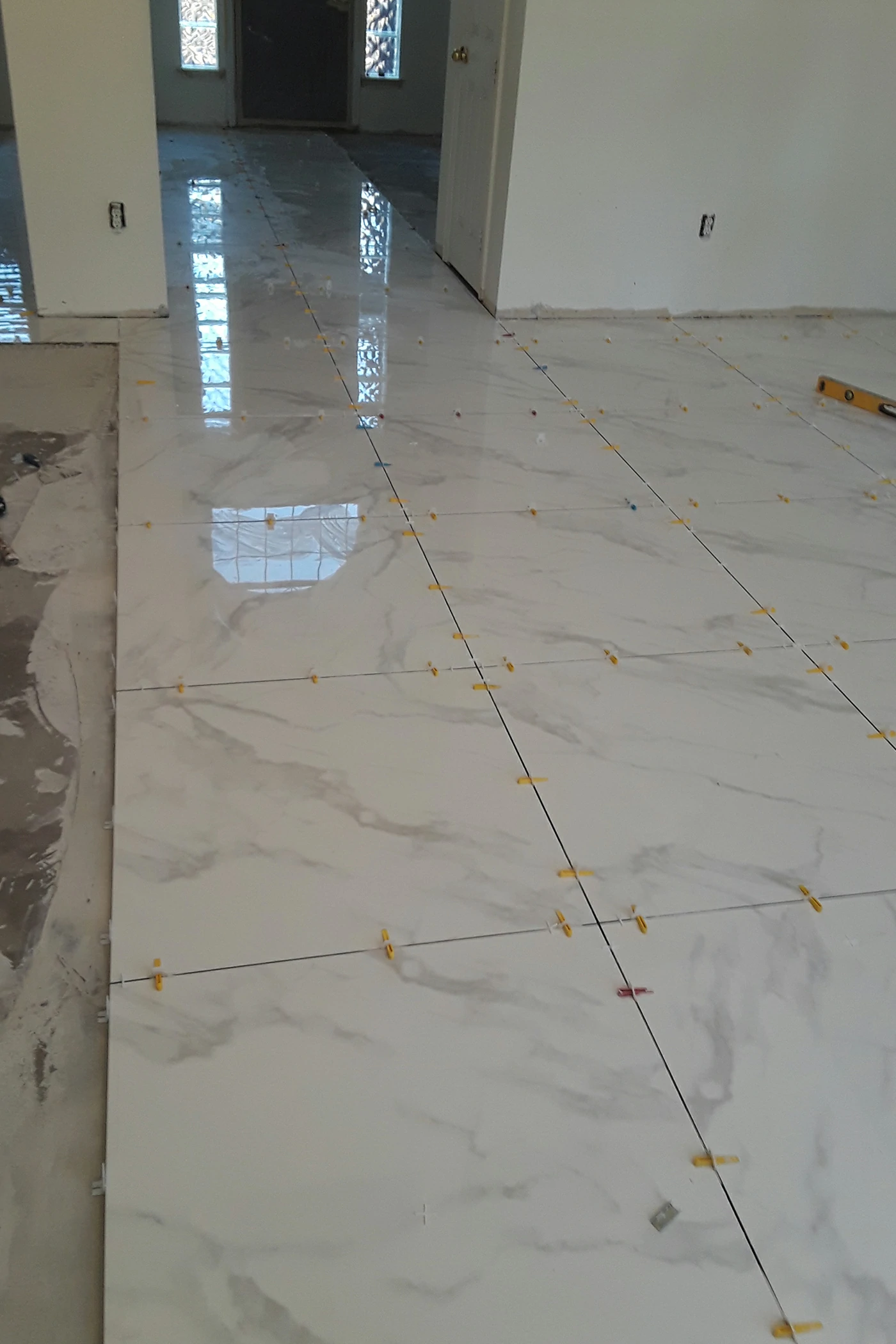
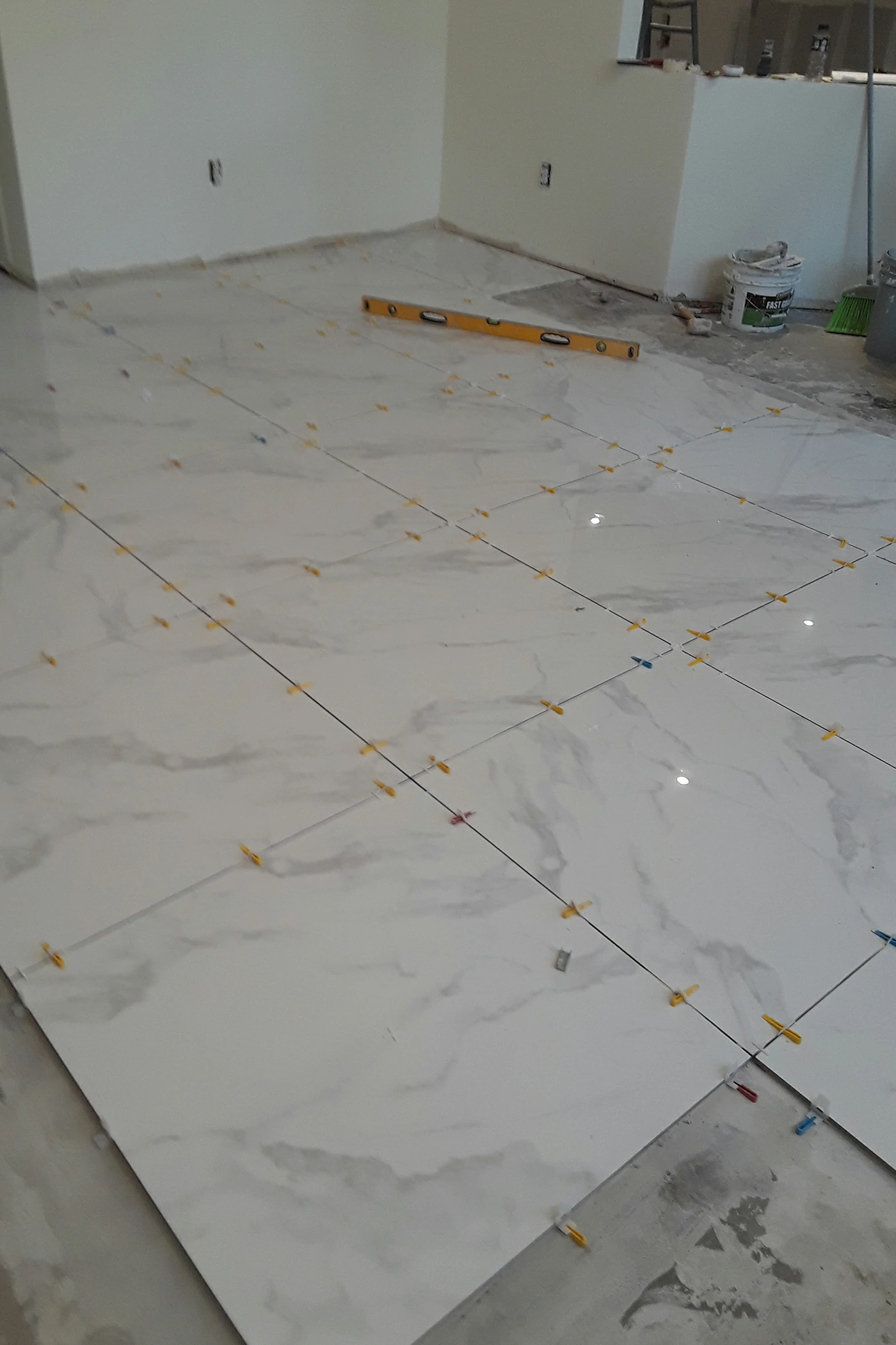
If you’re redesigning your living area, explore Bina Homes’ home remodeling services to integrate color and layout changes cohesively.
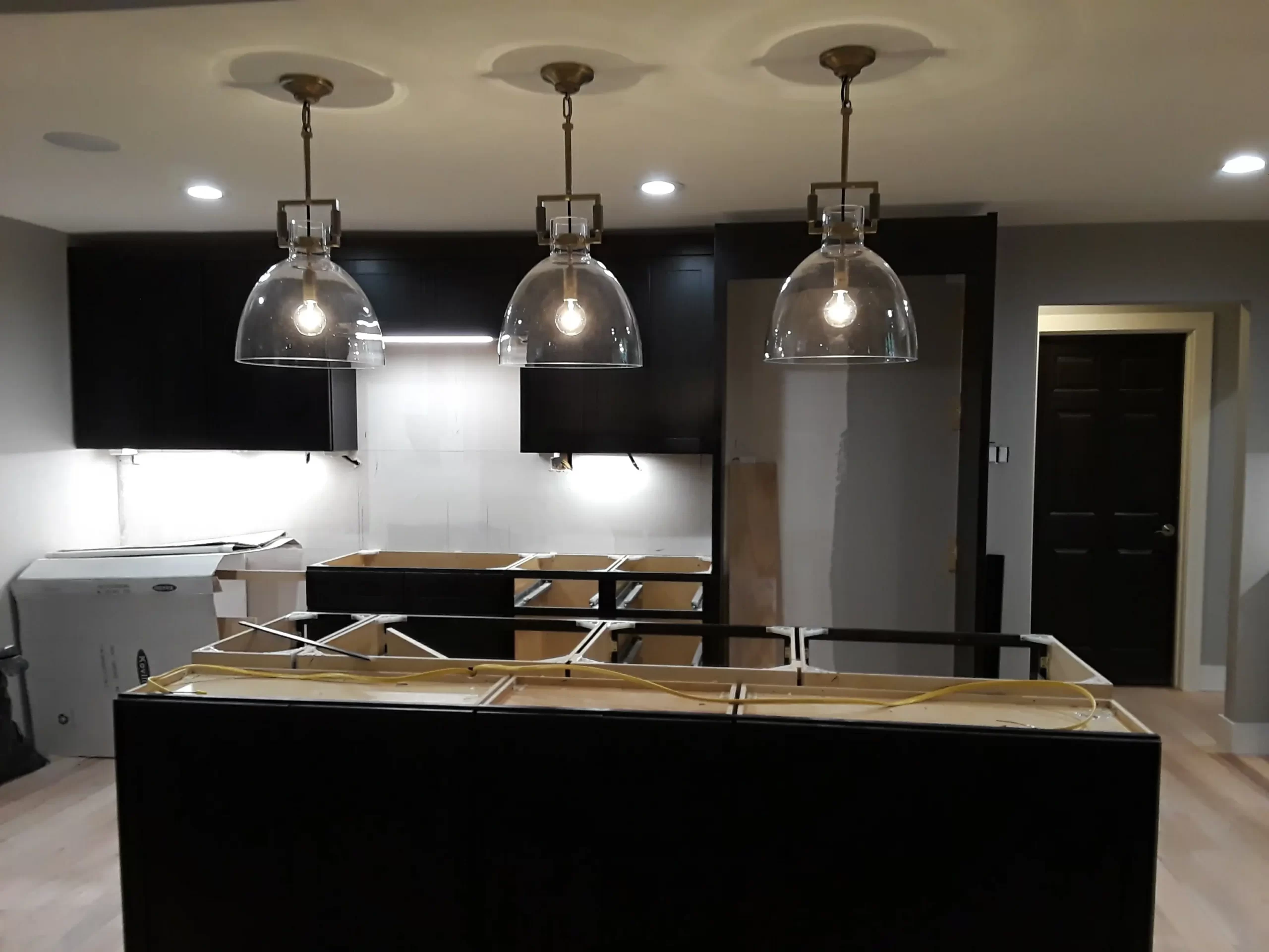
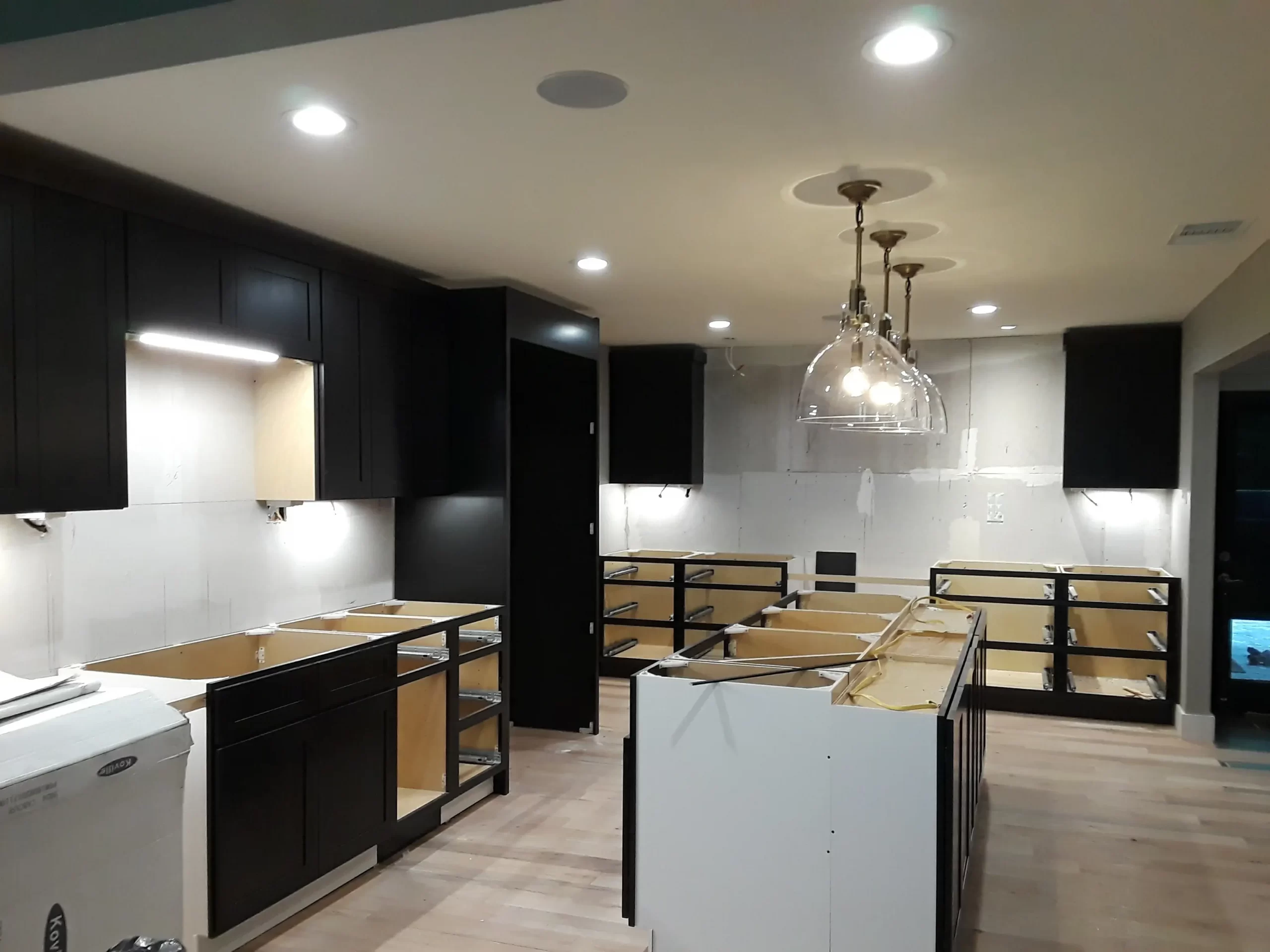
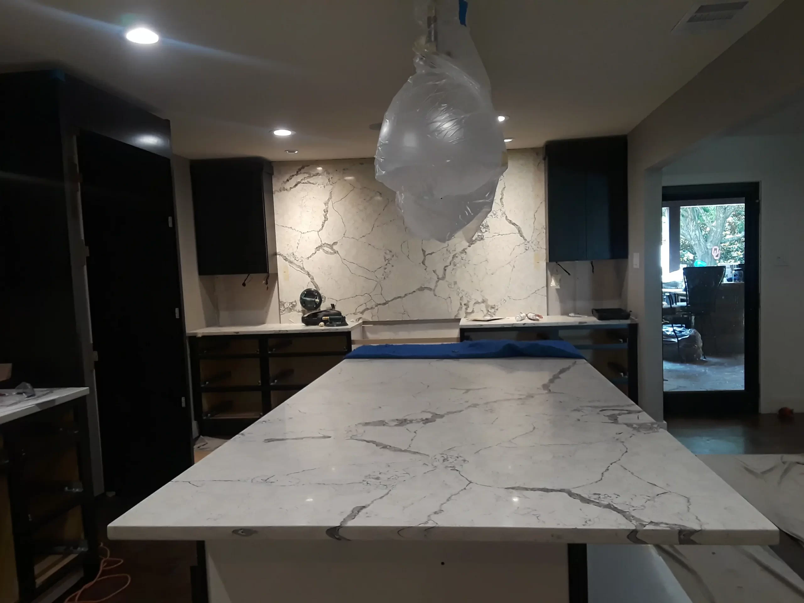
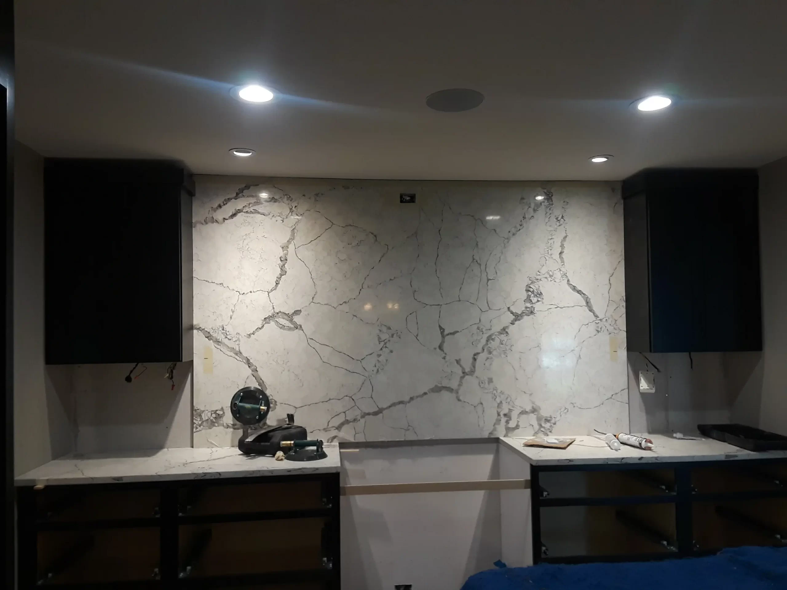
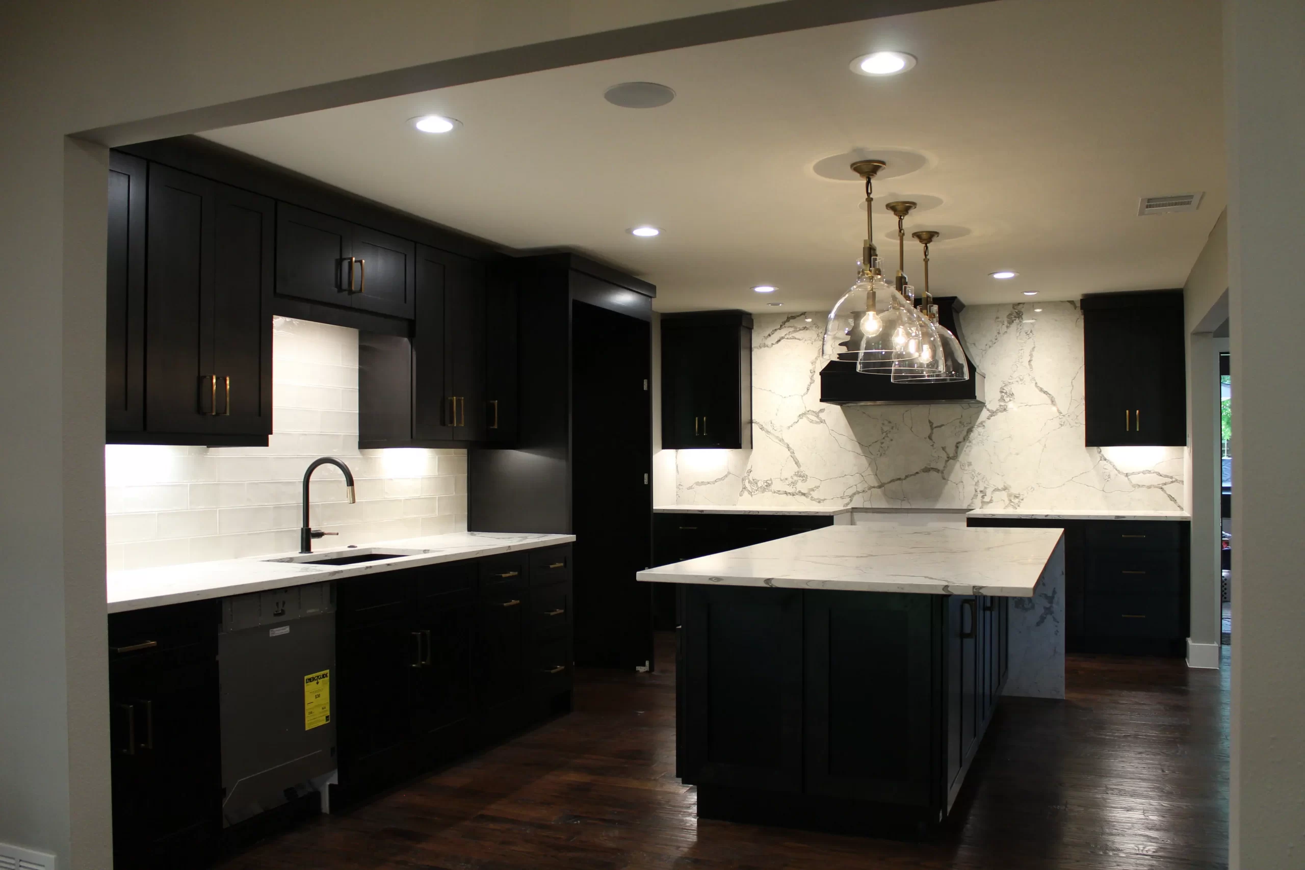
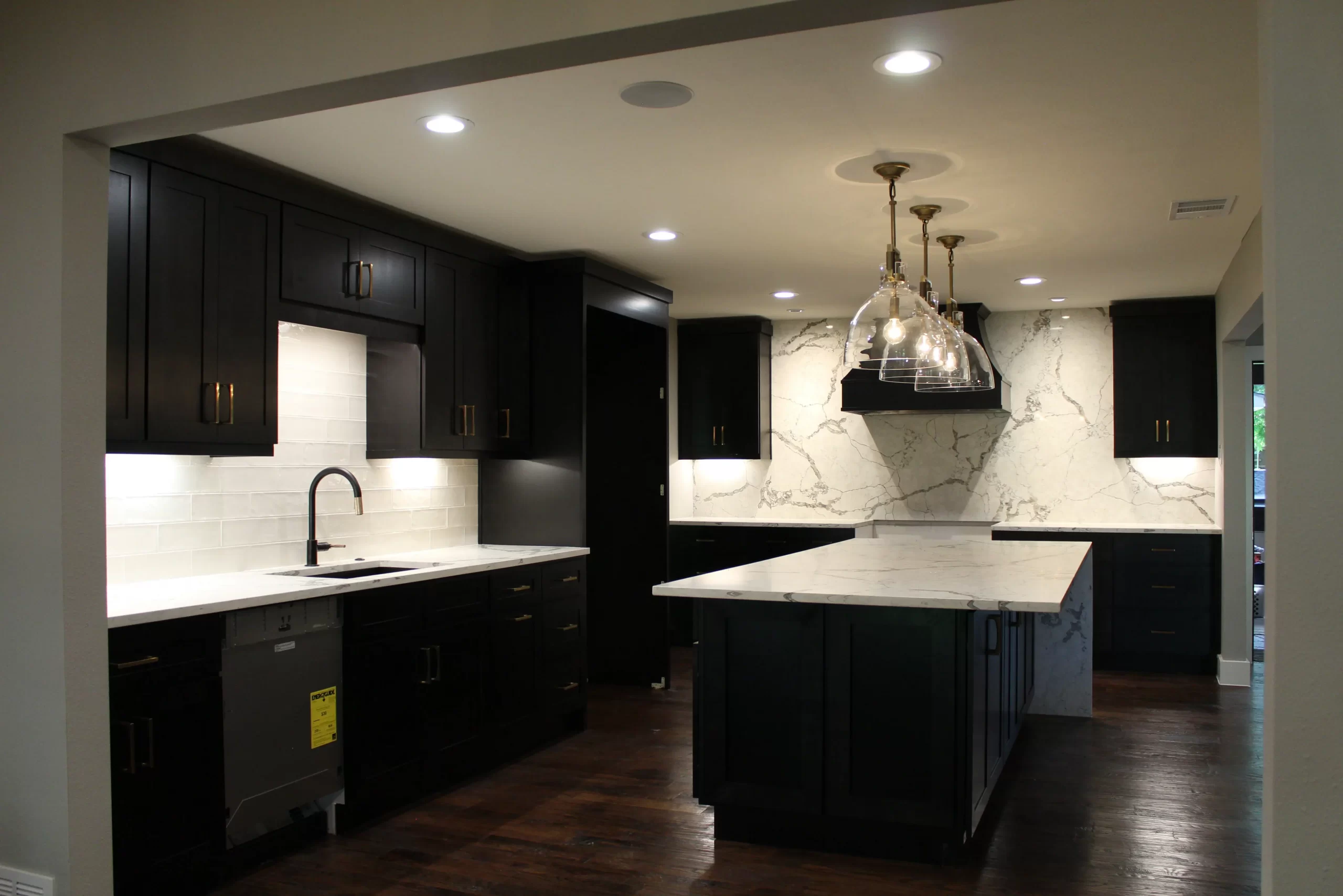
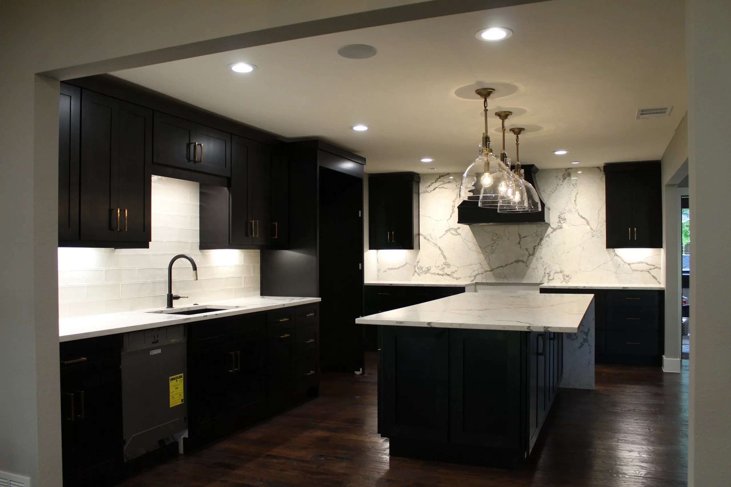
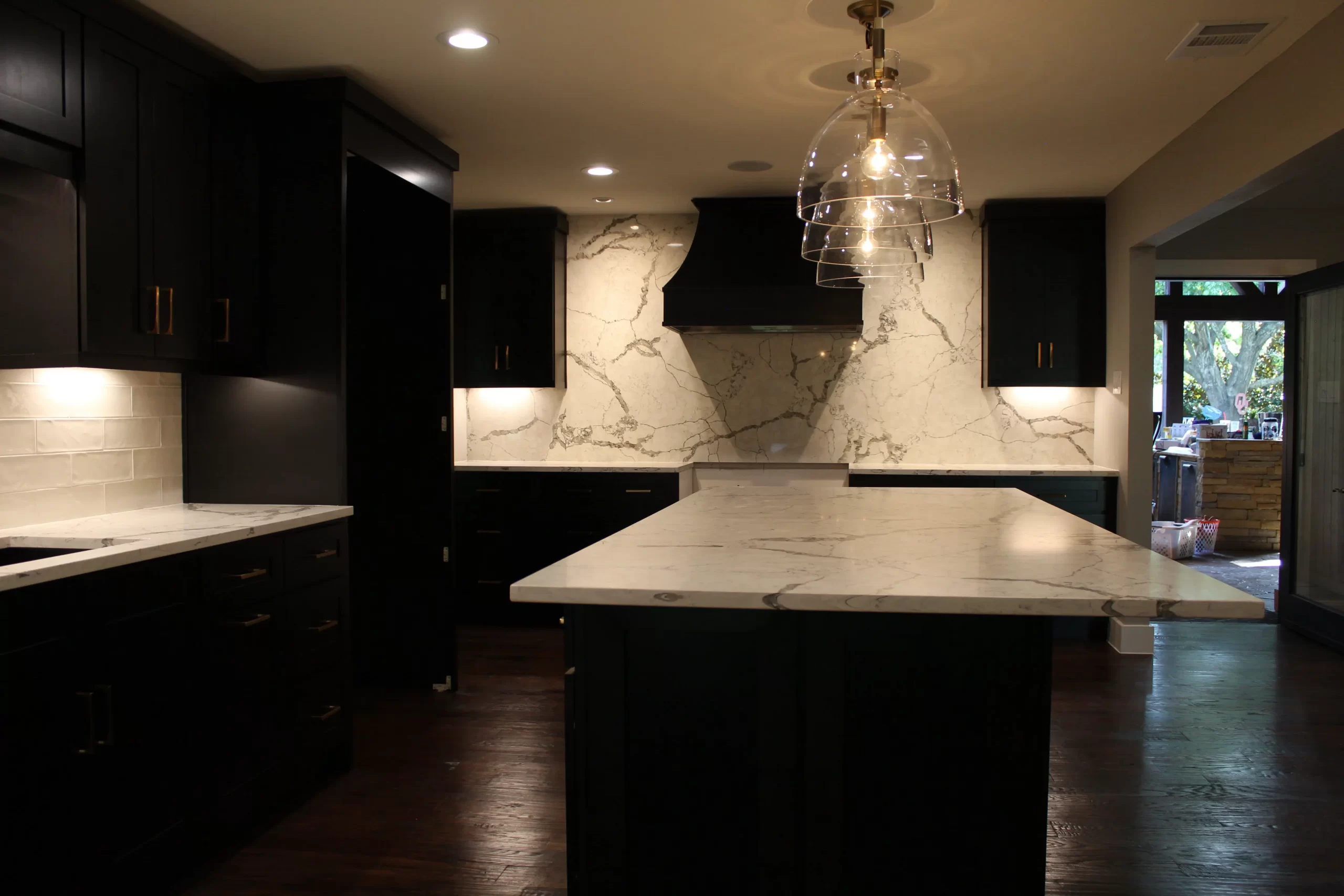
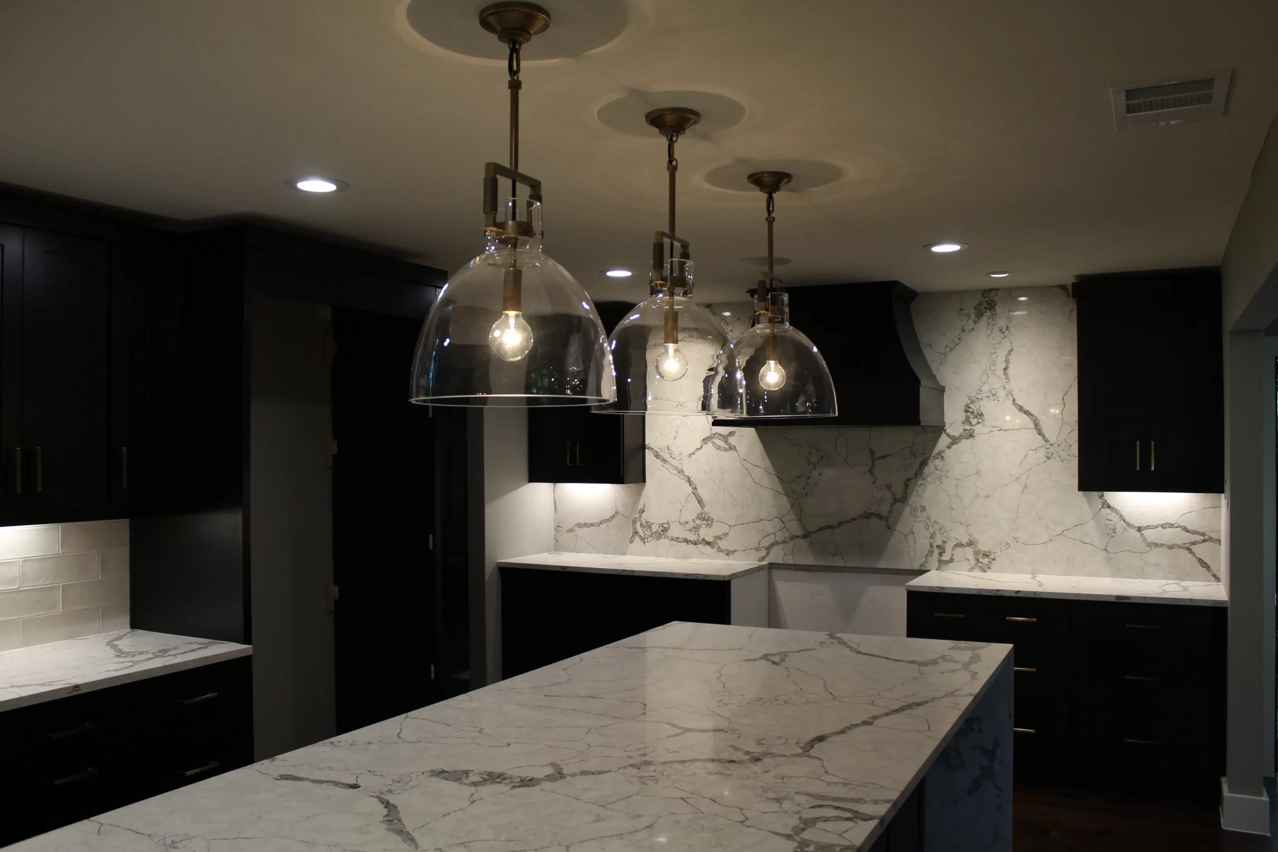
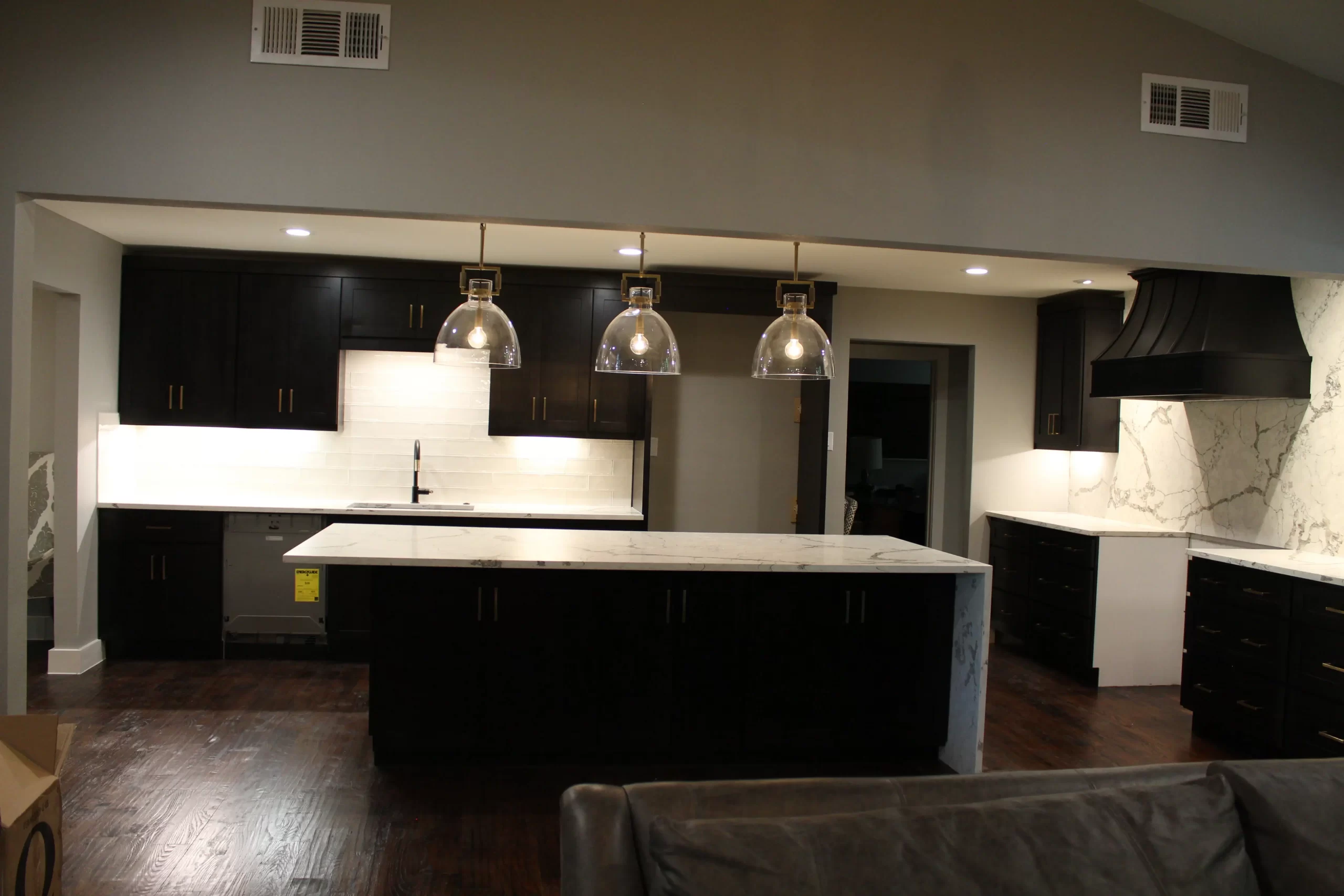
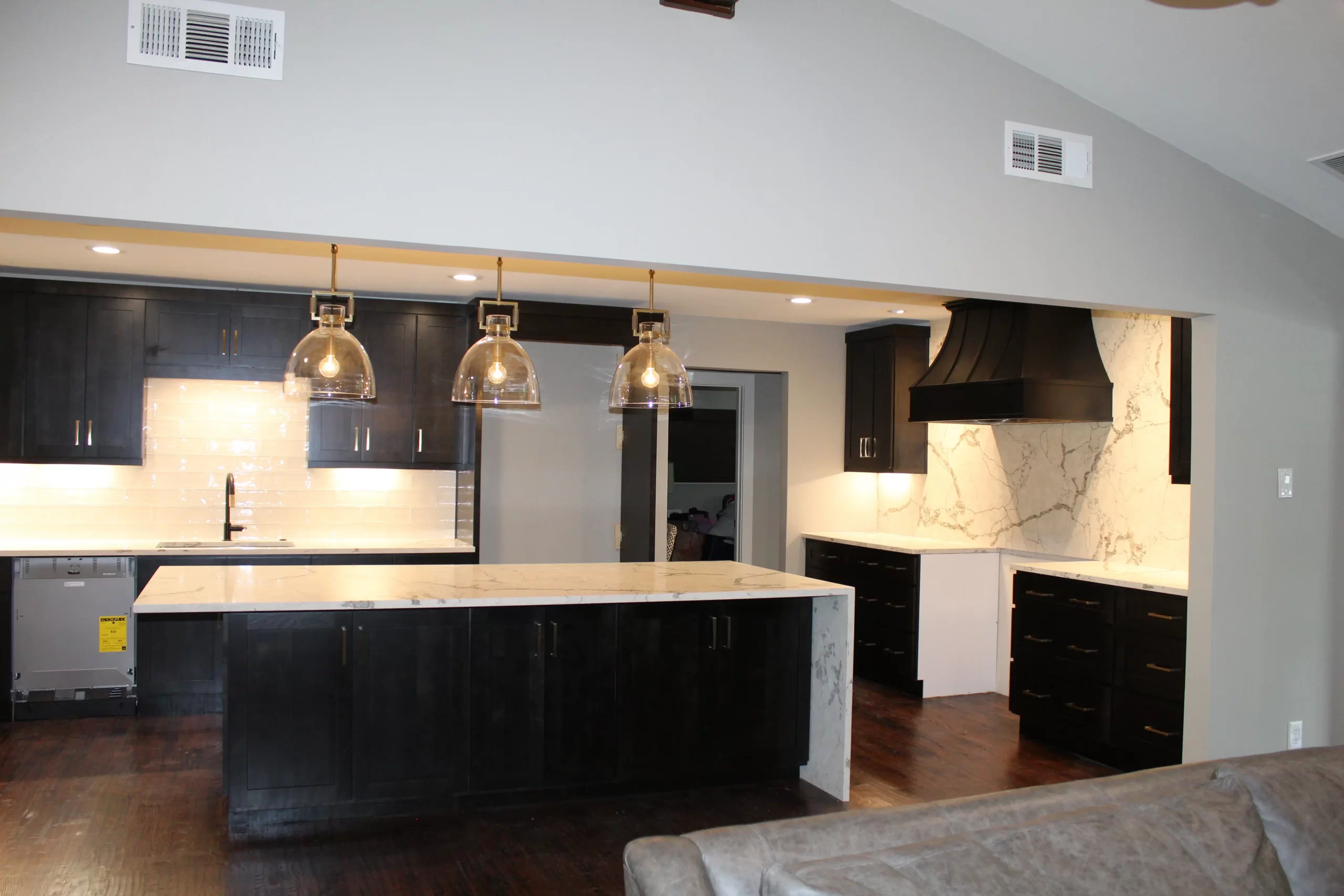
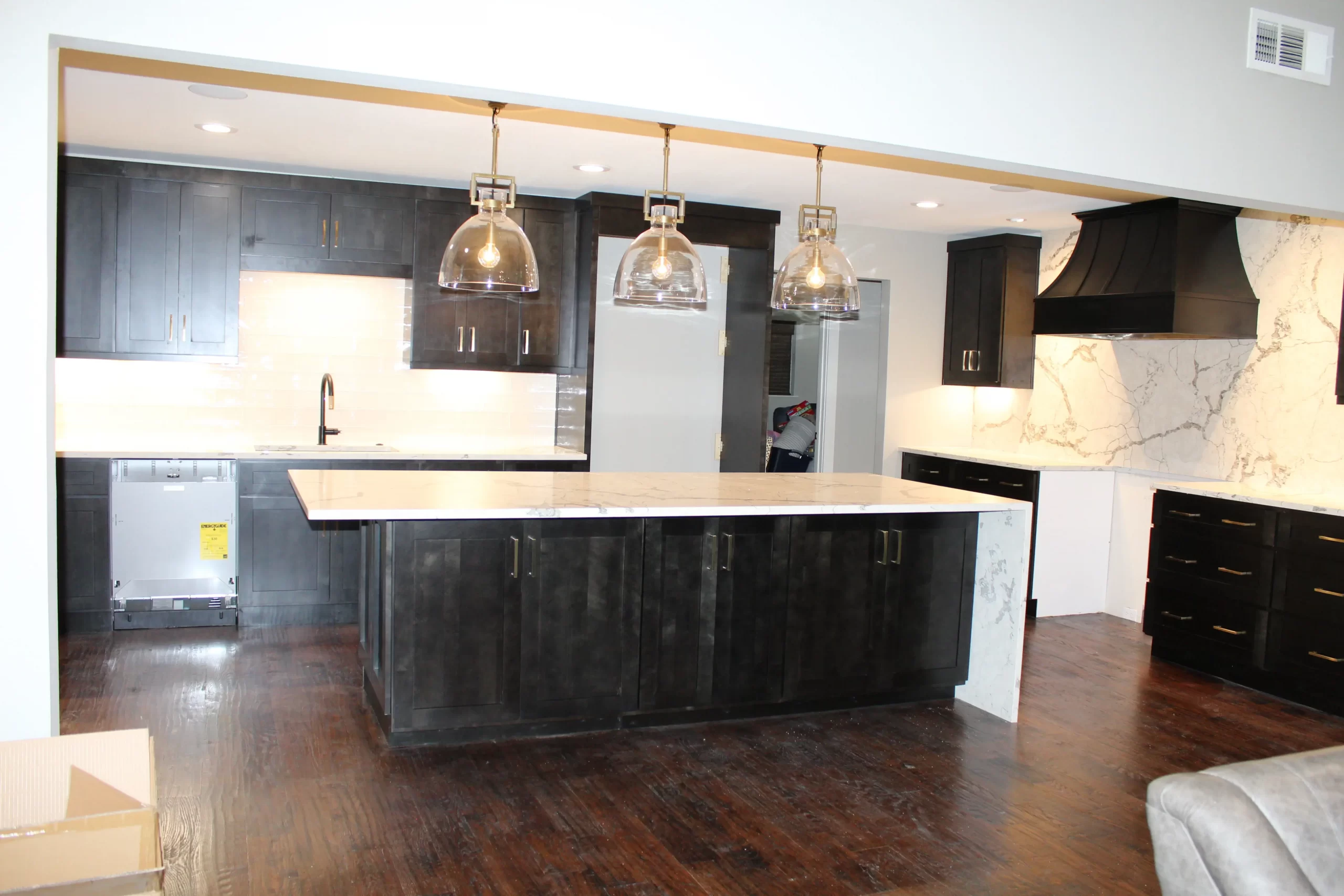
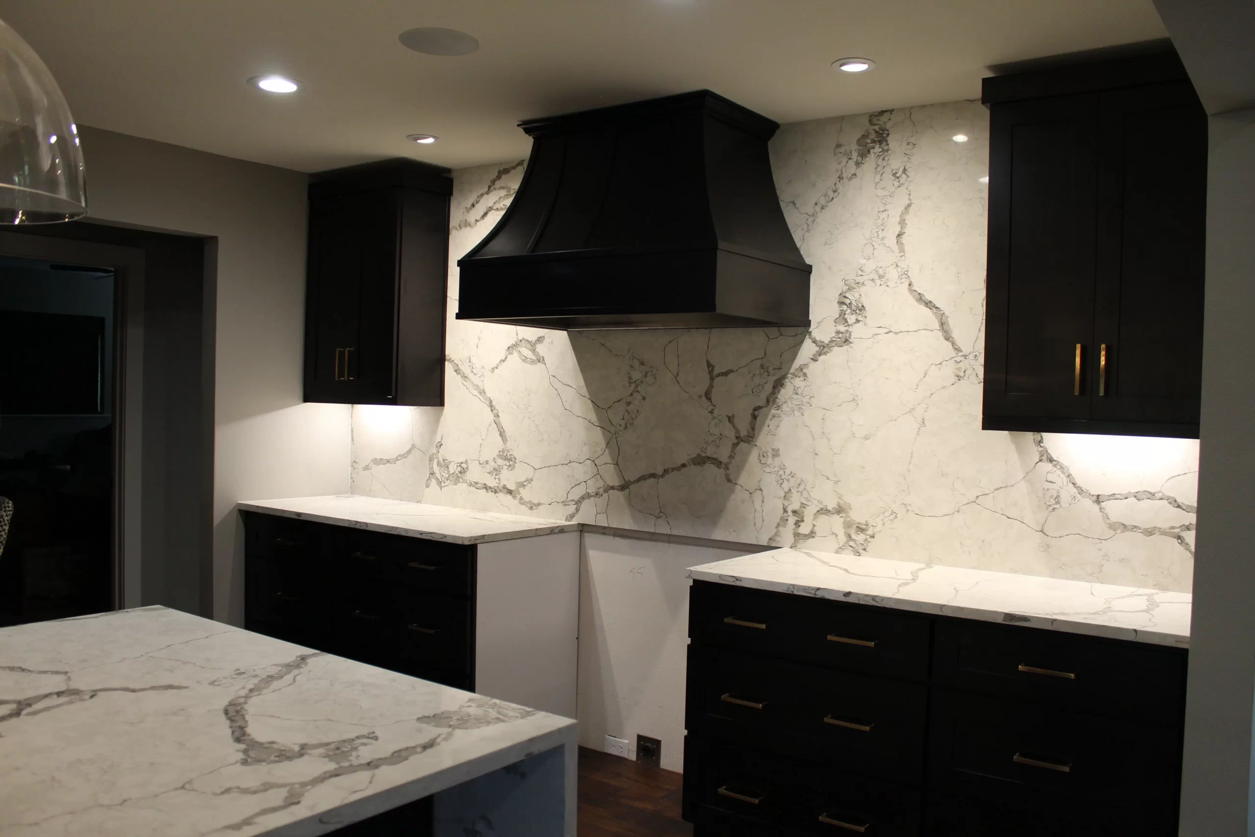
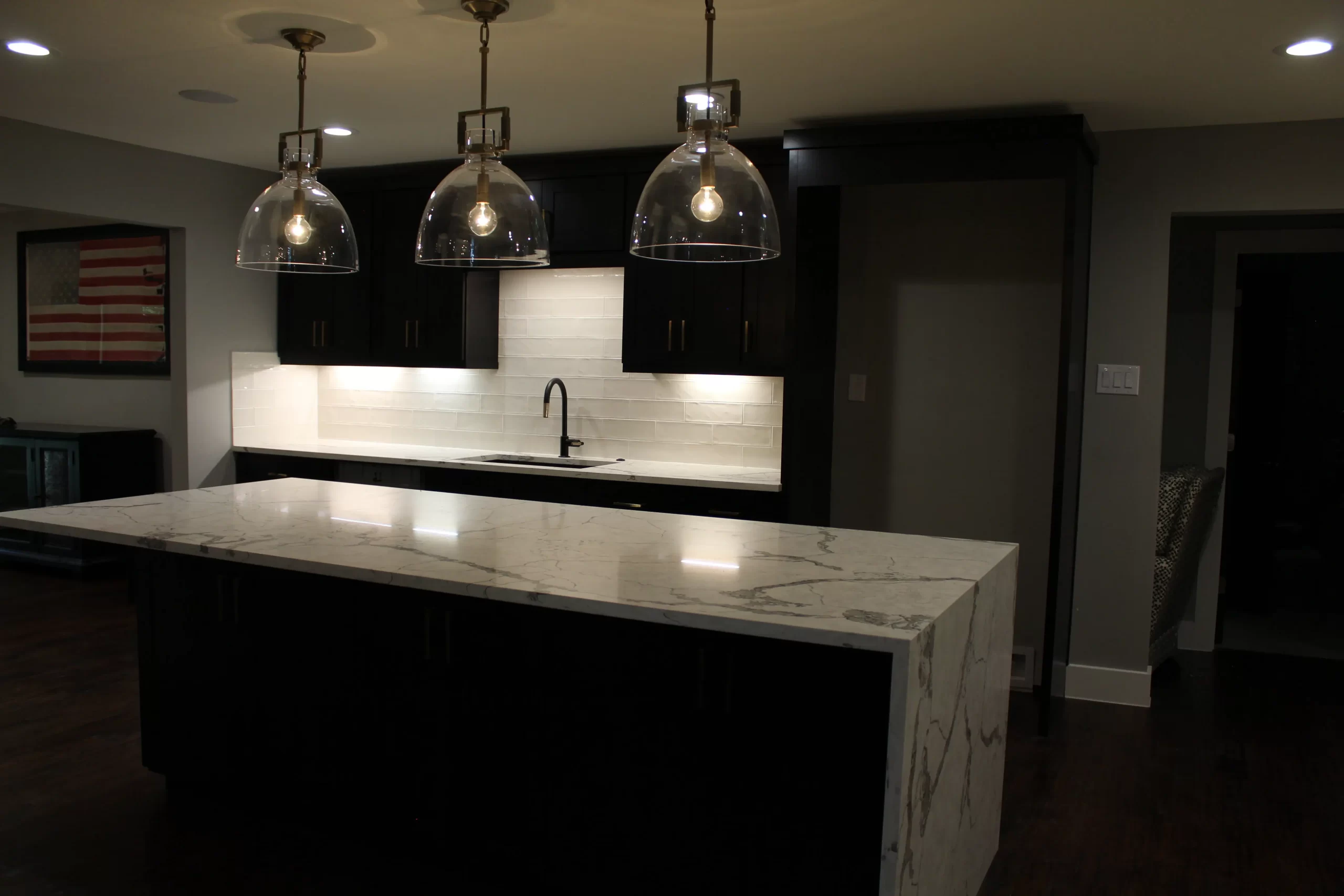
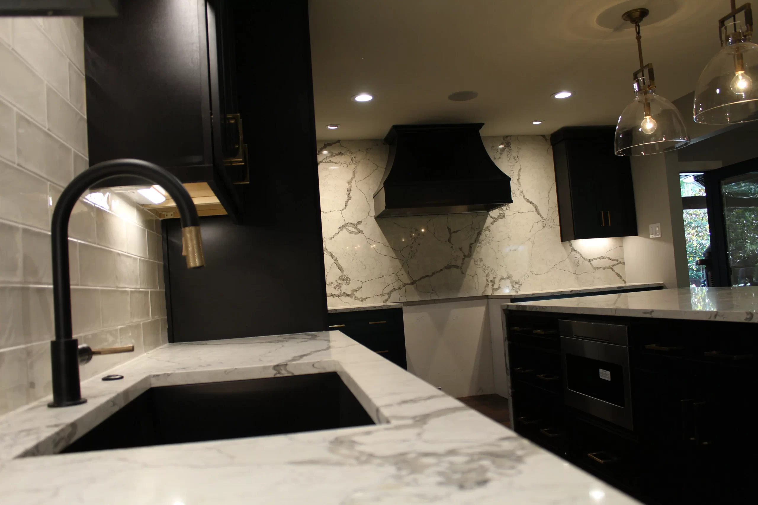
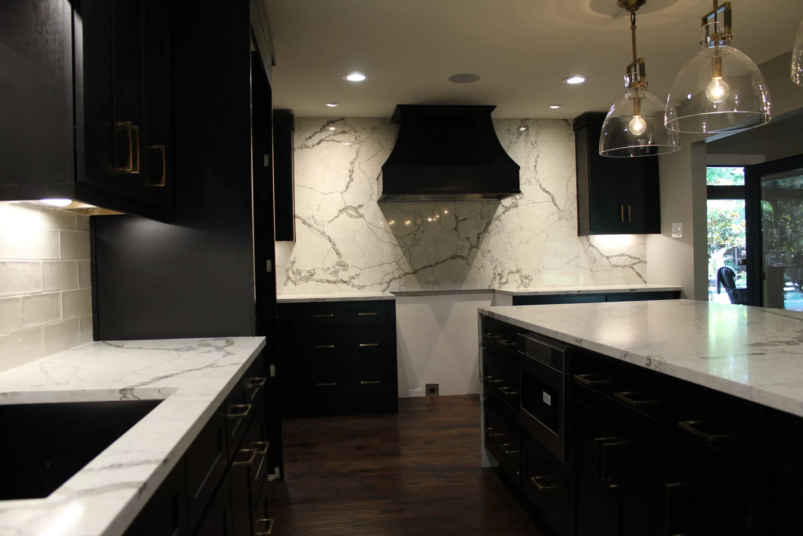
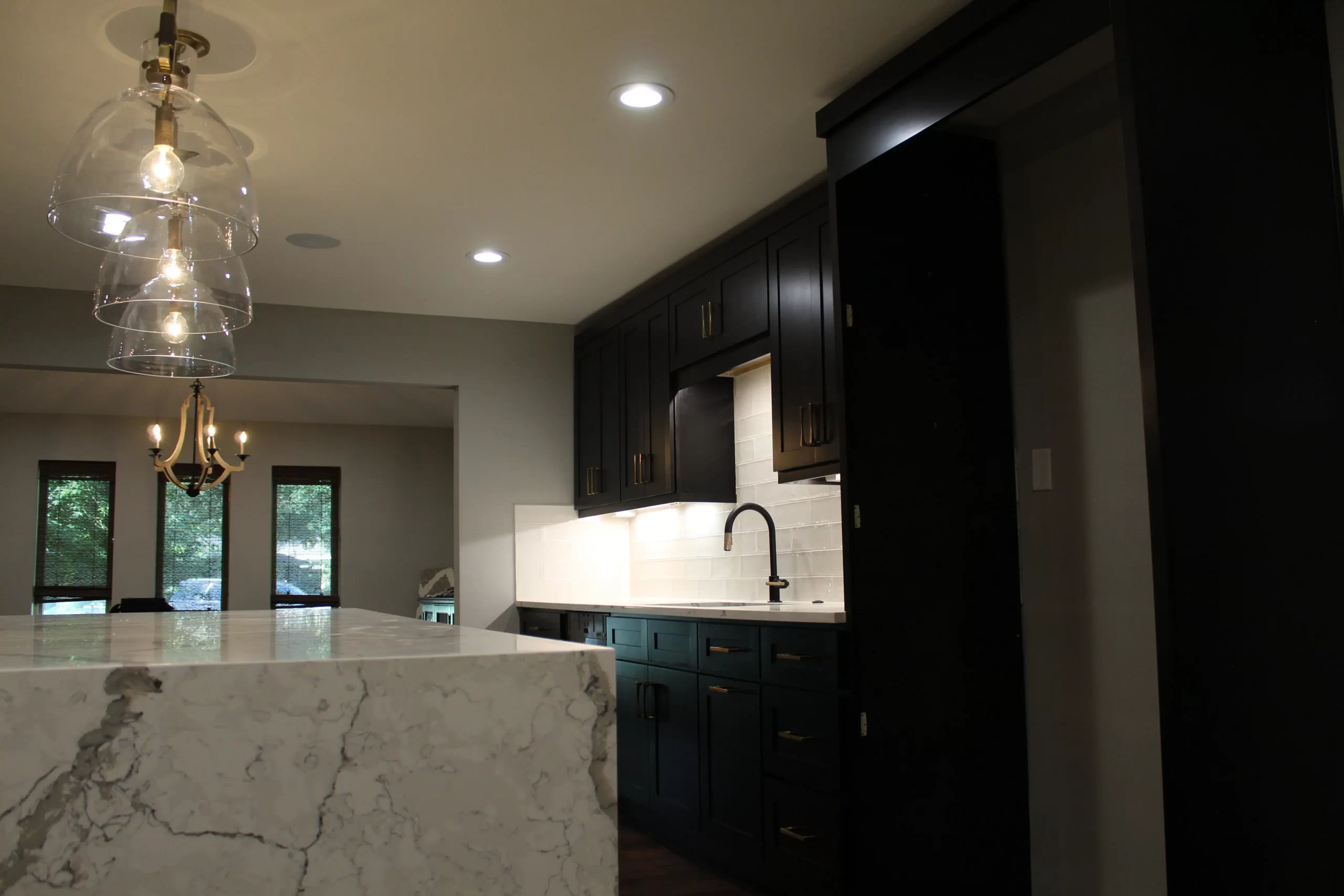
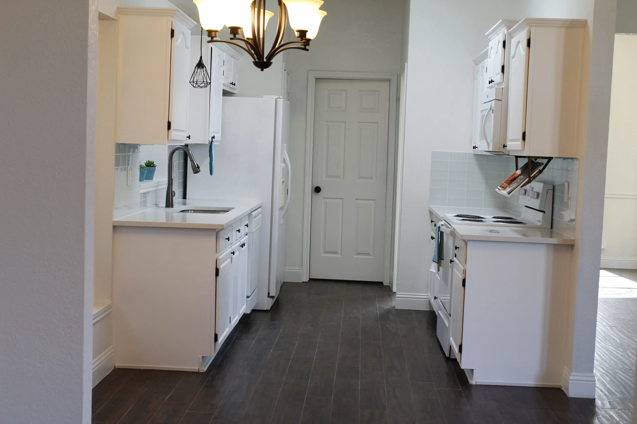
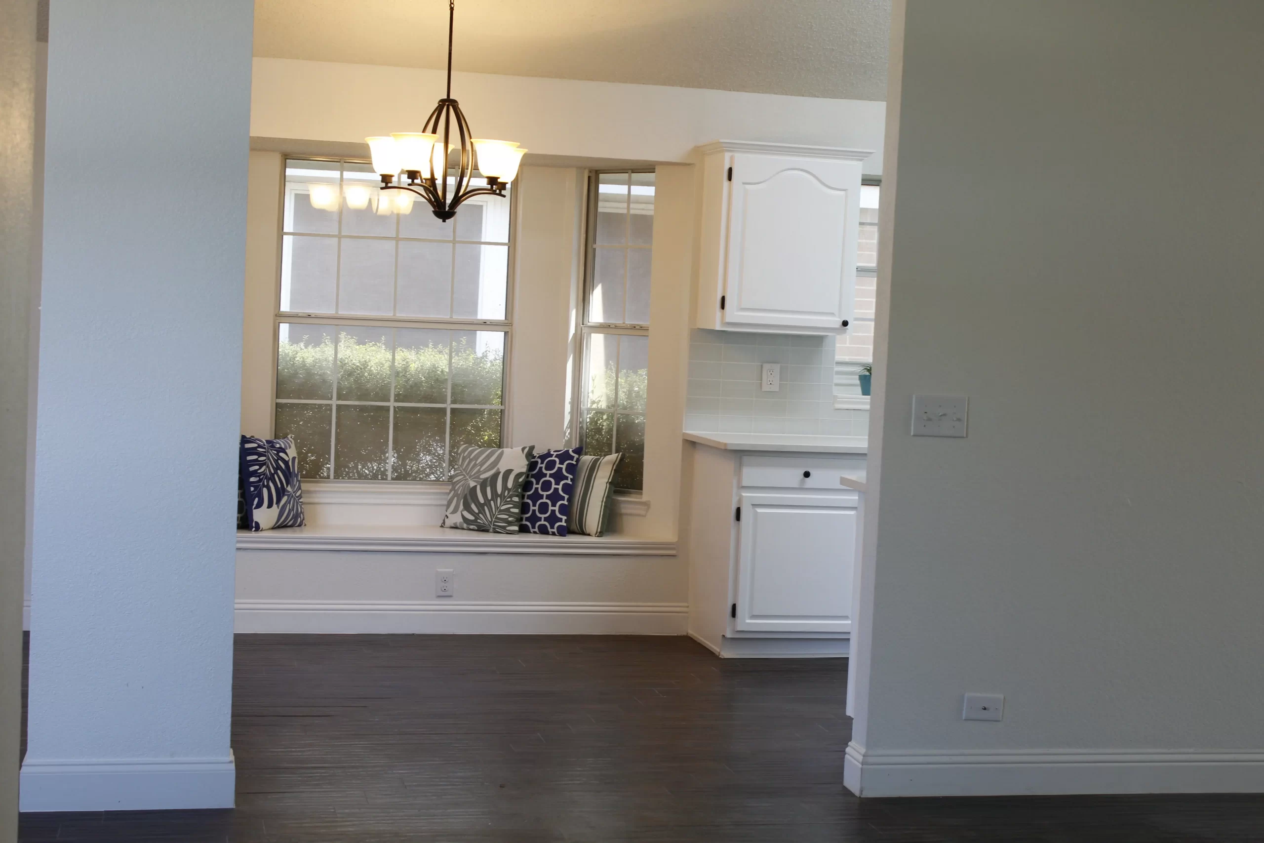
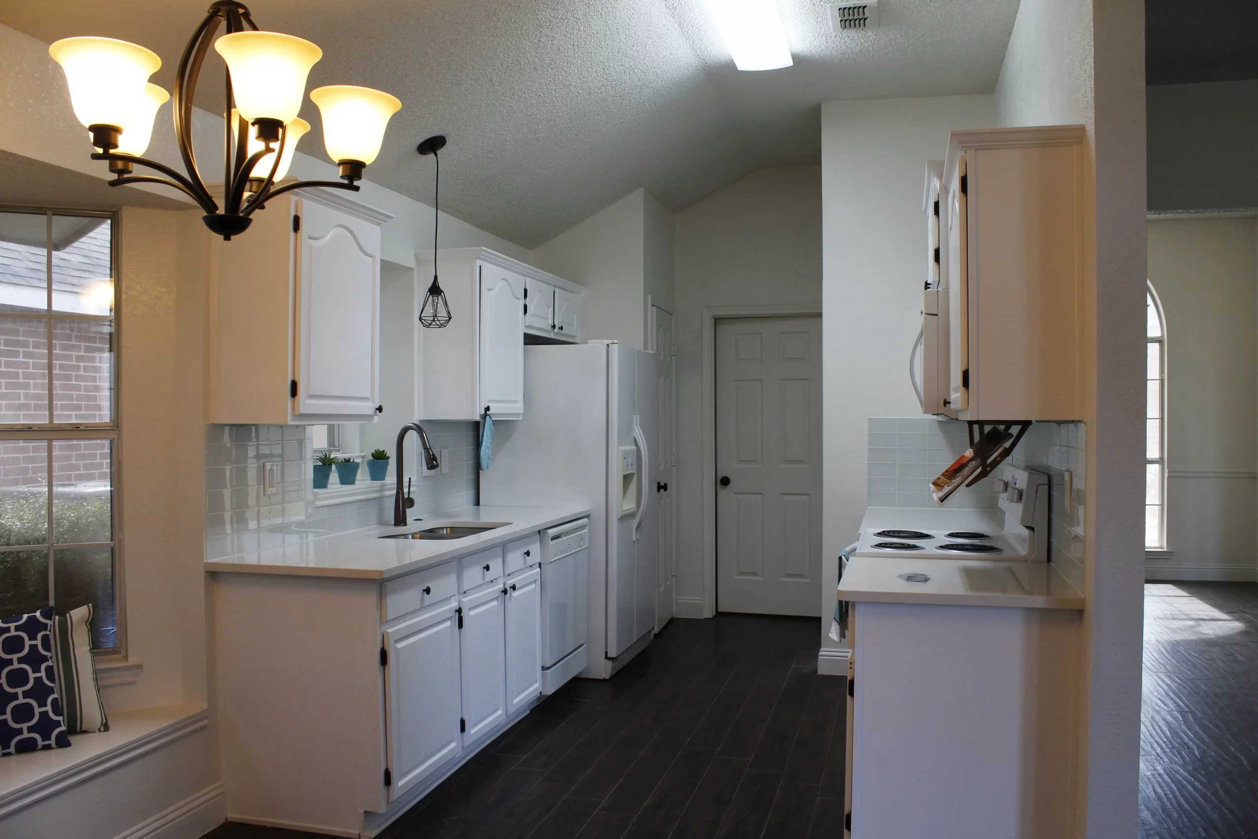
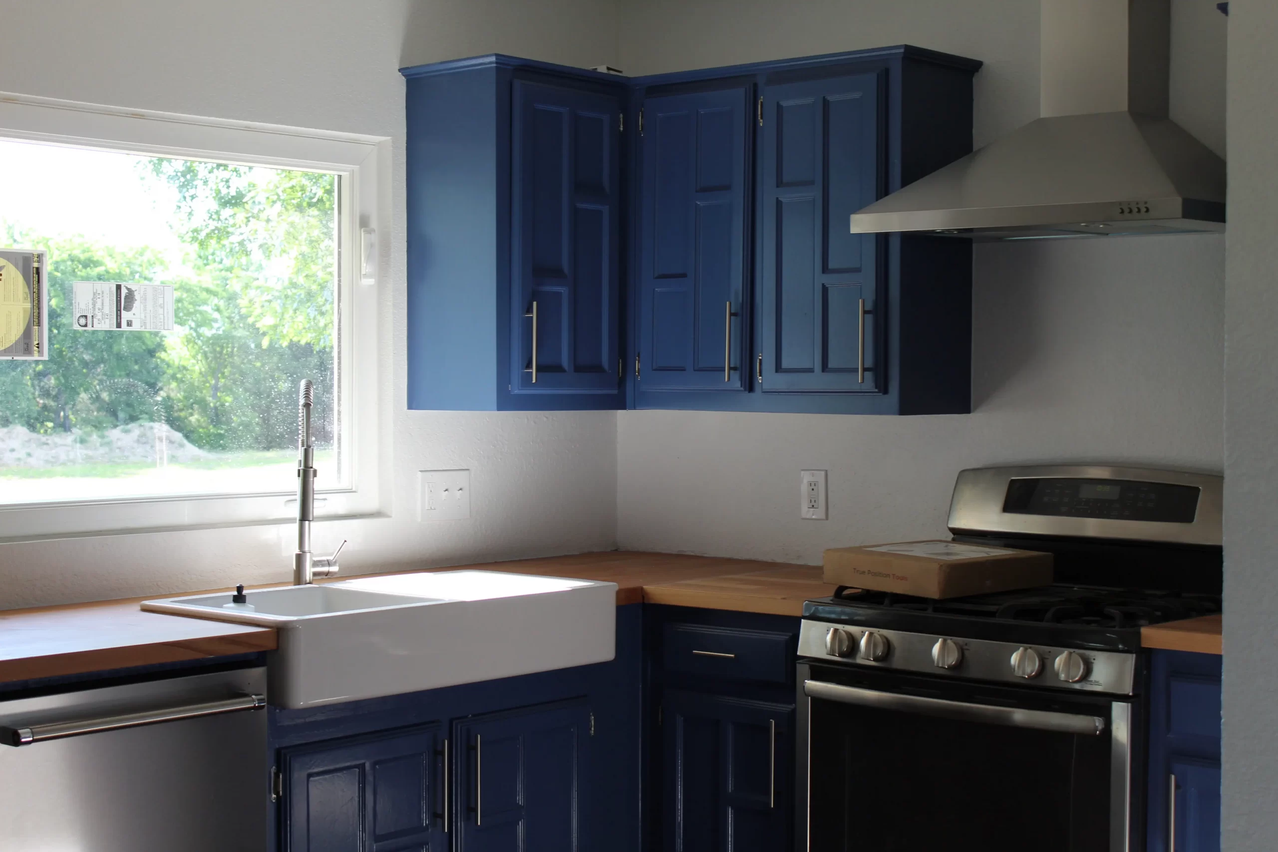
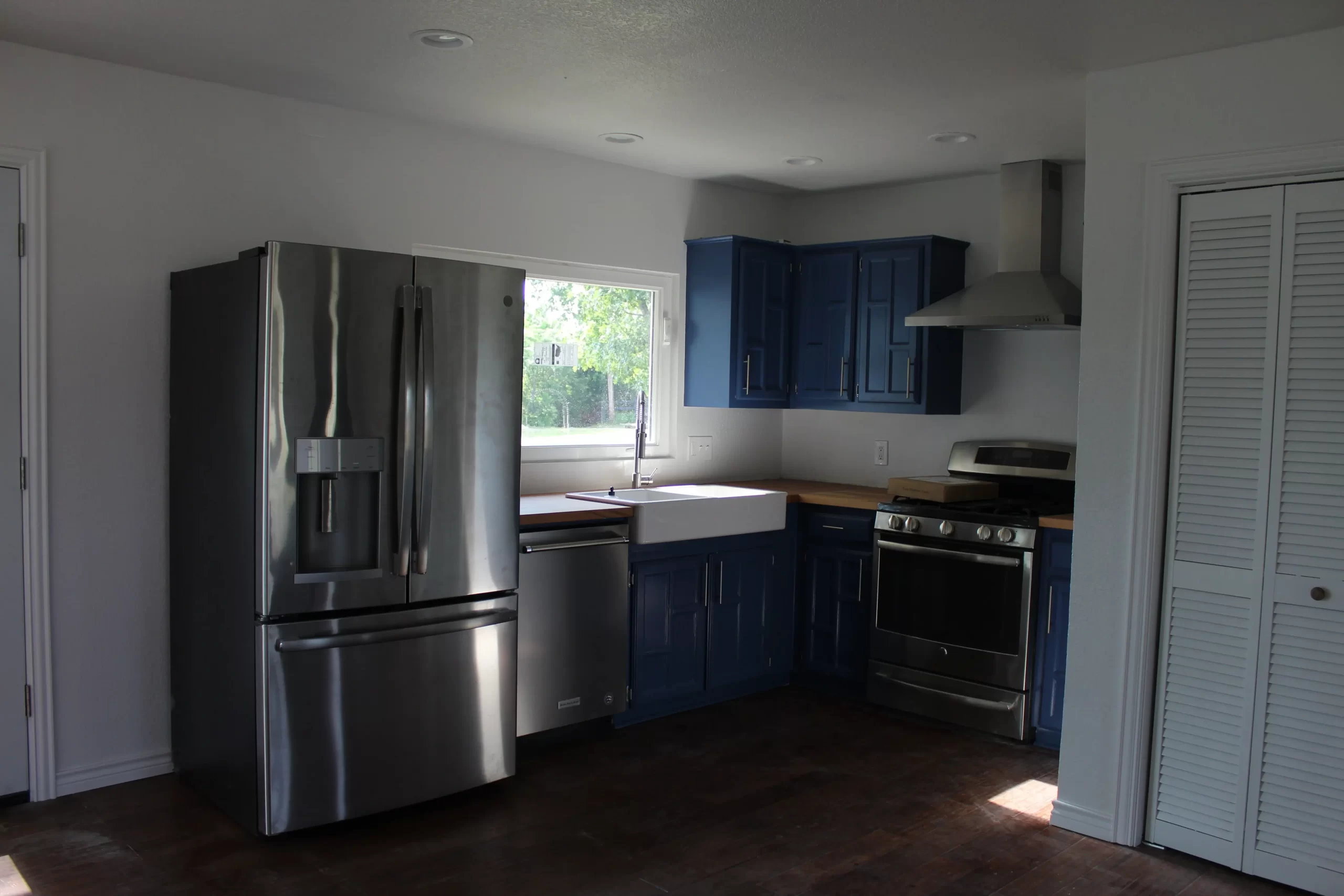
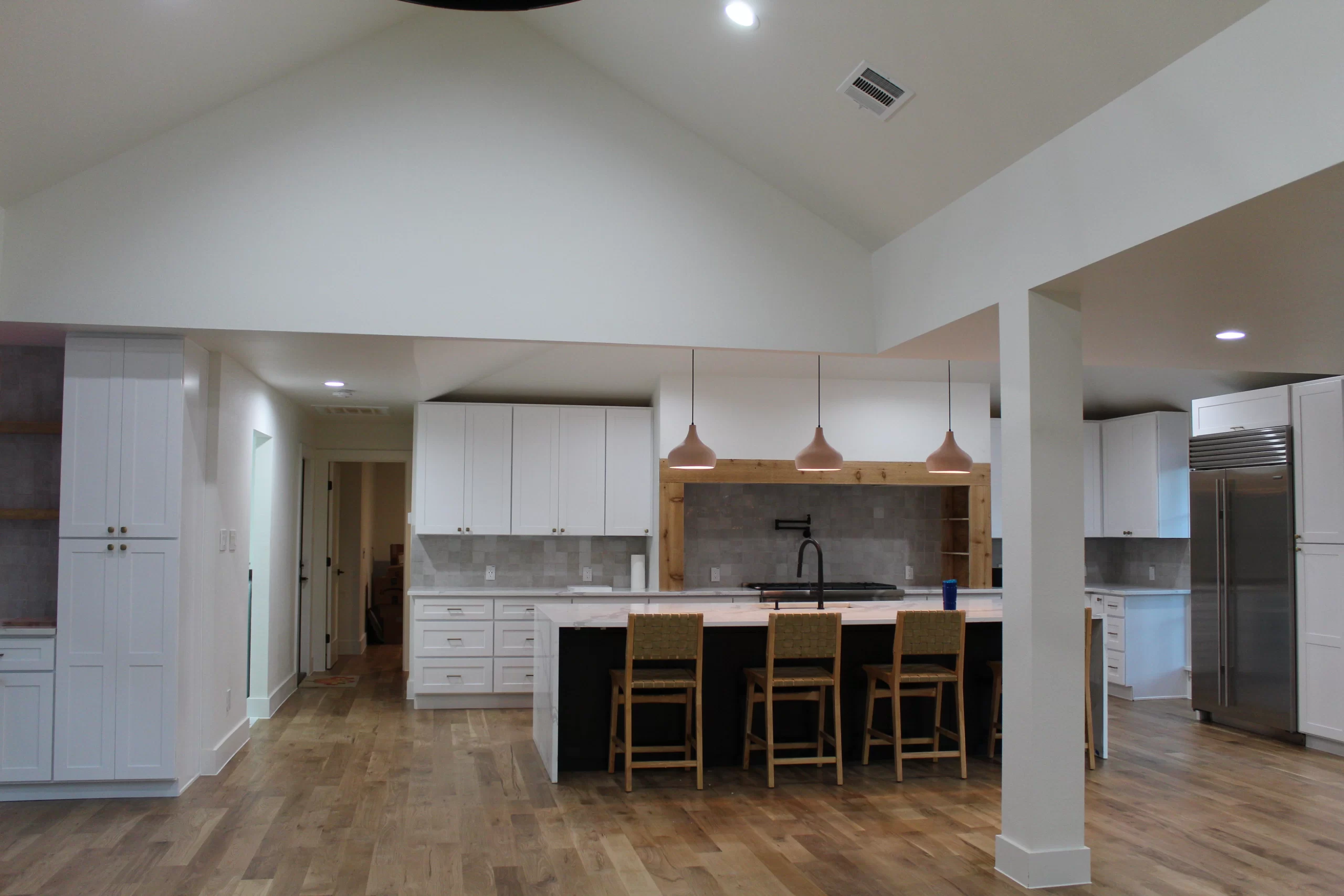
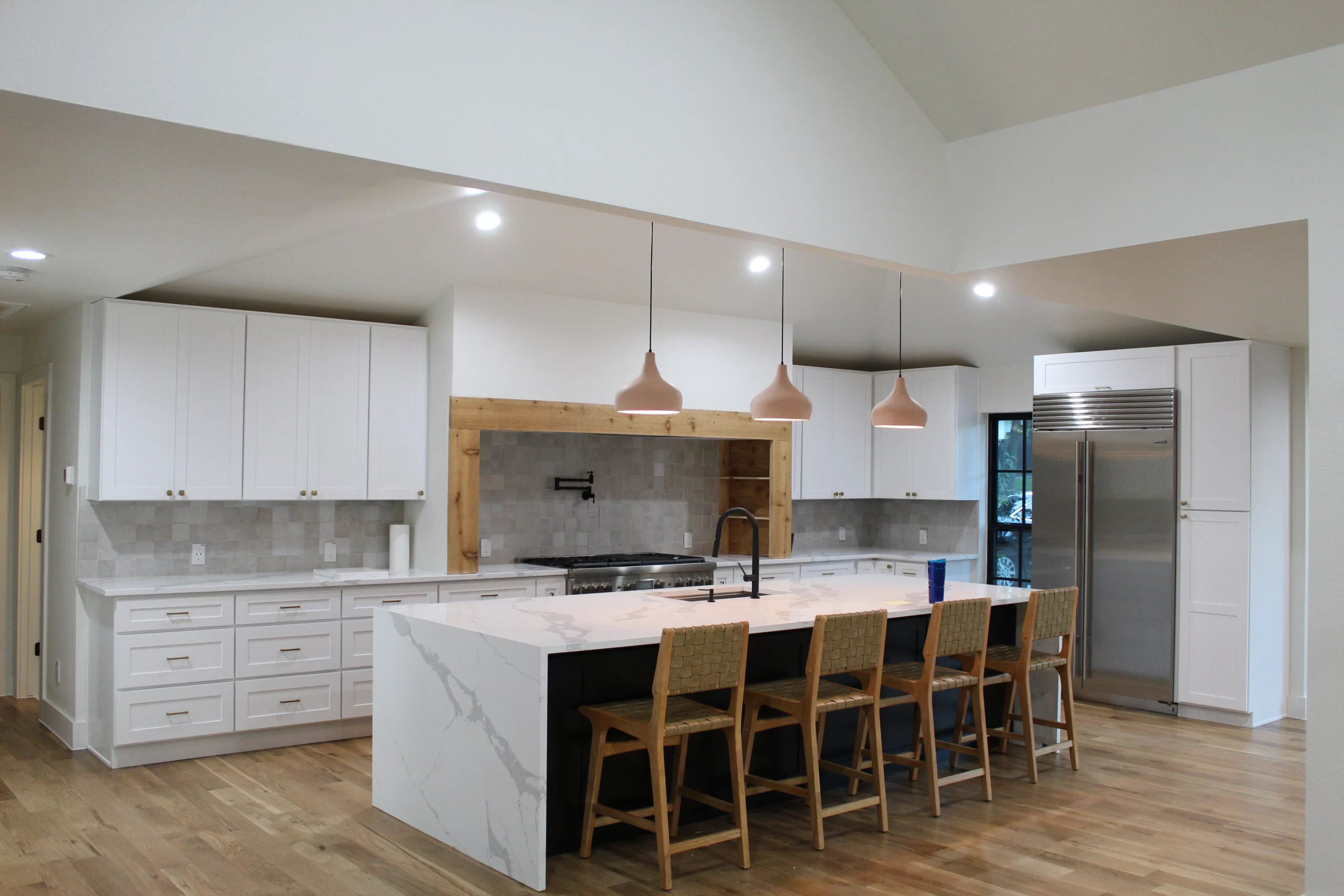
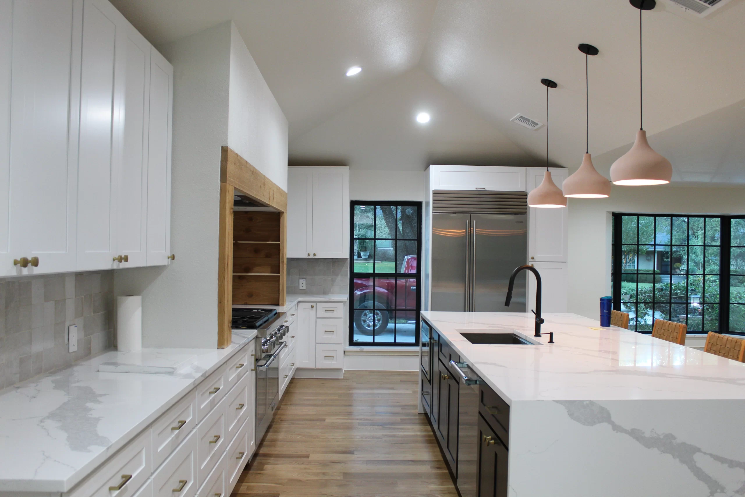
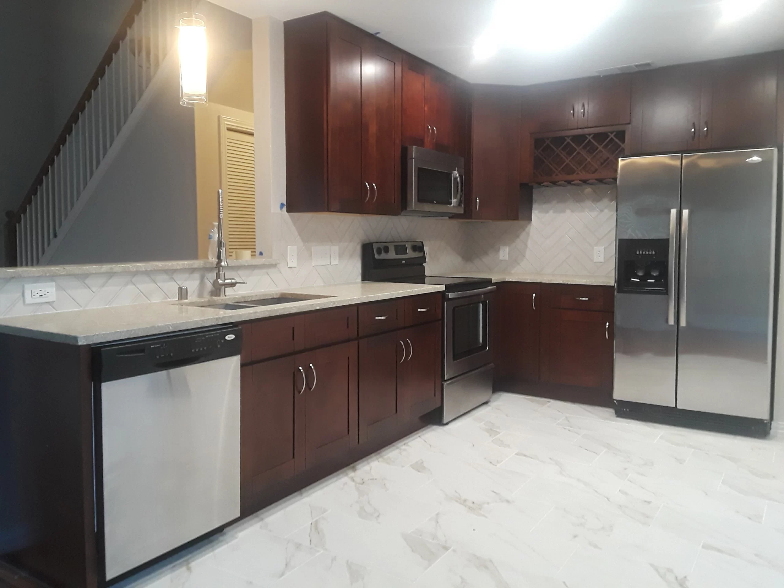
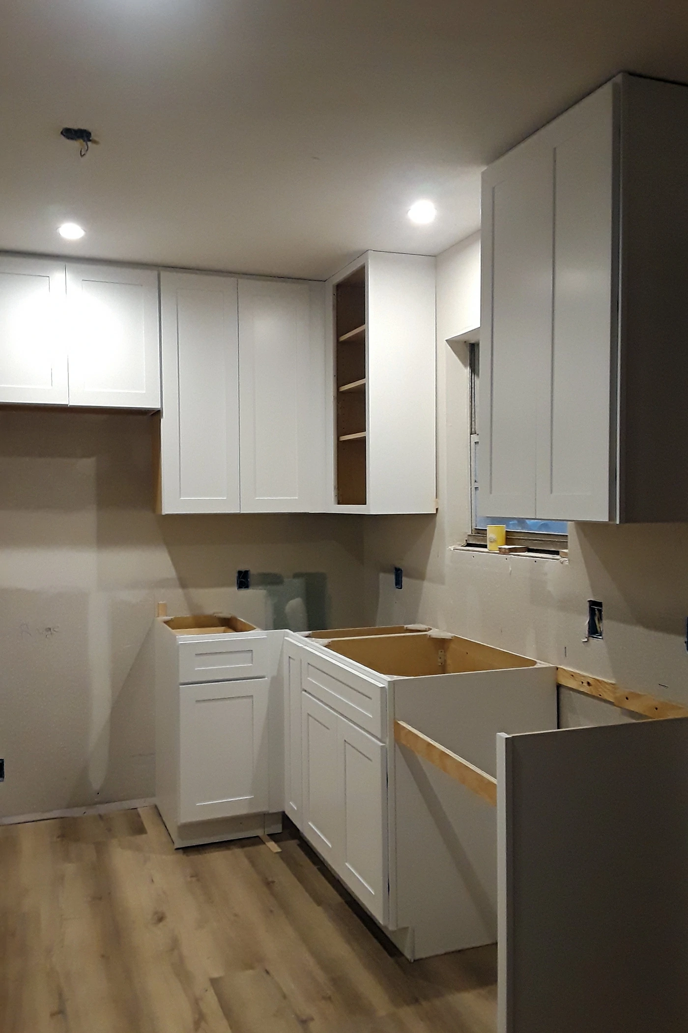
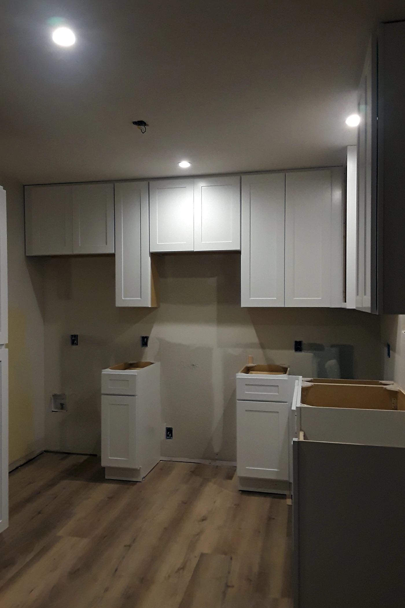
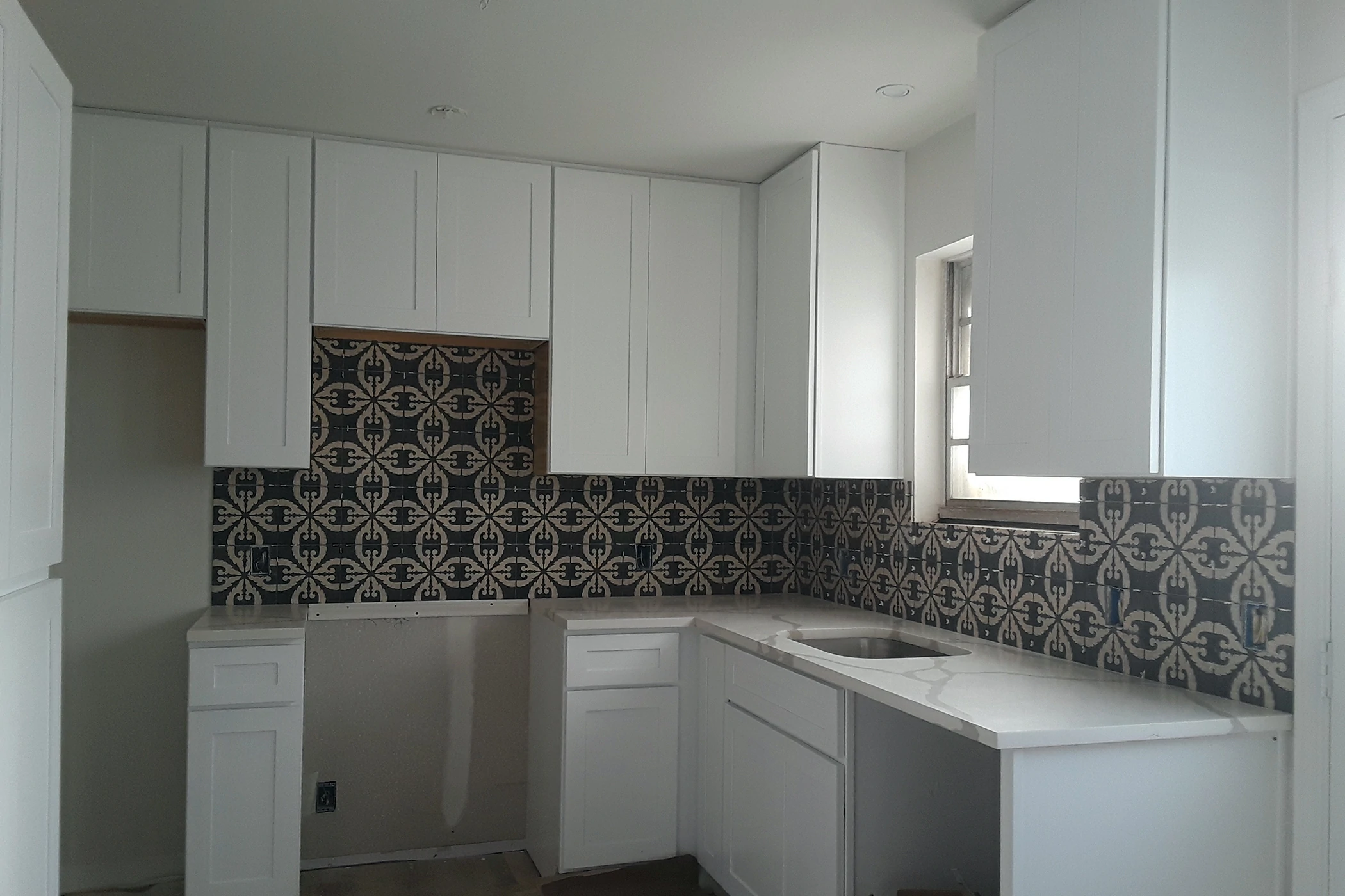
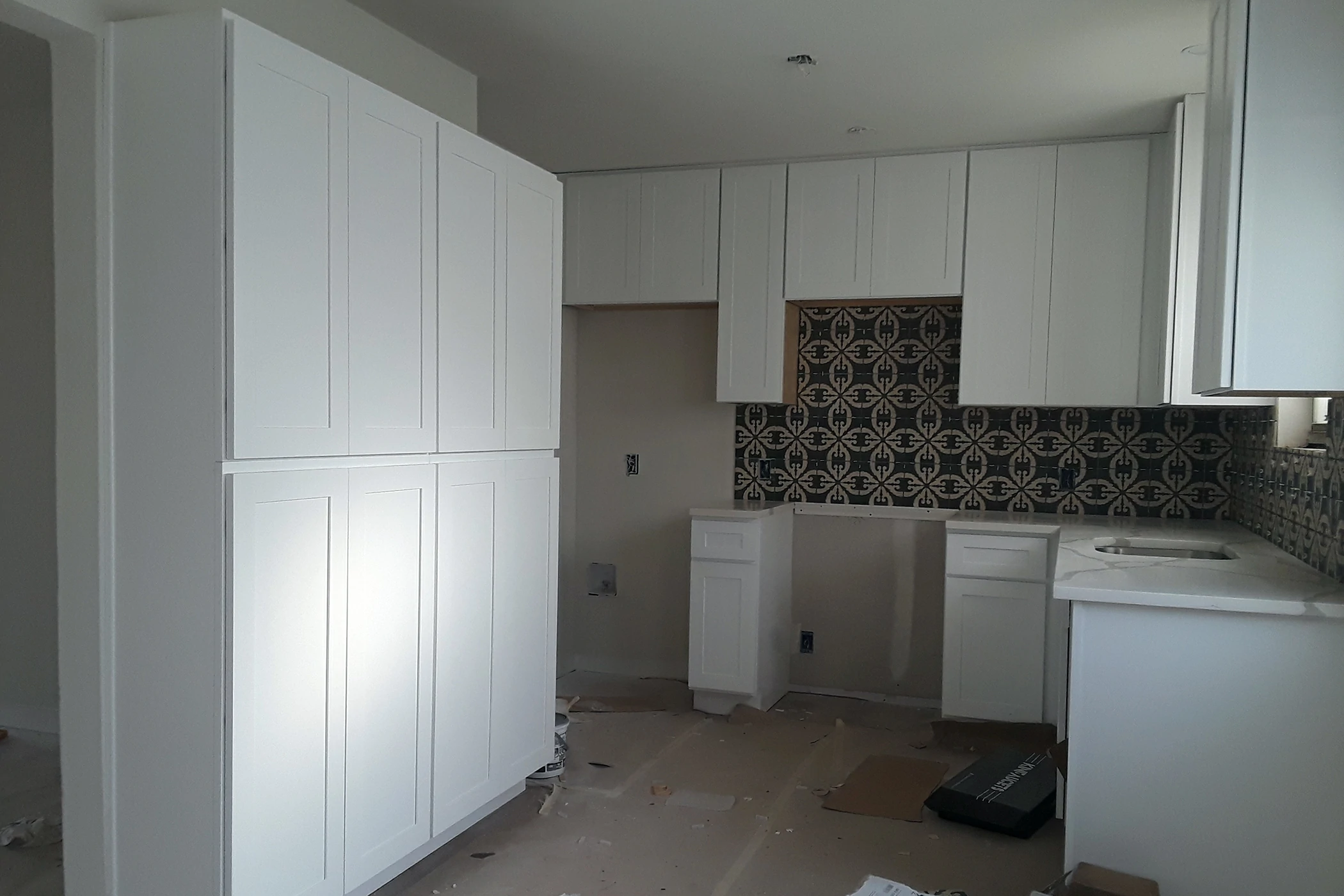
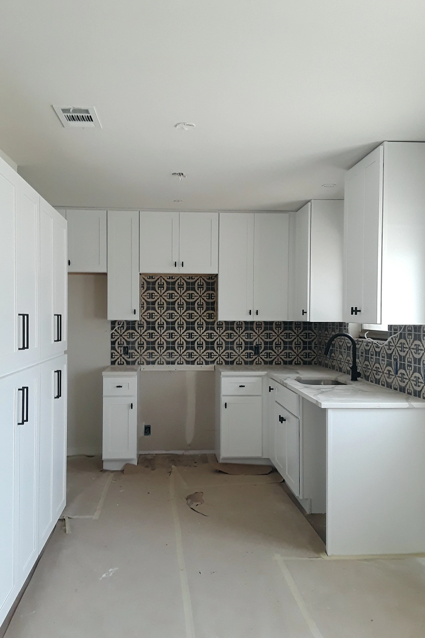
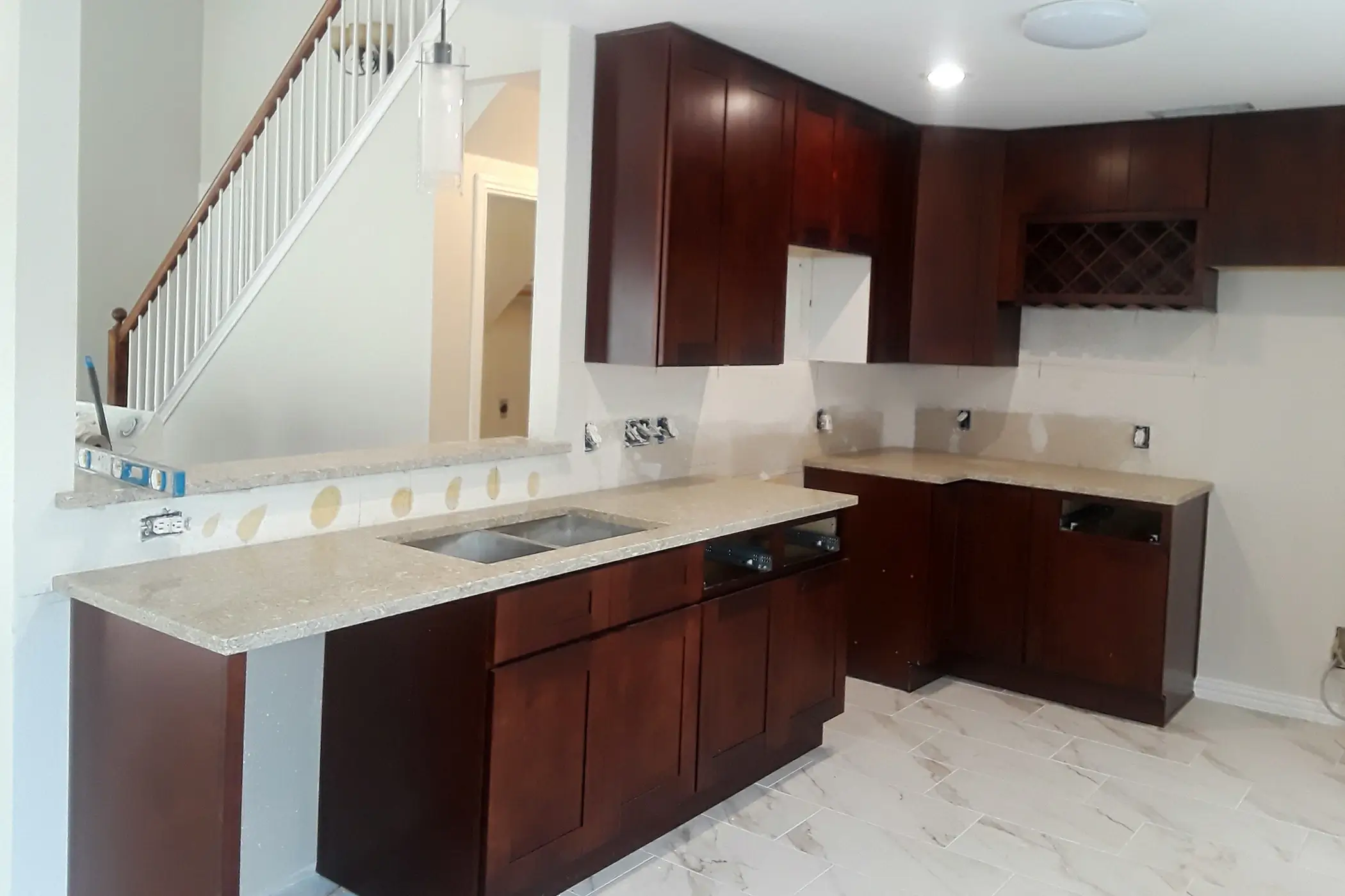
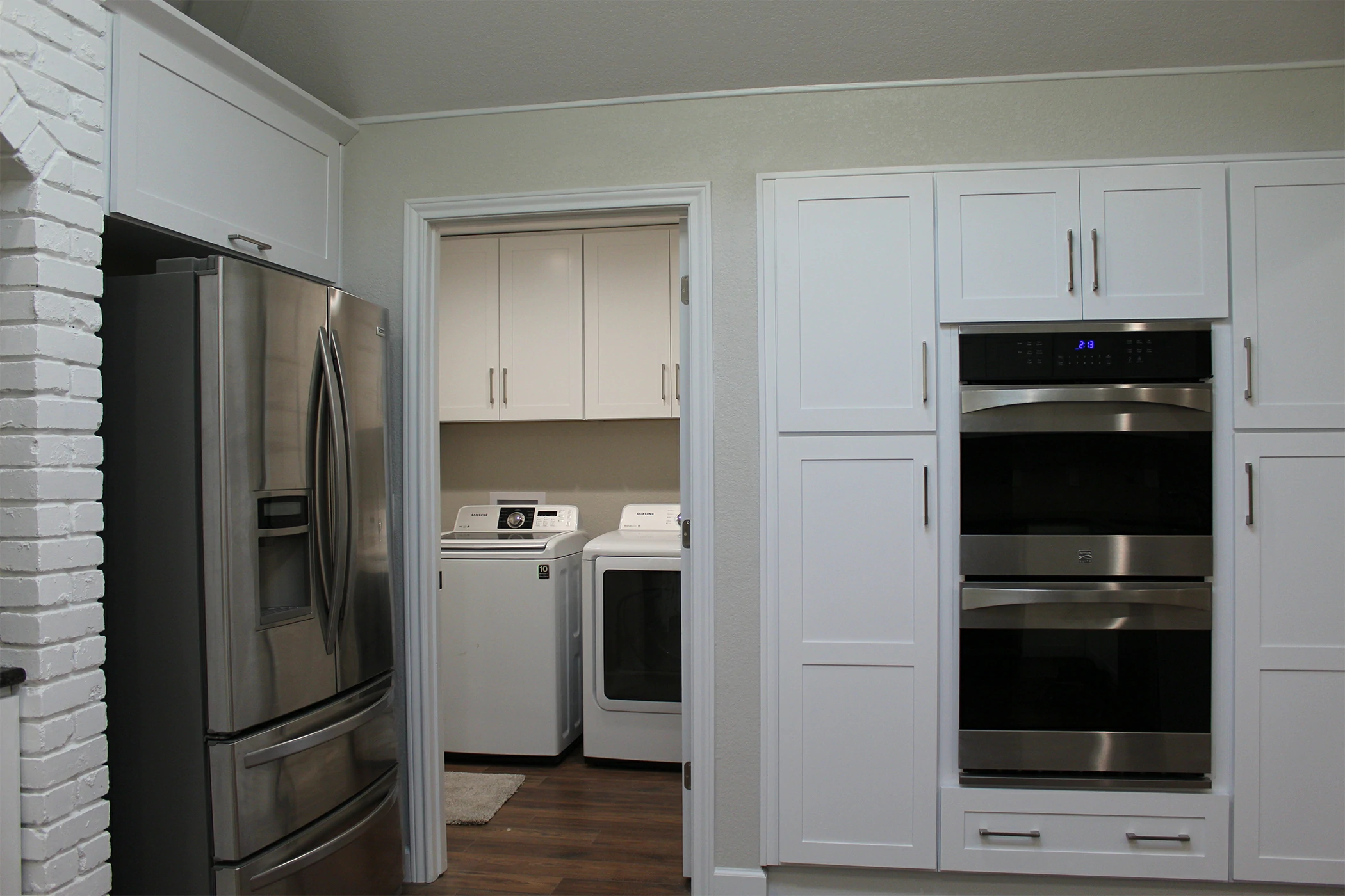
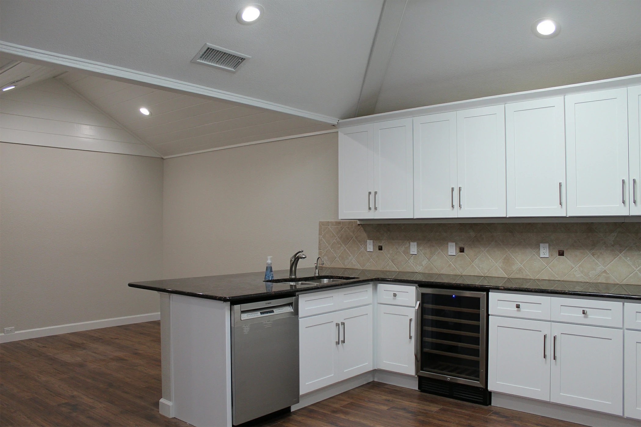
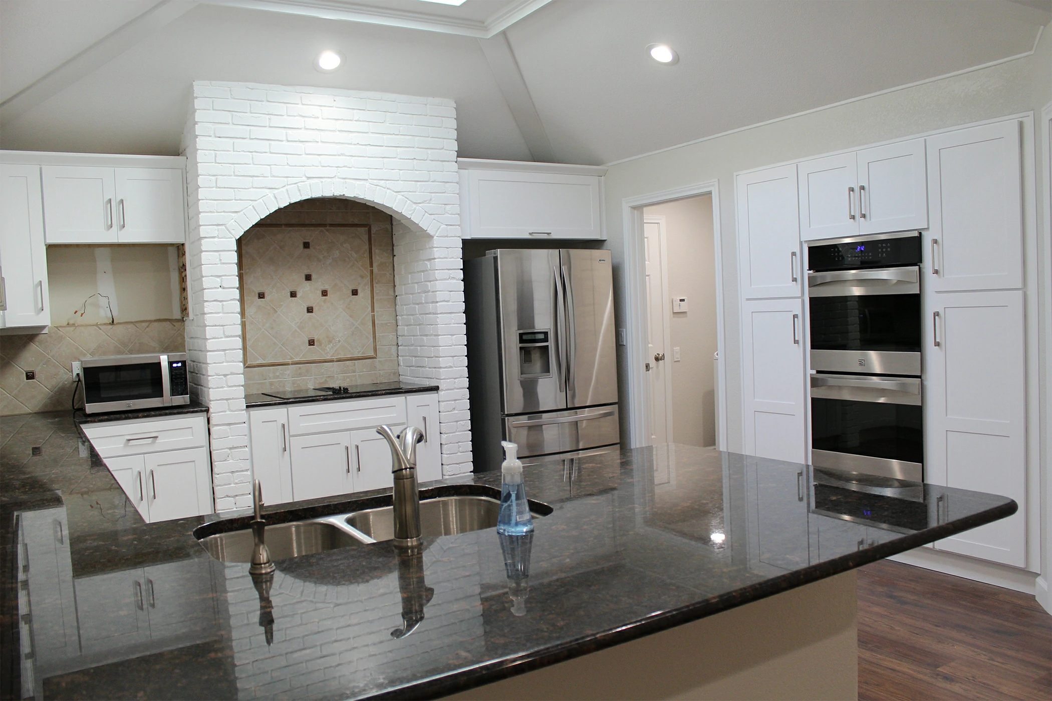
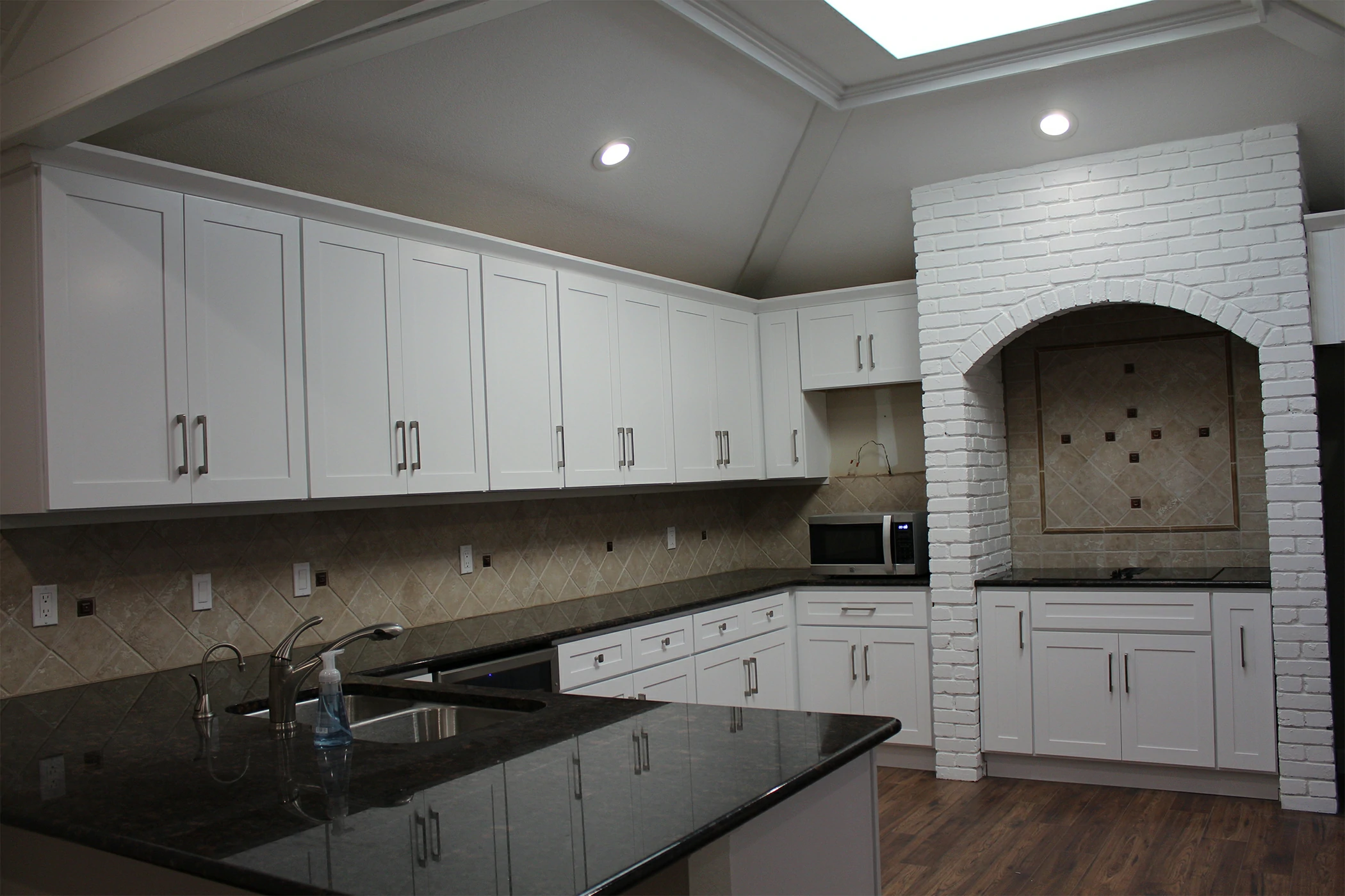
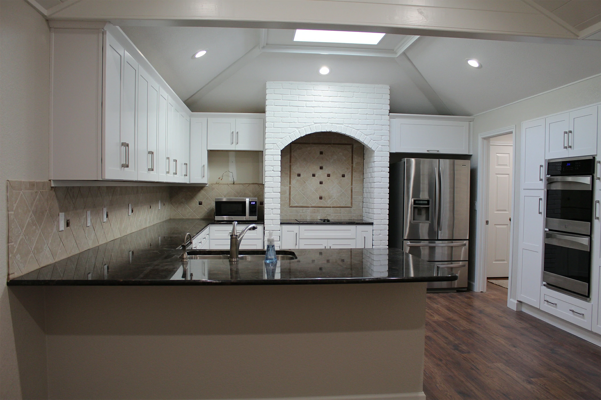
Kitchen: Fresh and Energizing
The kitchen is a place of creativity and energy. Lighter tones like soft gray, sage, or pale blue reflect cleanliness and freshness. White cabinetry paired with wooden textures creates balance between modernity and warmth.
Through kitchen remodeling, Bina Homes helps homeowners design kitchens that are functional, inviting, and perfectly color-coordinated.
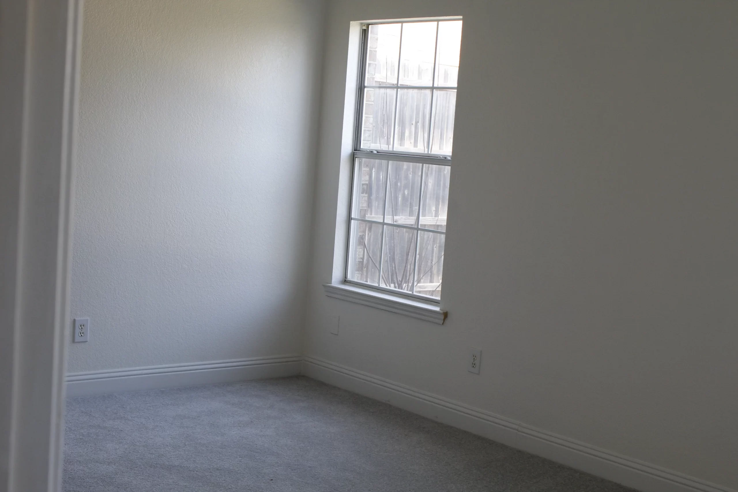
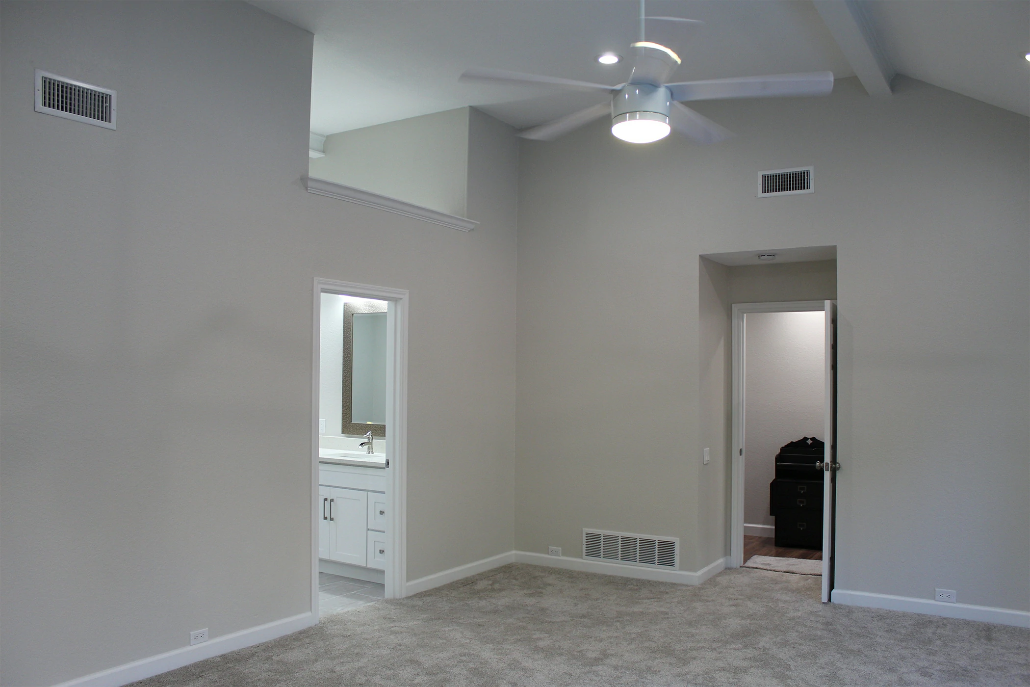
Bedroom: Peaceful and Restorative
Bedrooms benefit from muted tones that promote rest. Pastels, cool blues, lavender, and warm whites create serenity and softness. Avoid overly stimulating shades like bright red or neon tones. Instead, layer textiles and textures within the same color family for depth and comfort.
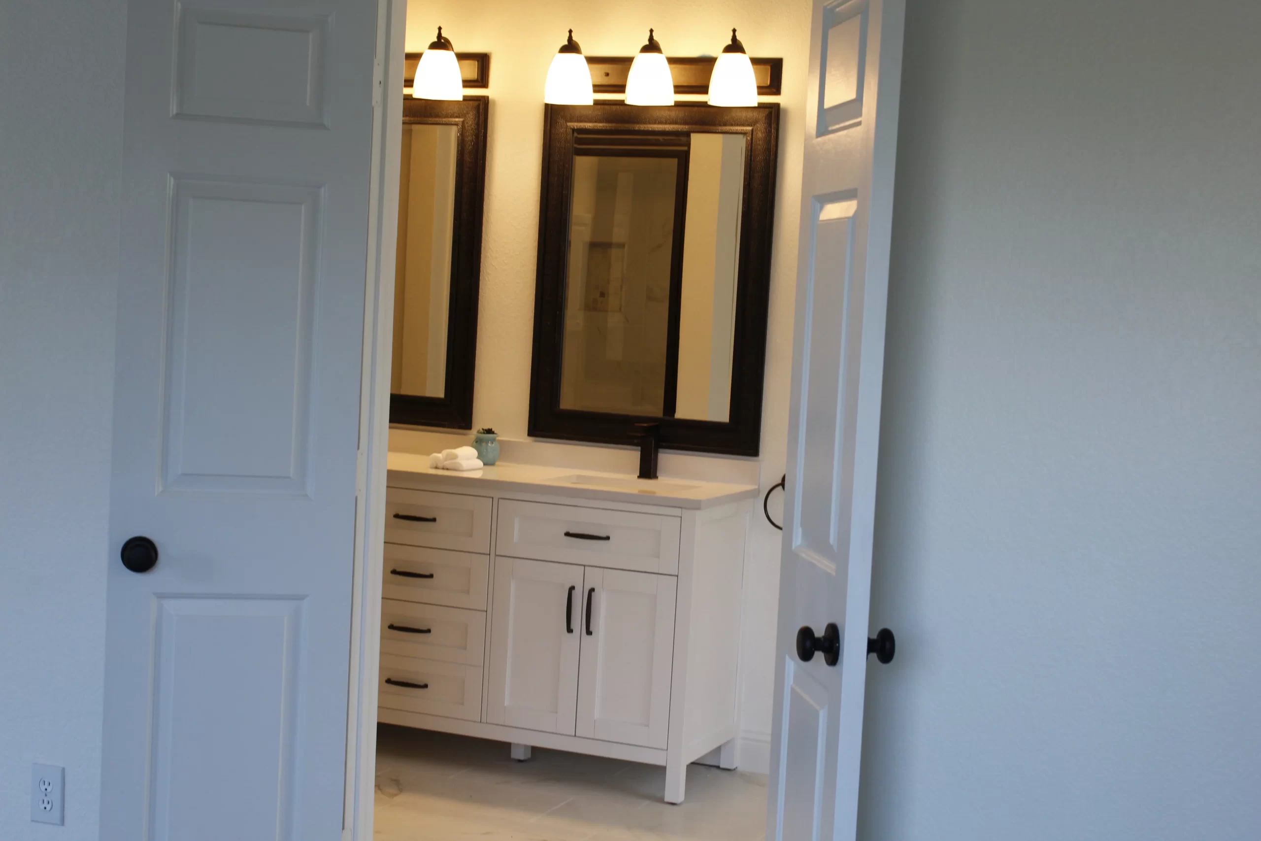
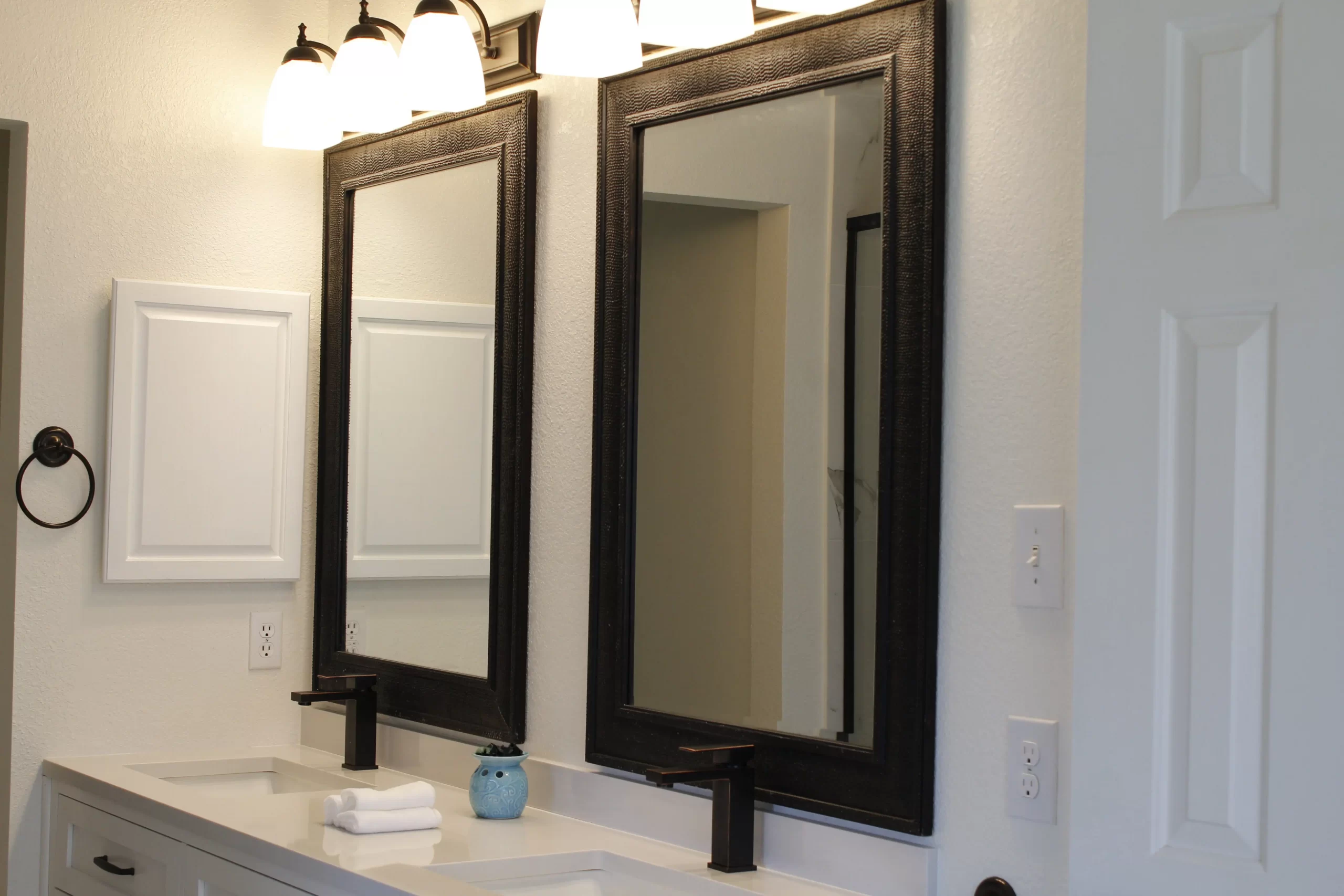
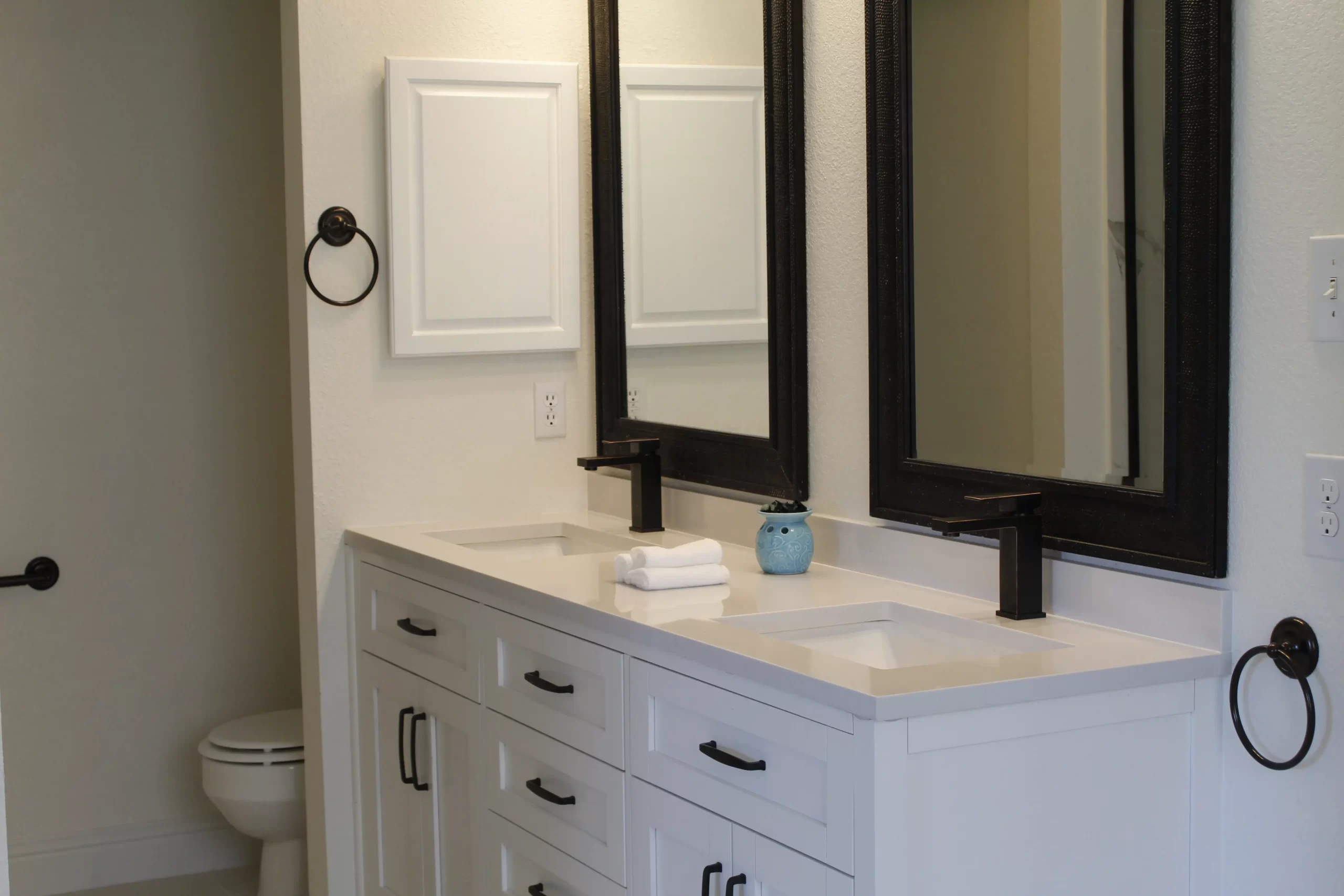
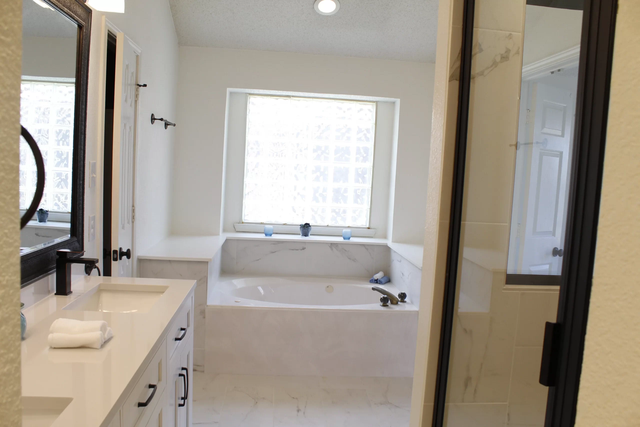
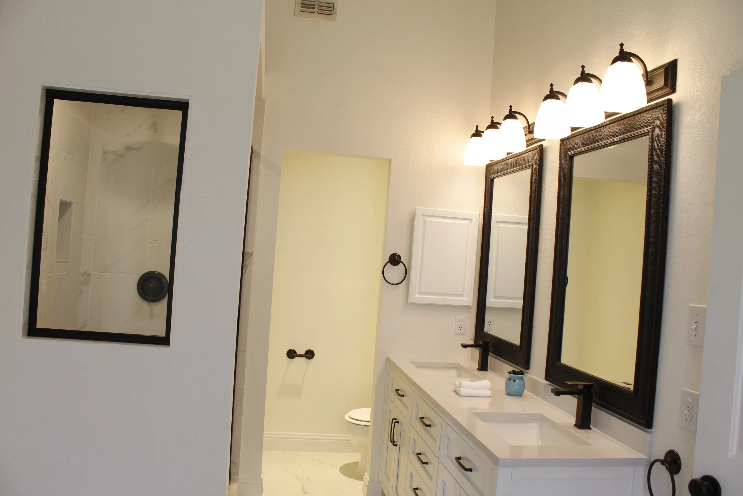
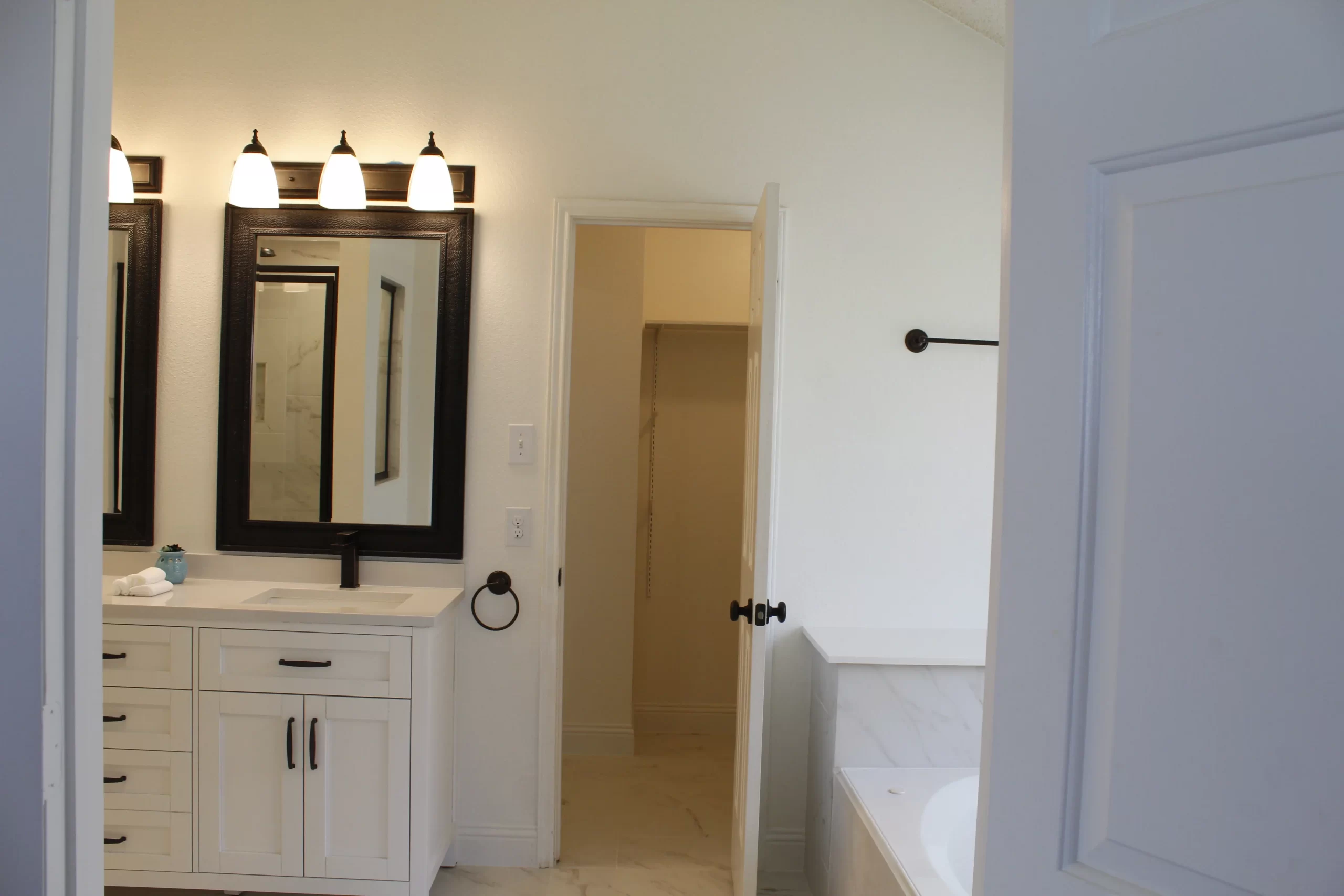
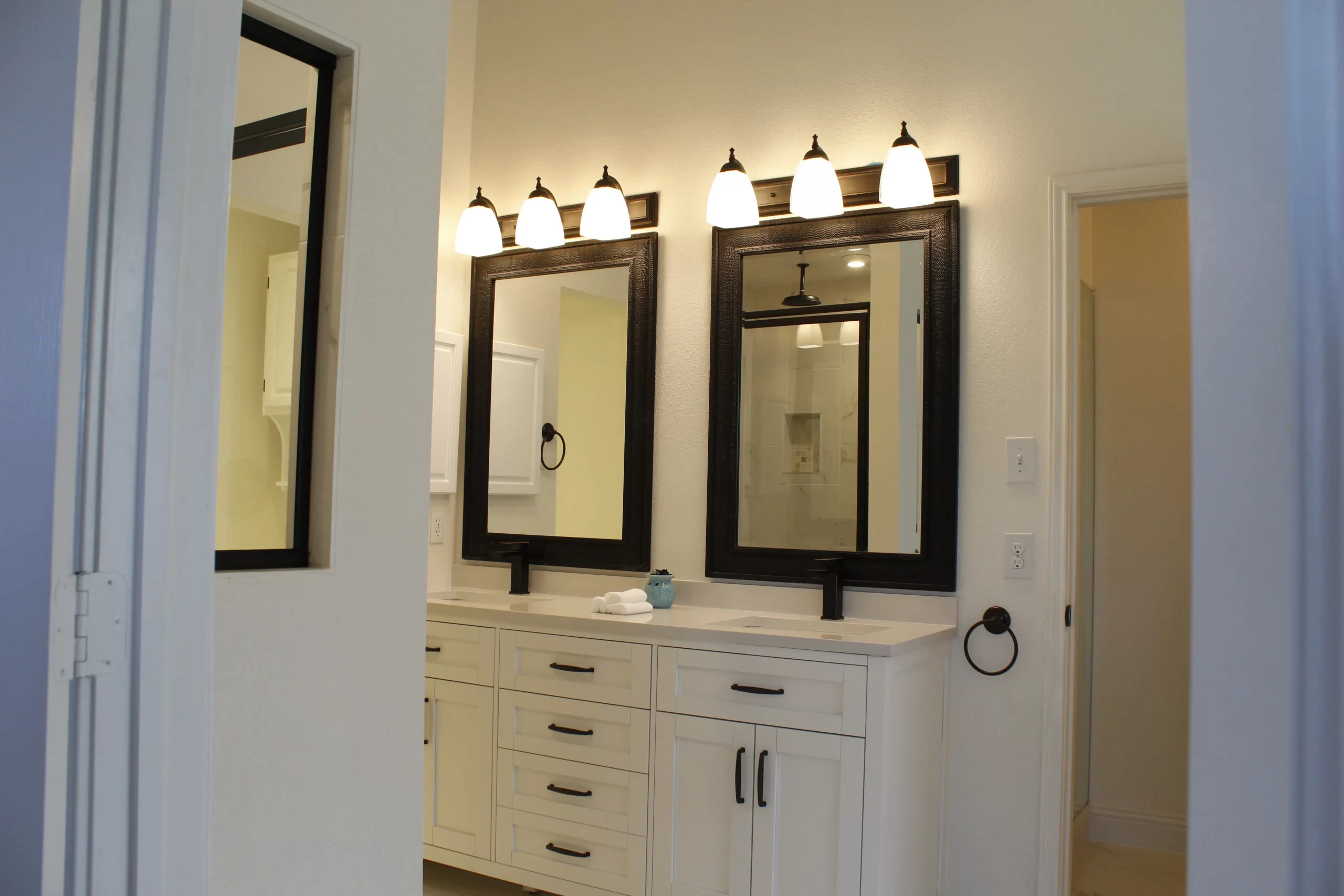
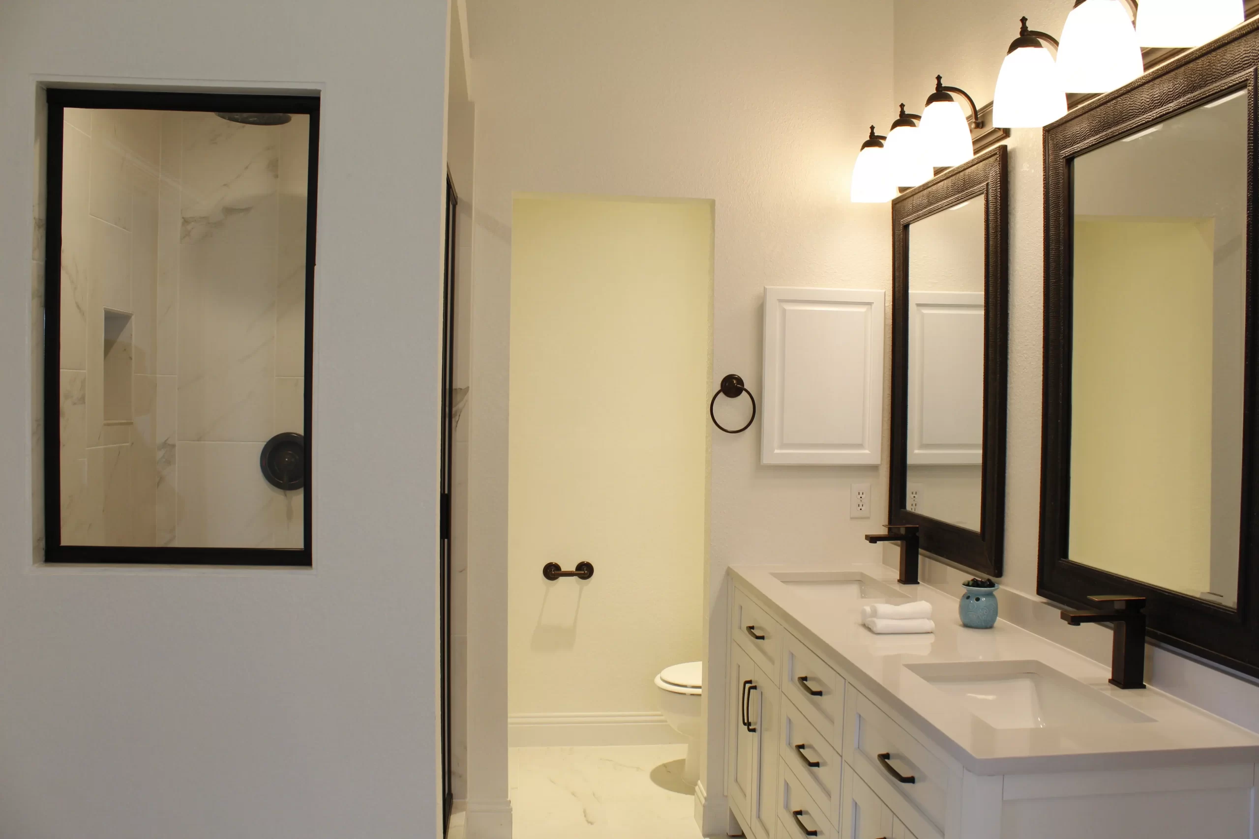
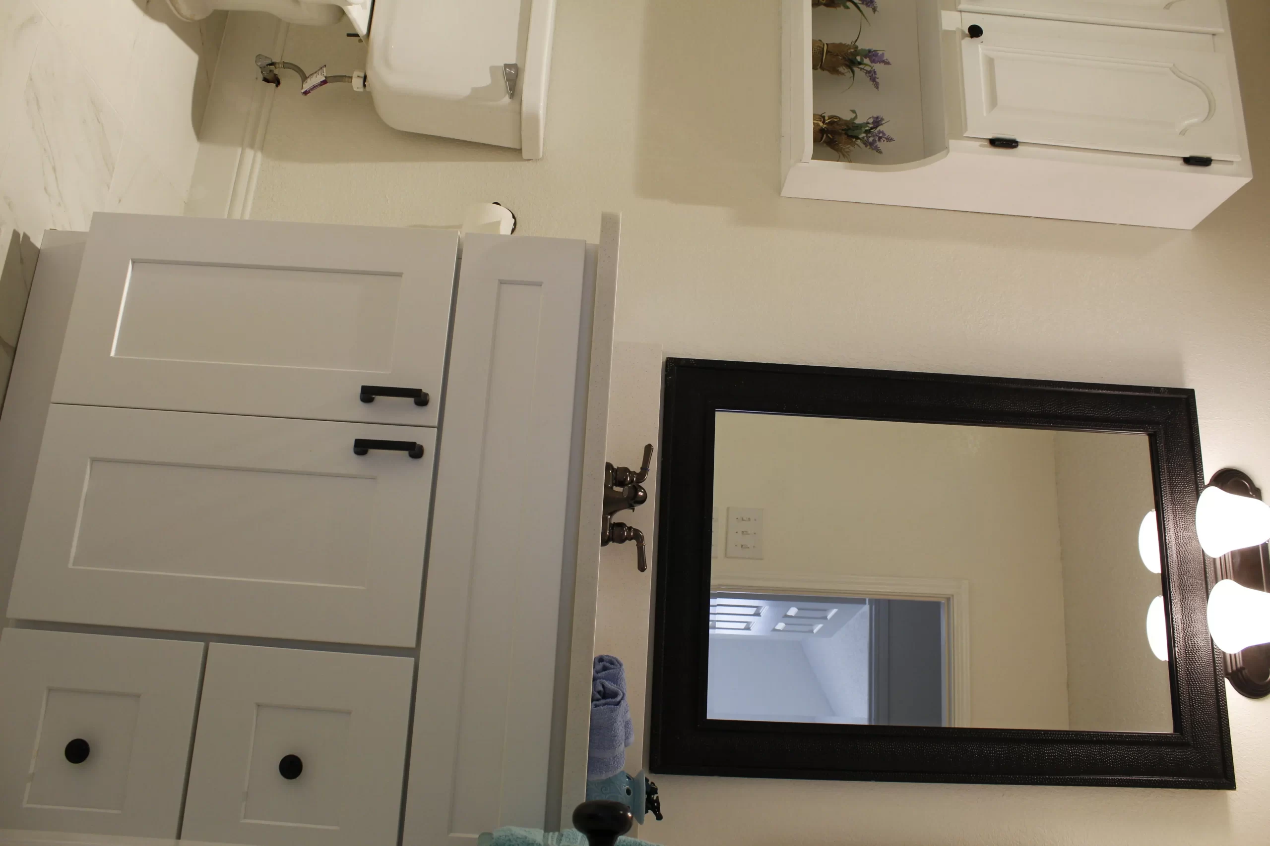
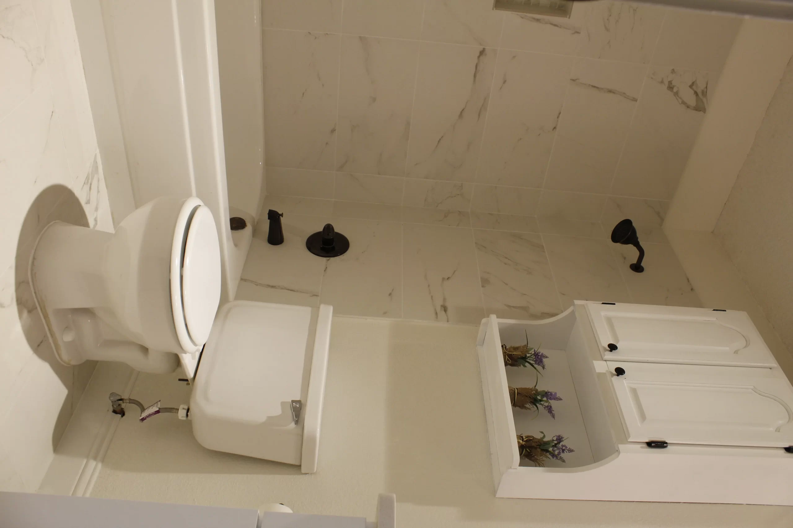
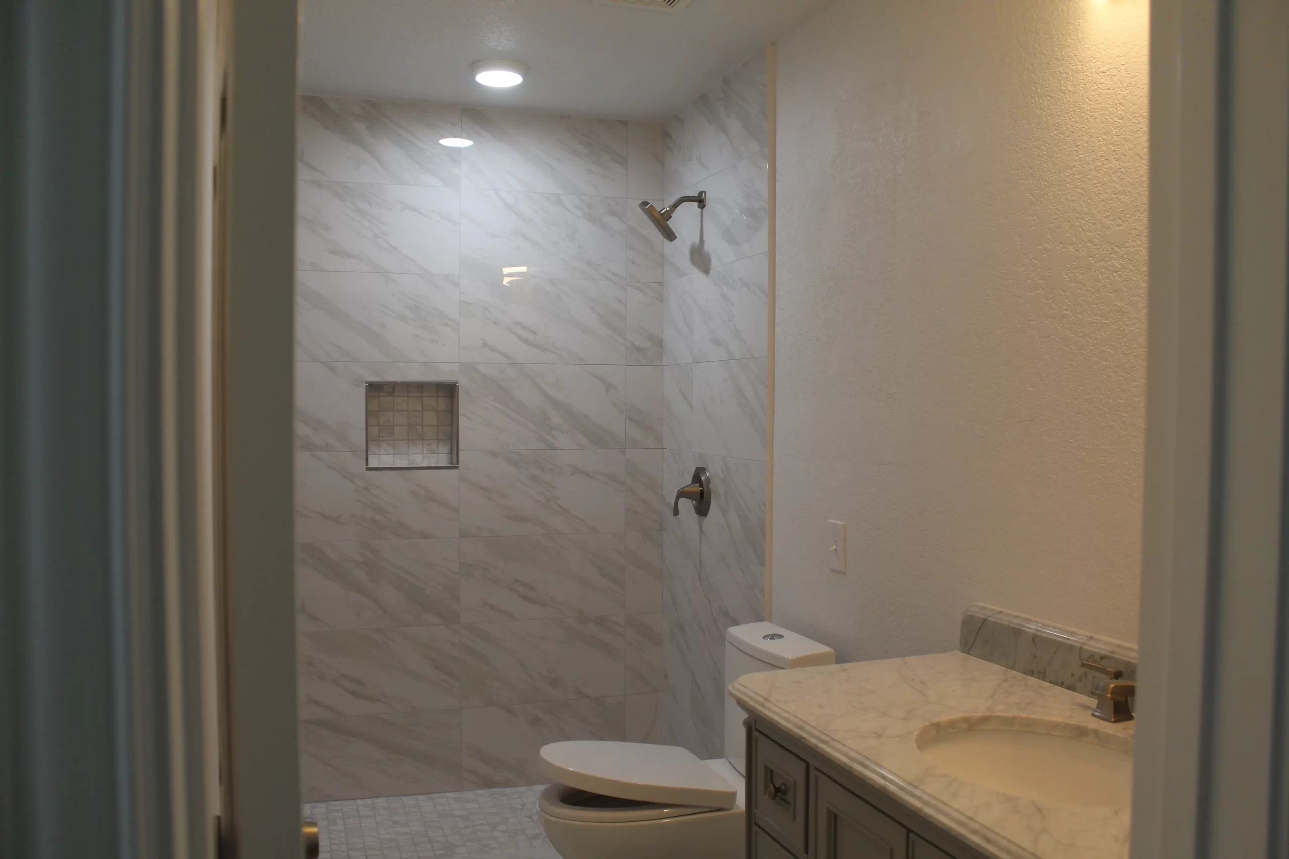
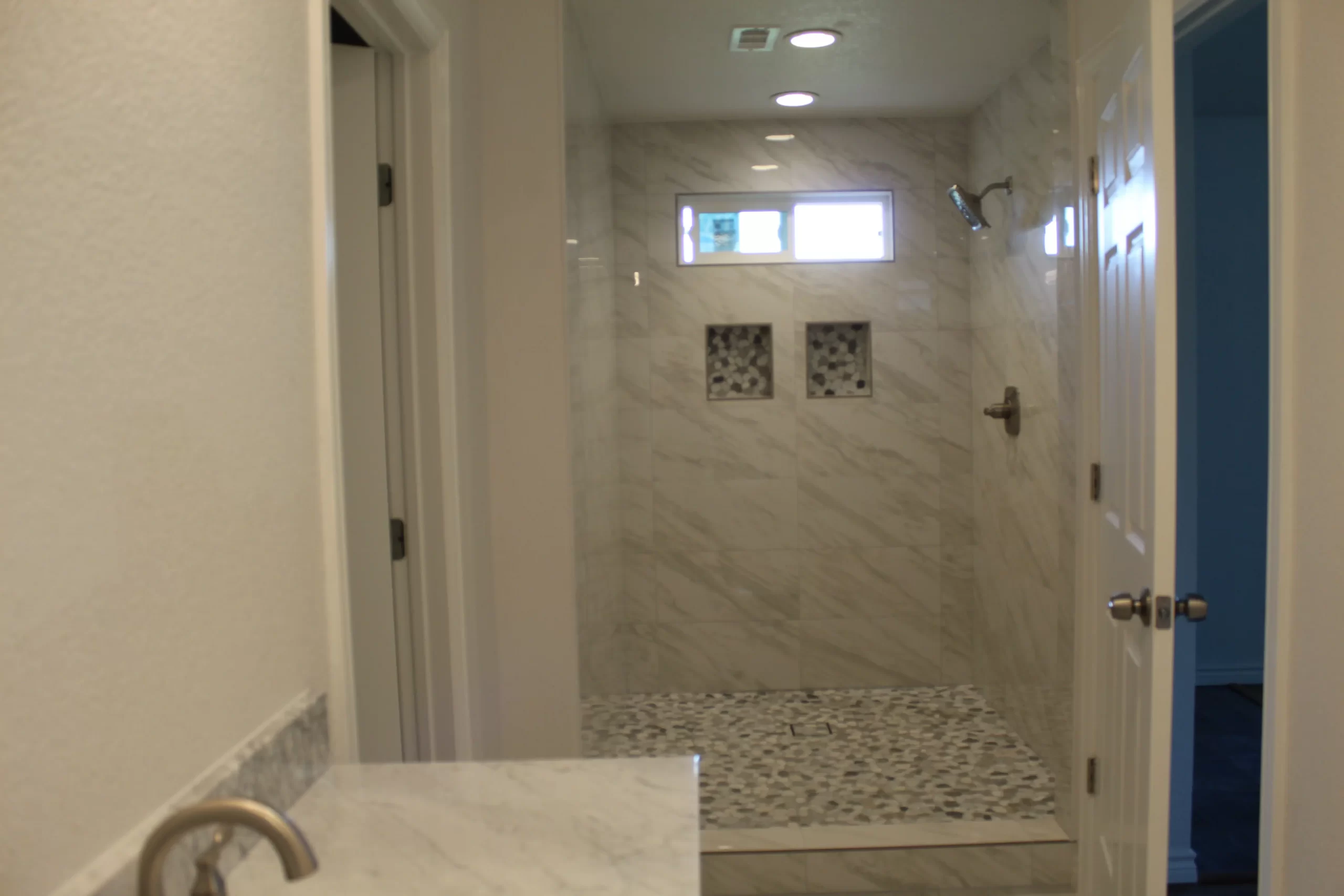
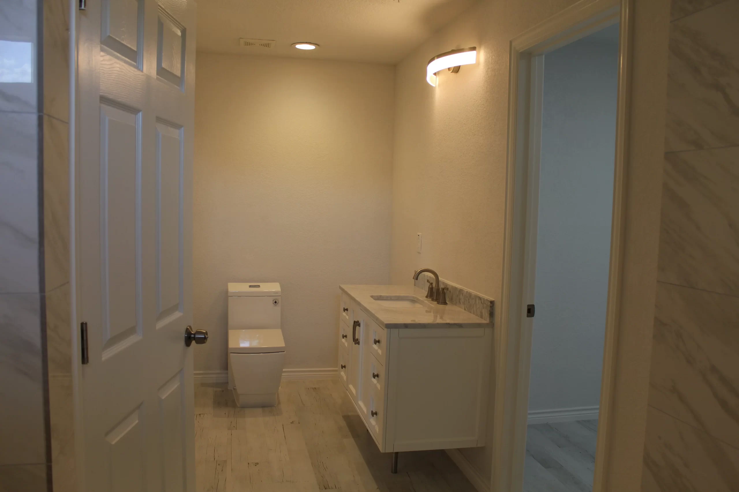
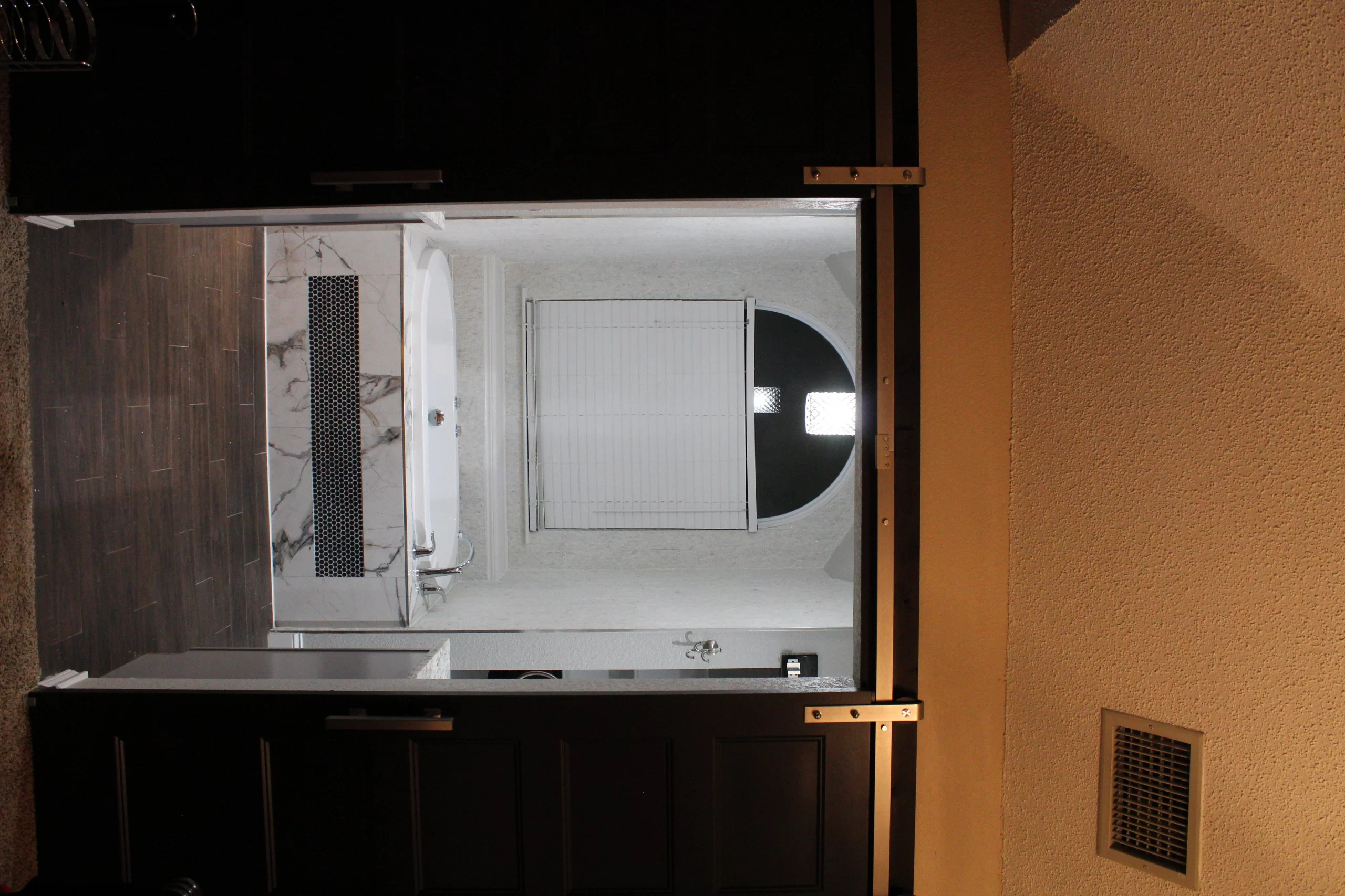
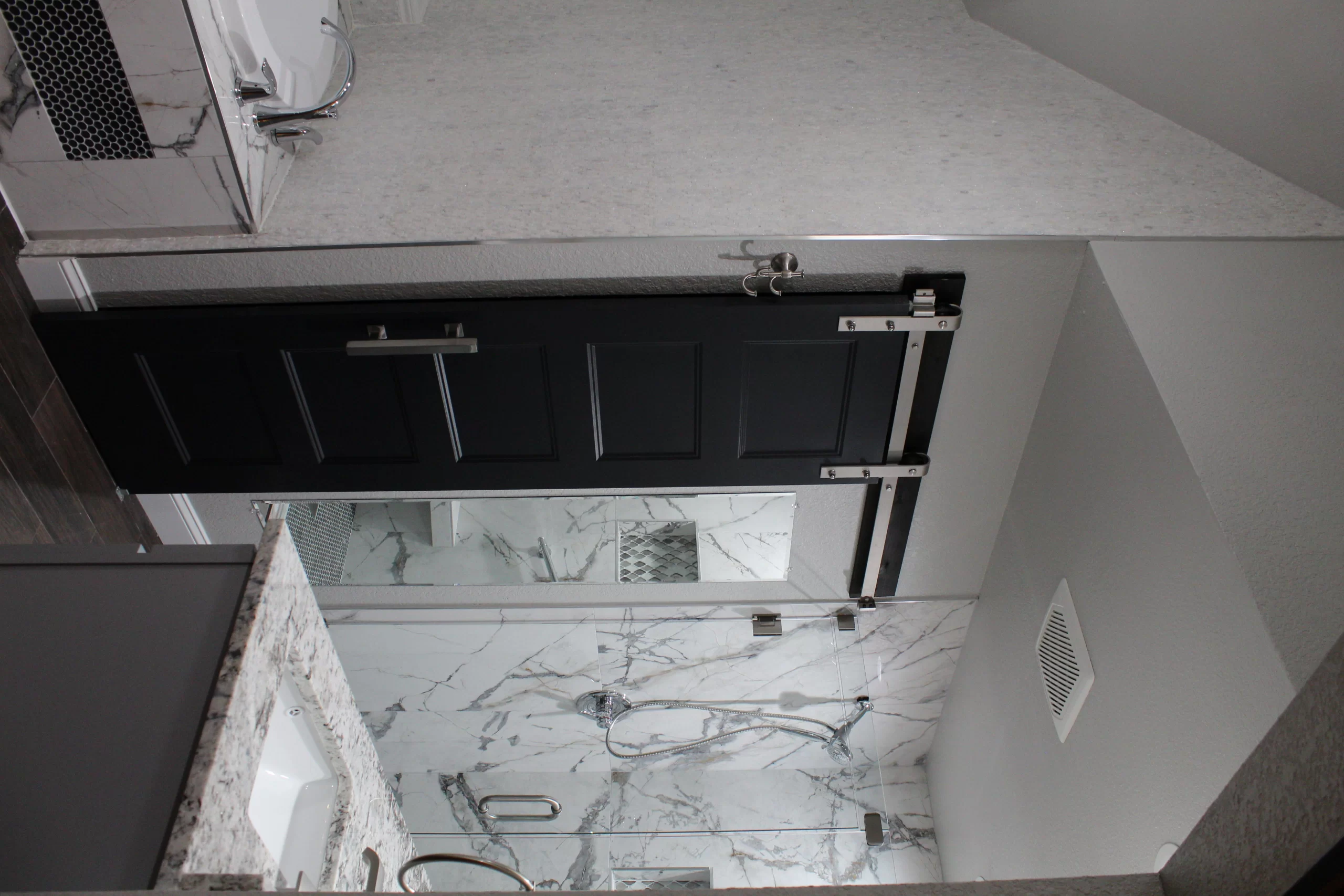
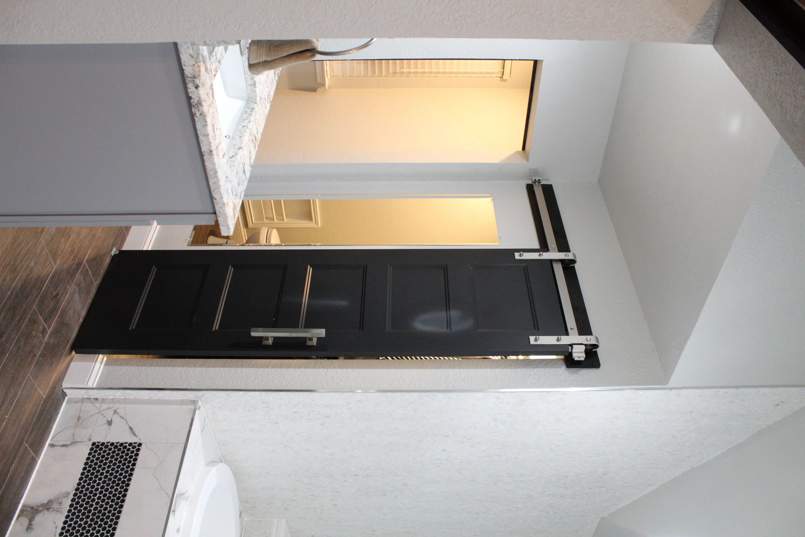
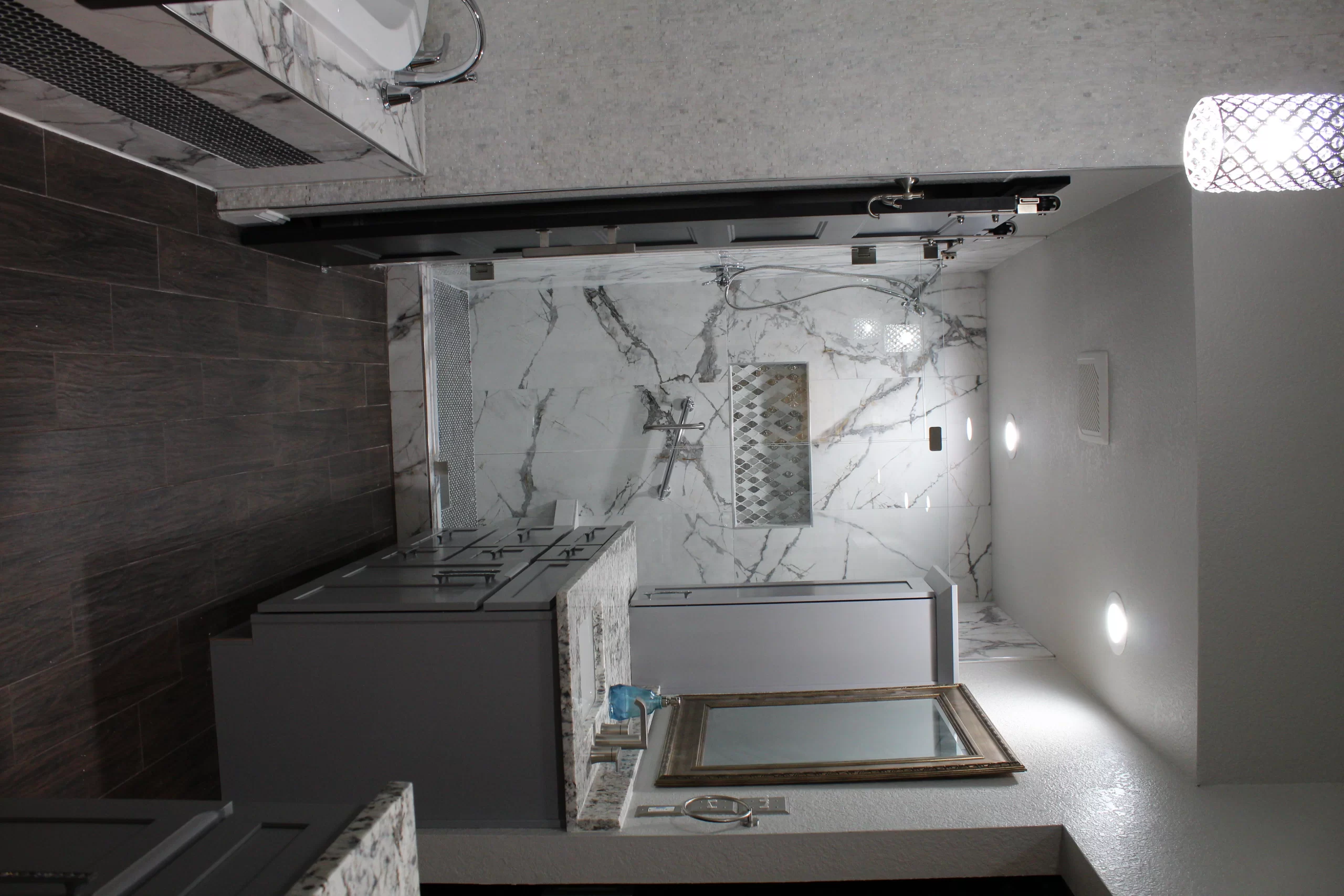
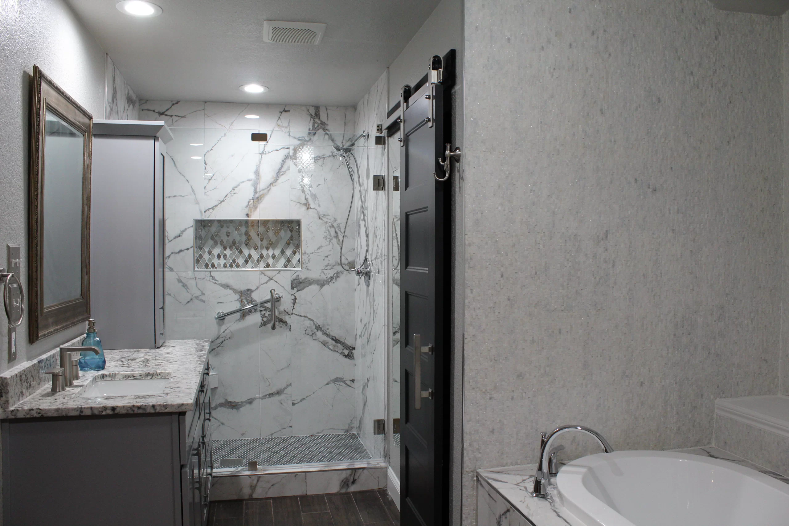
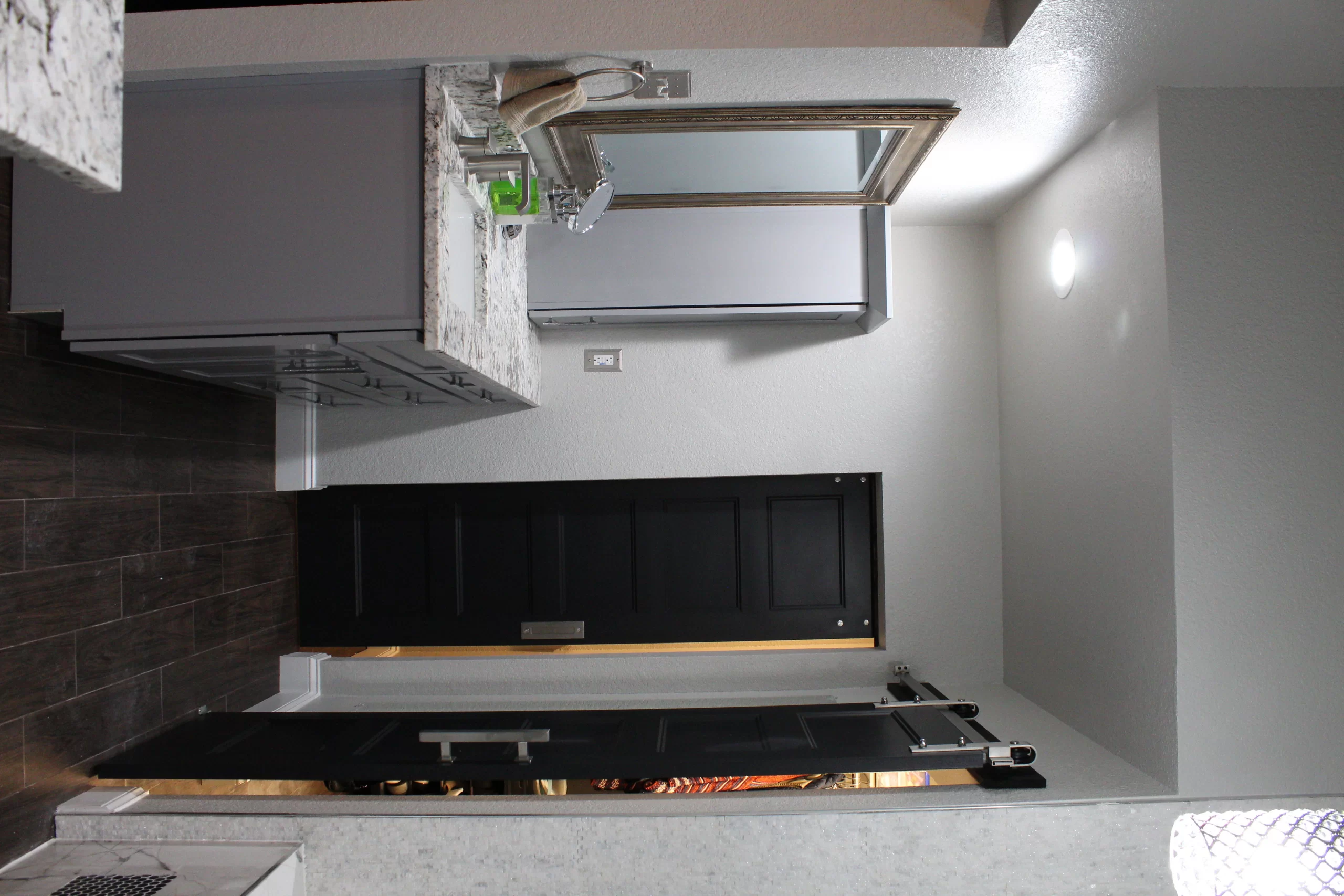
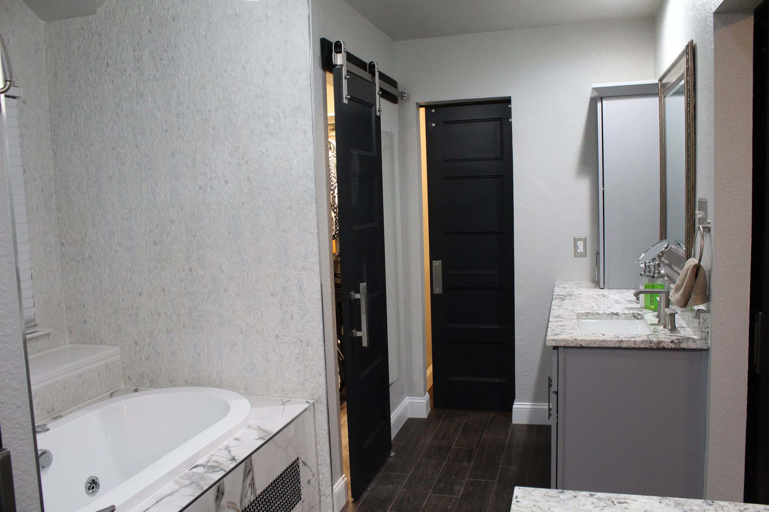
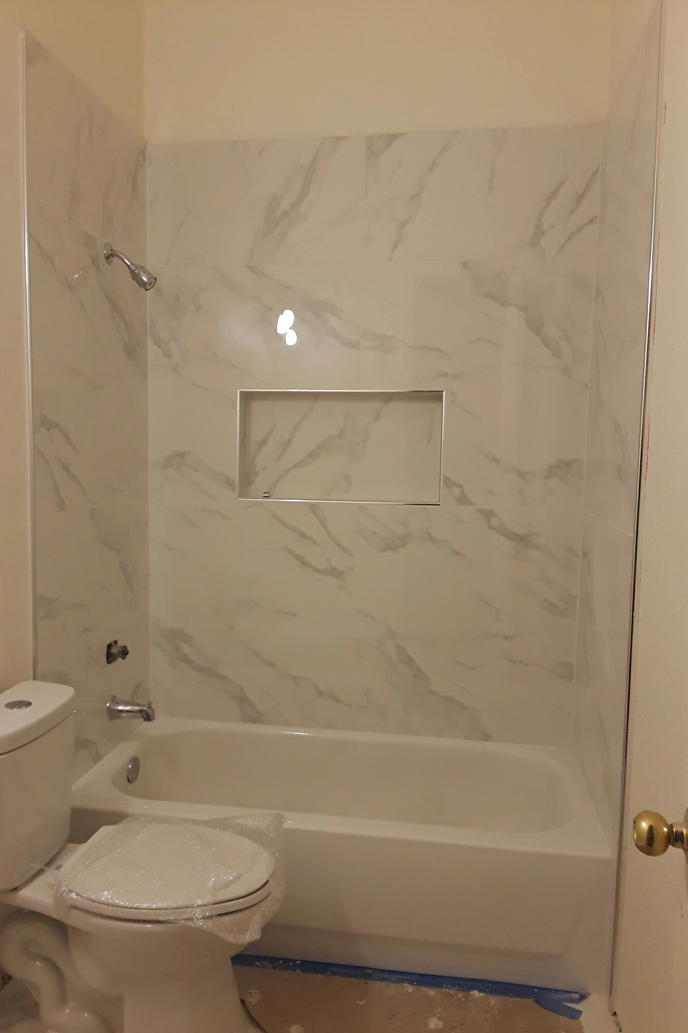
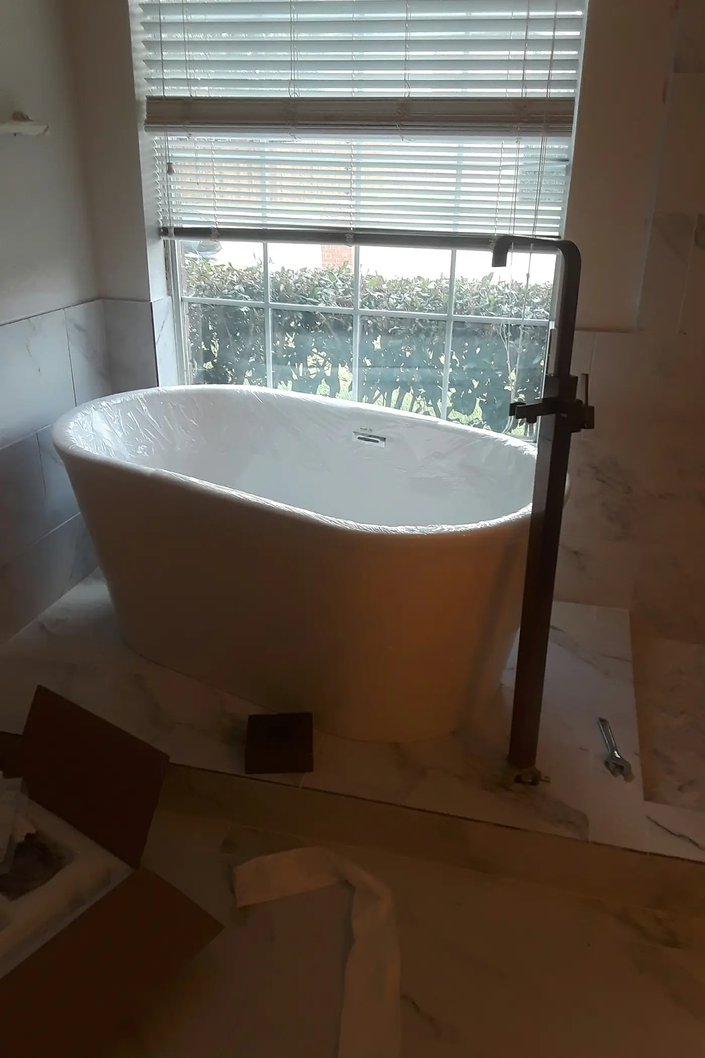
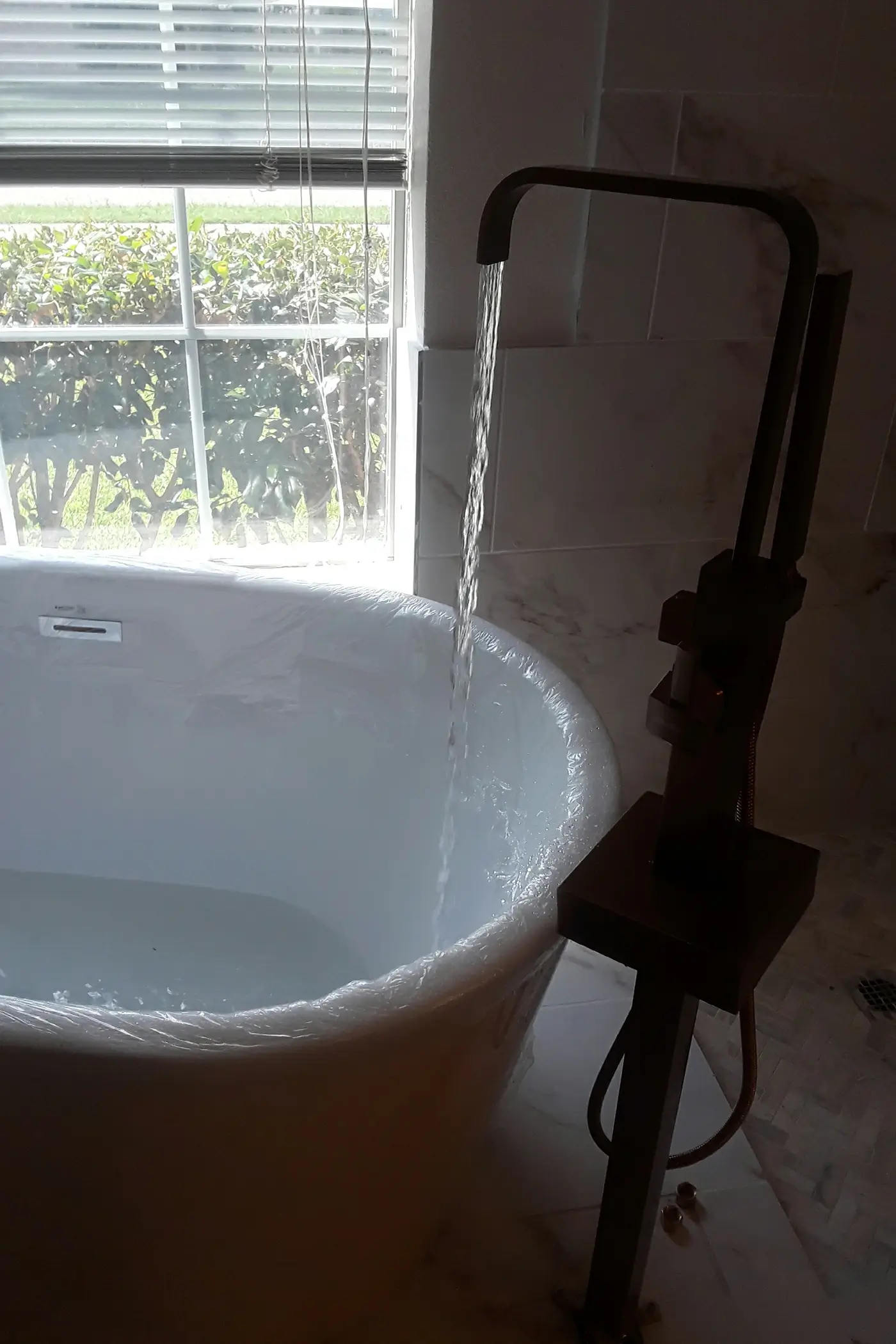
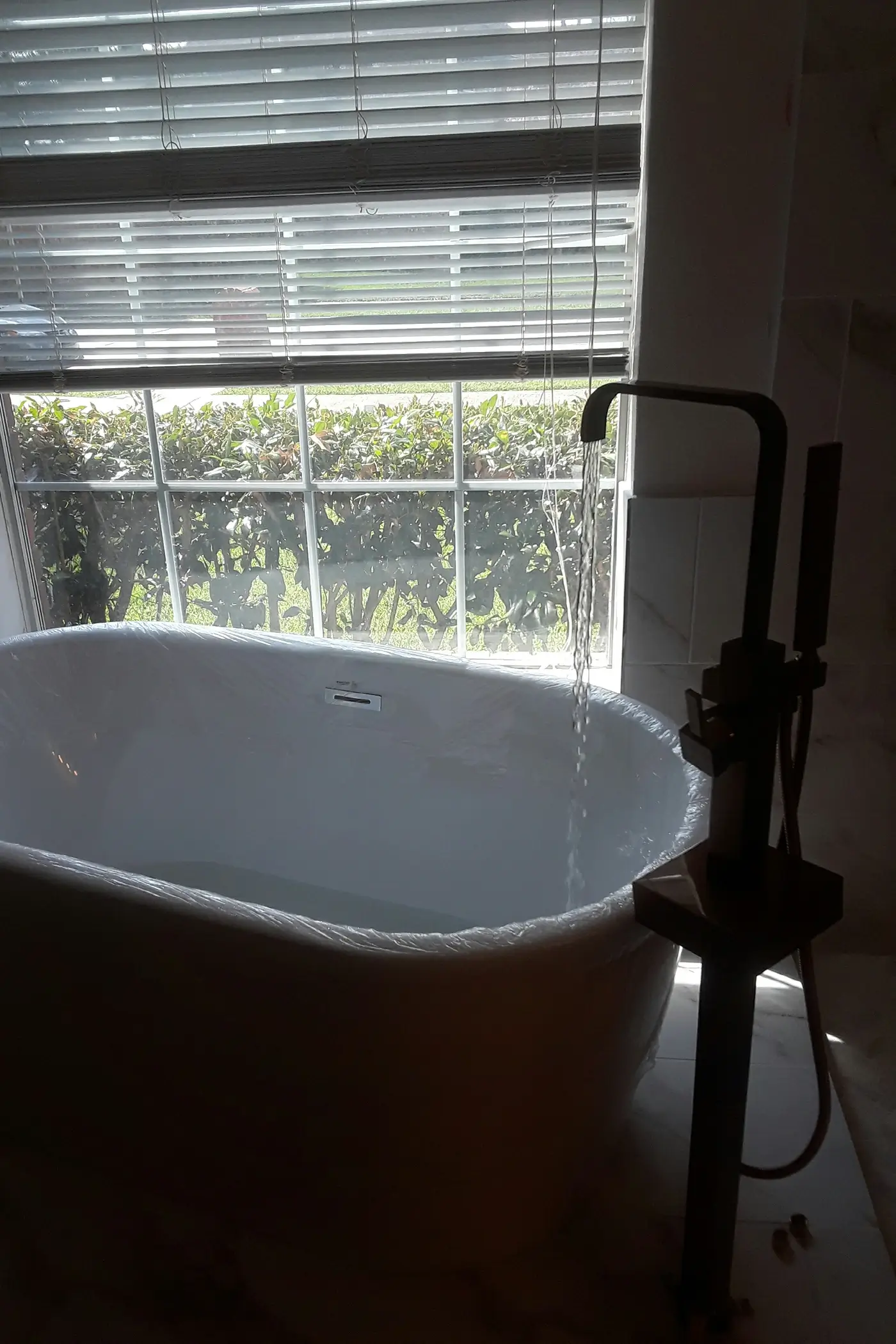
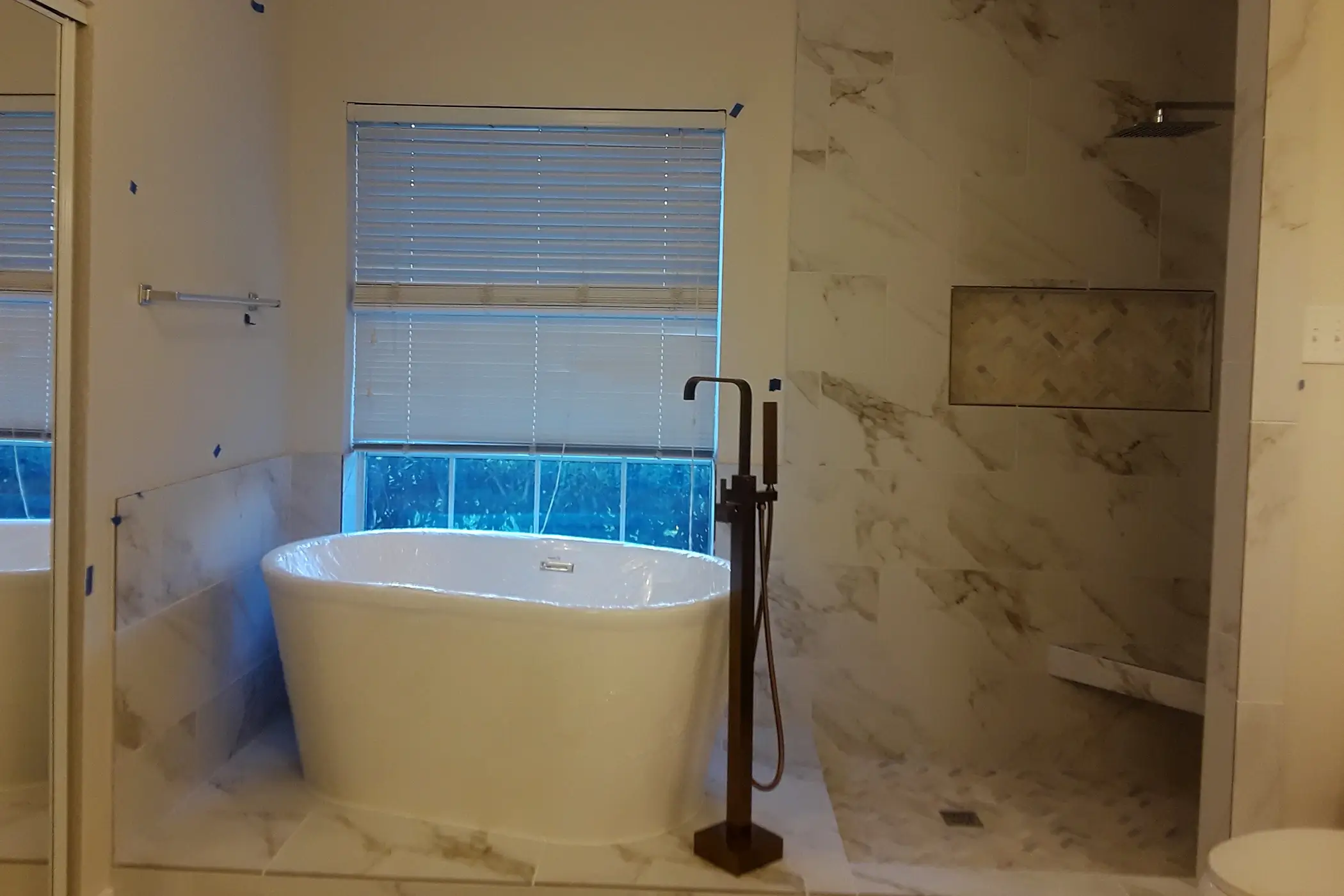
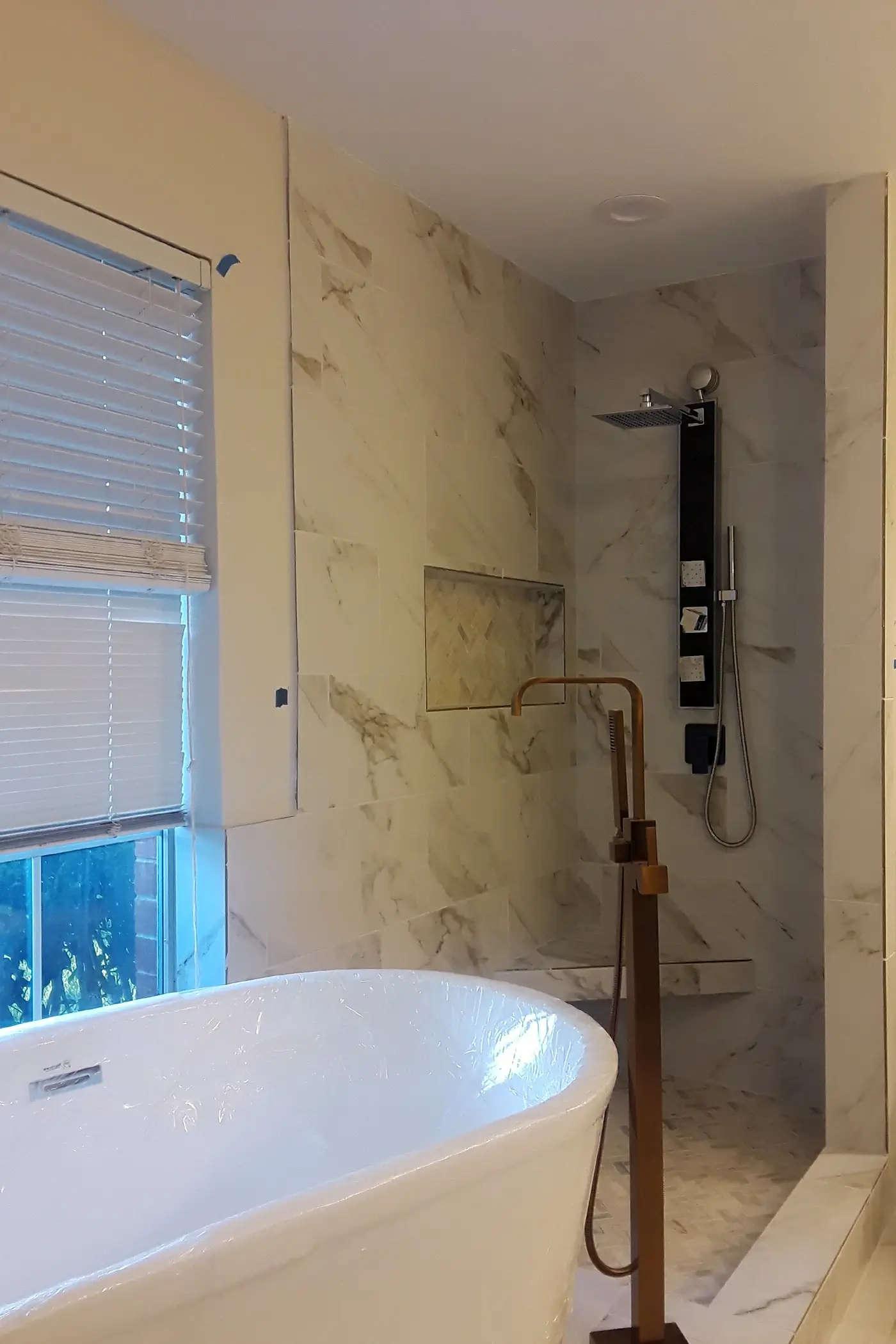
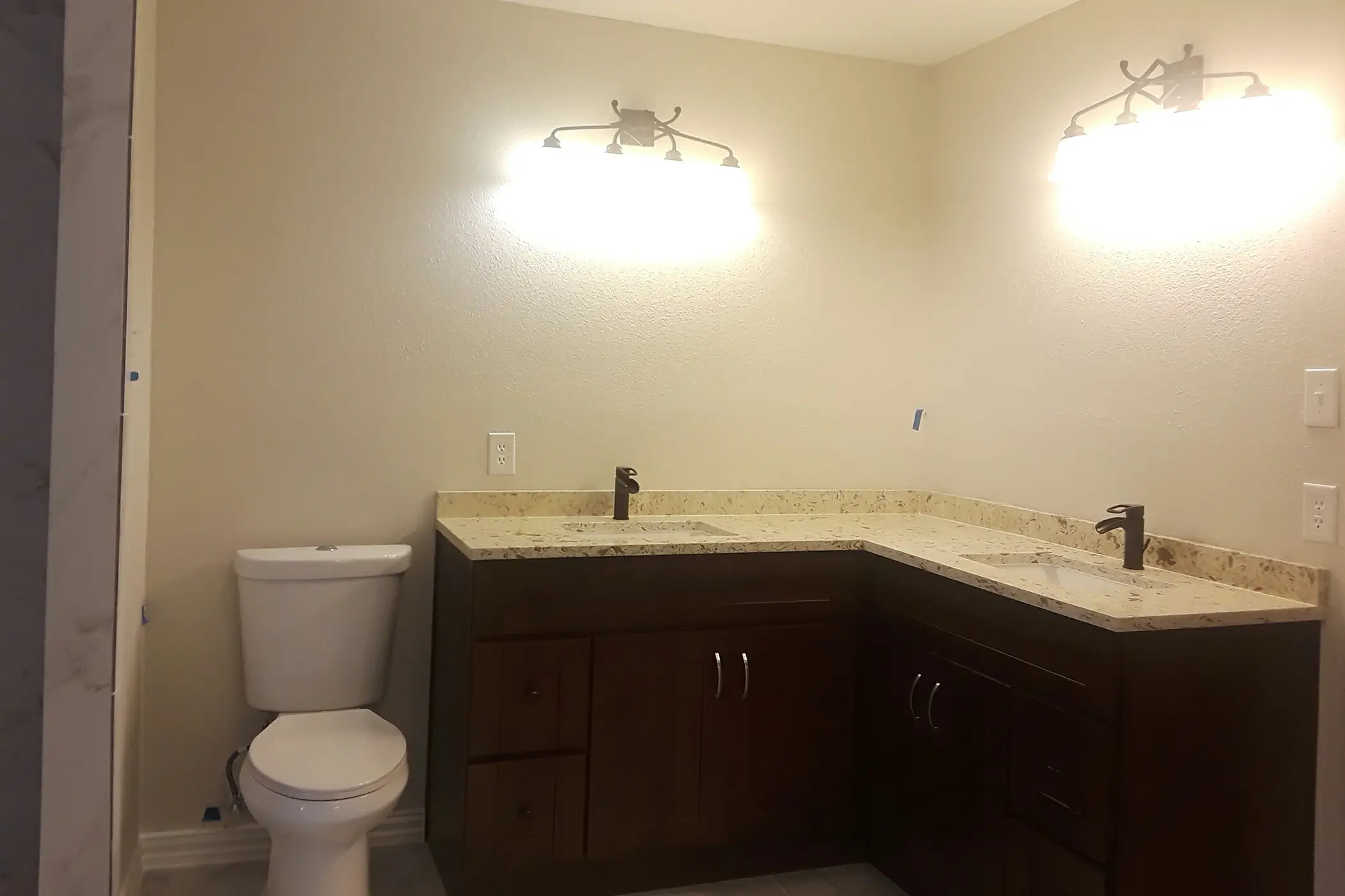
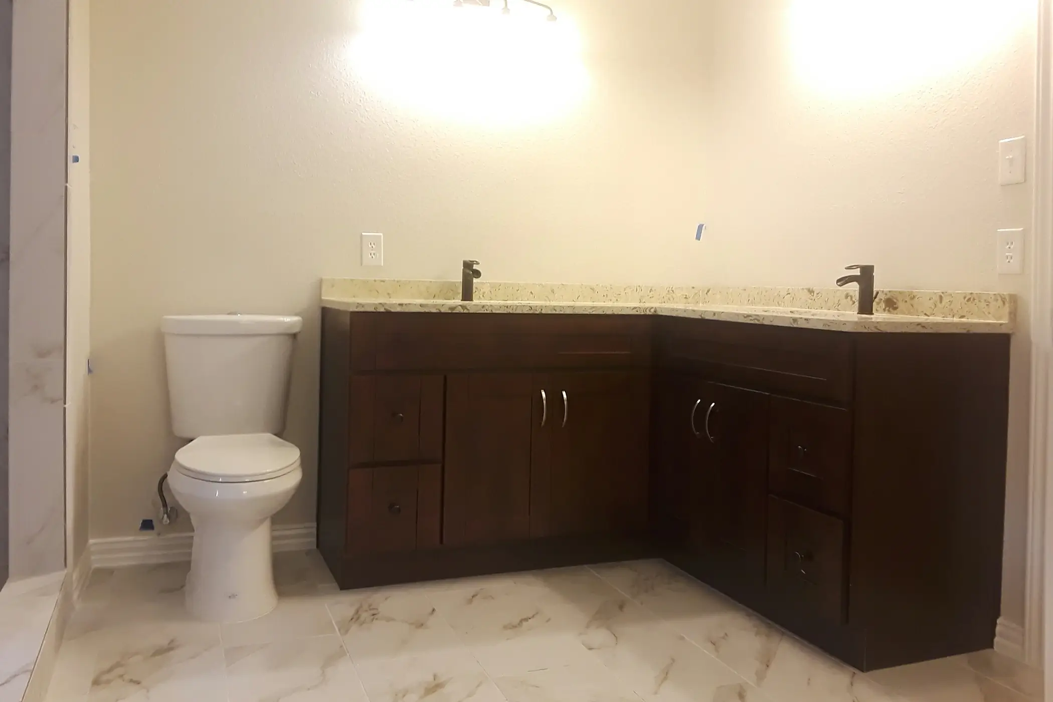
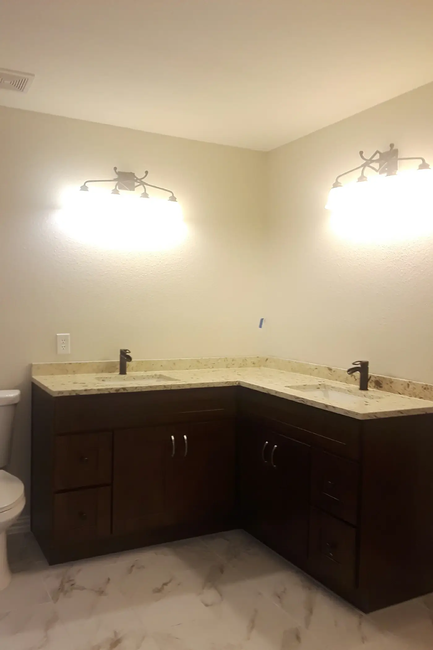
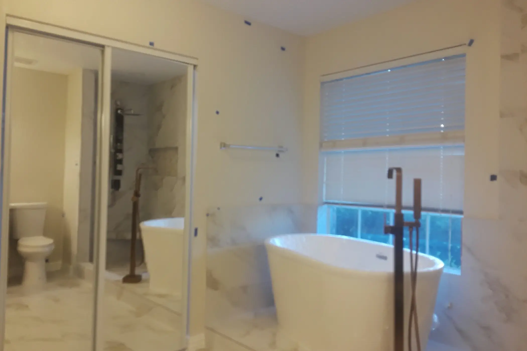
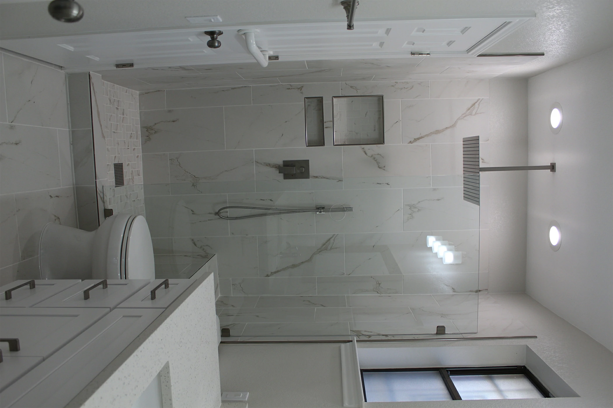
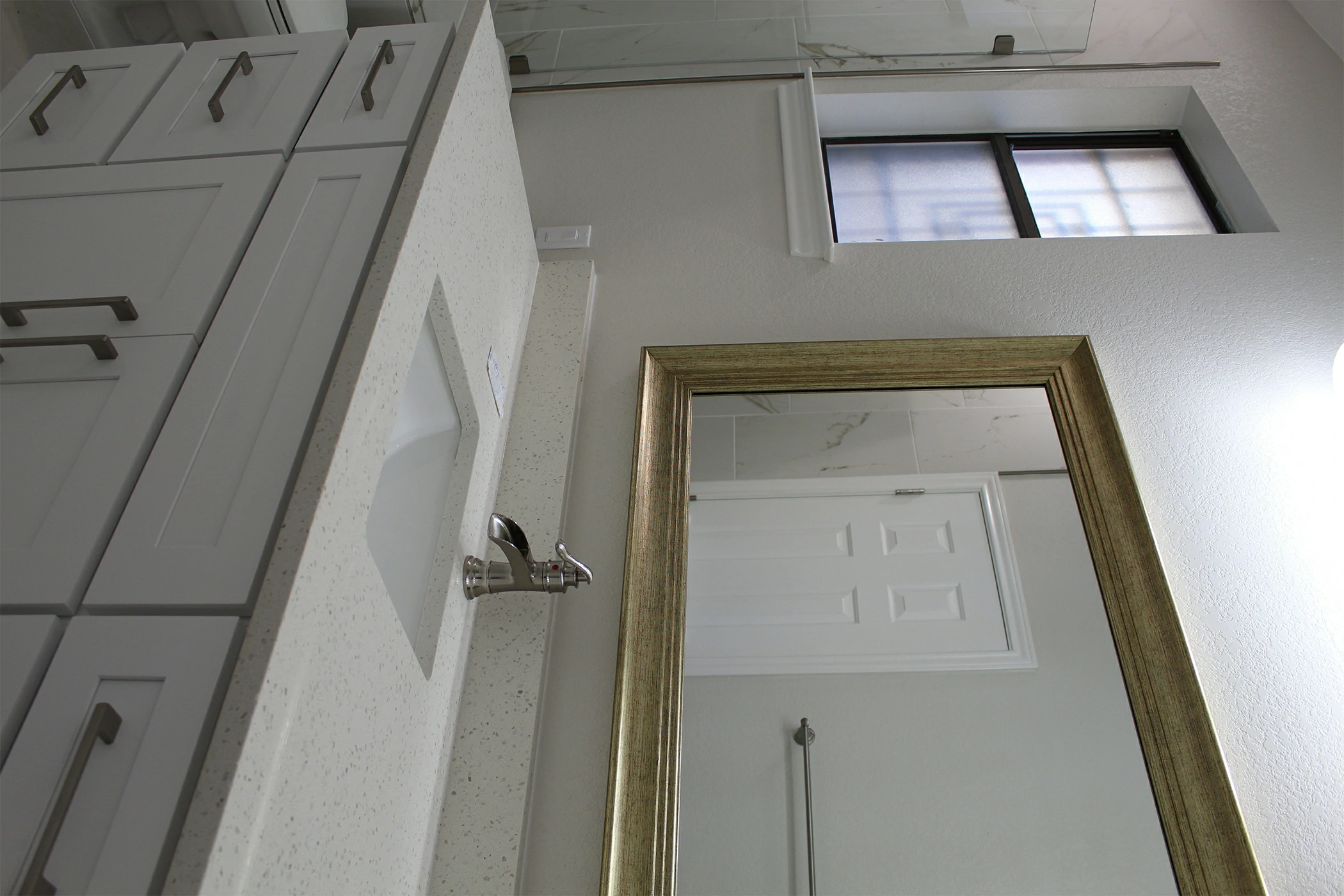
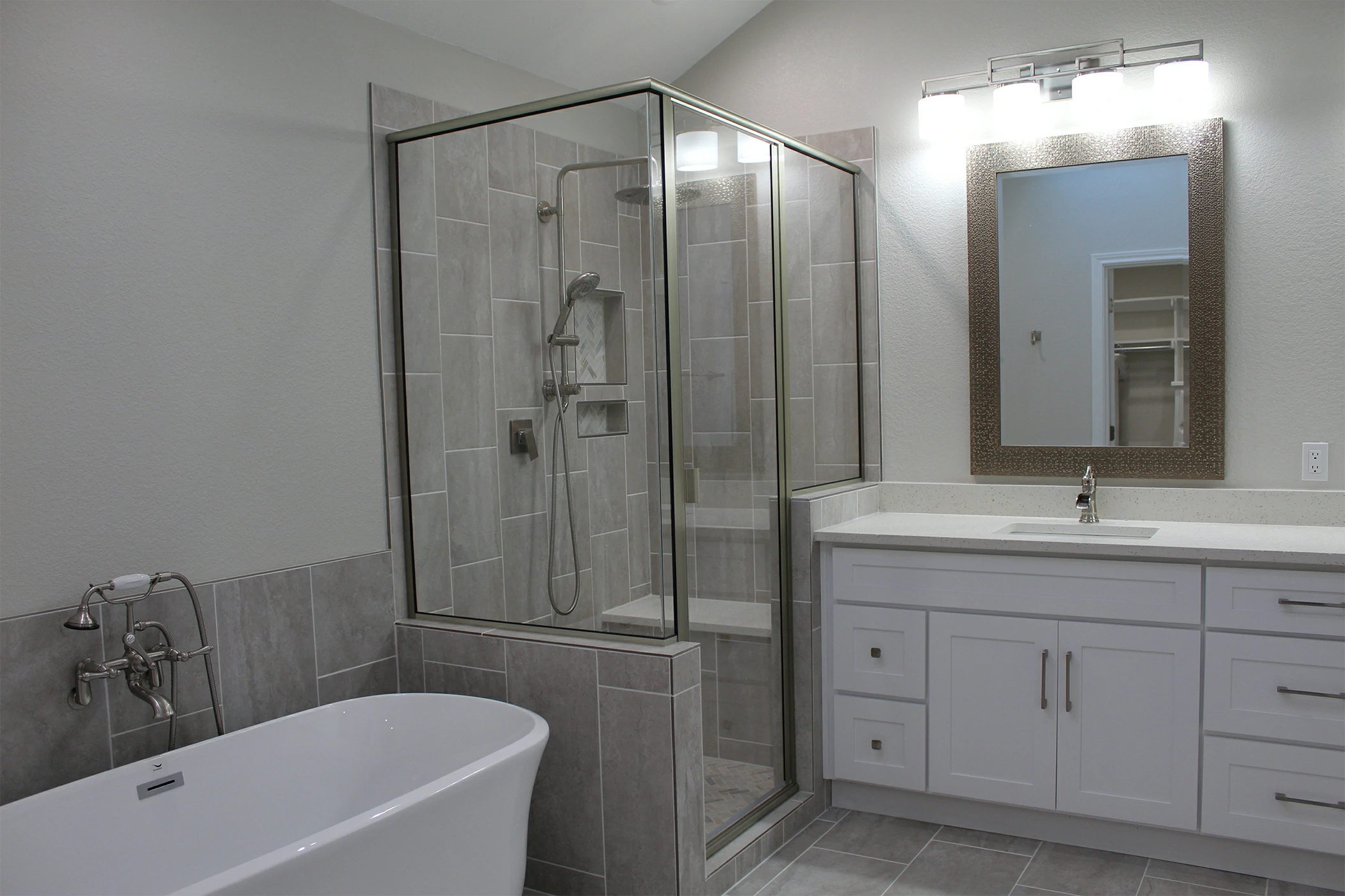
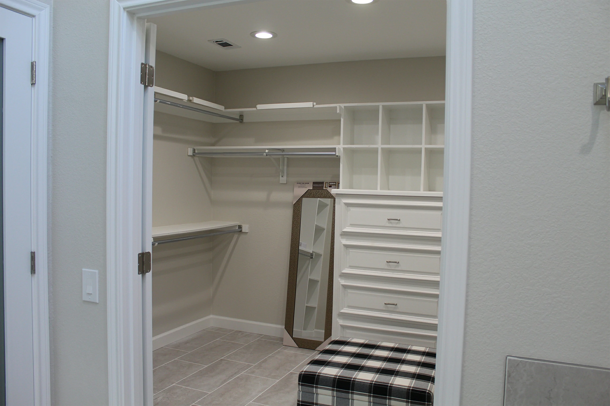
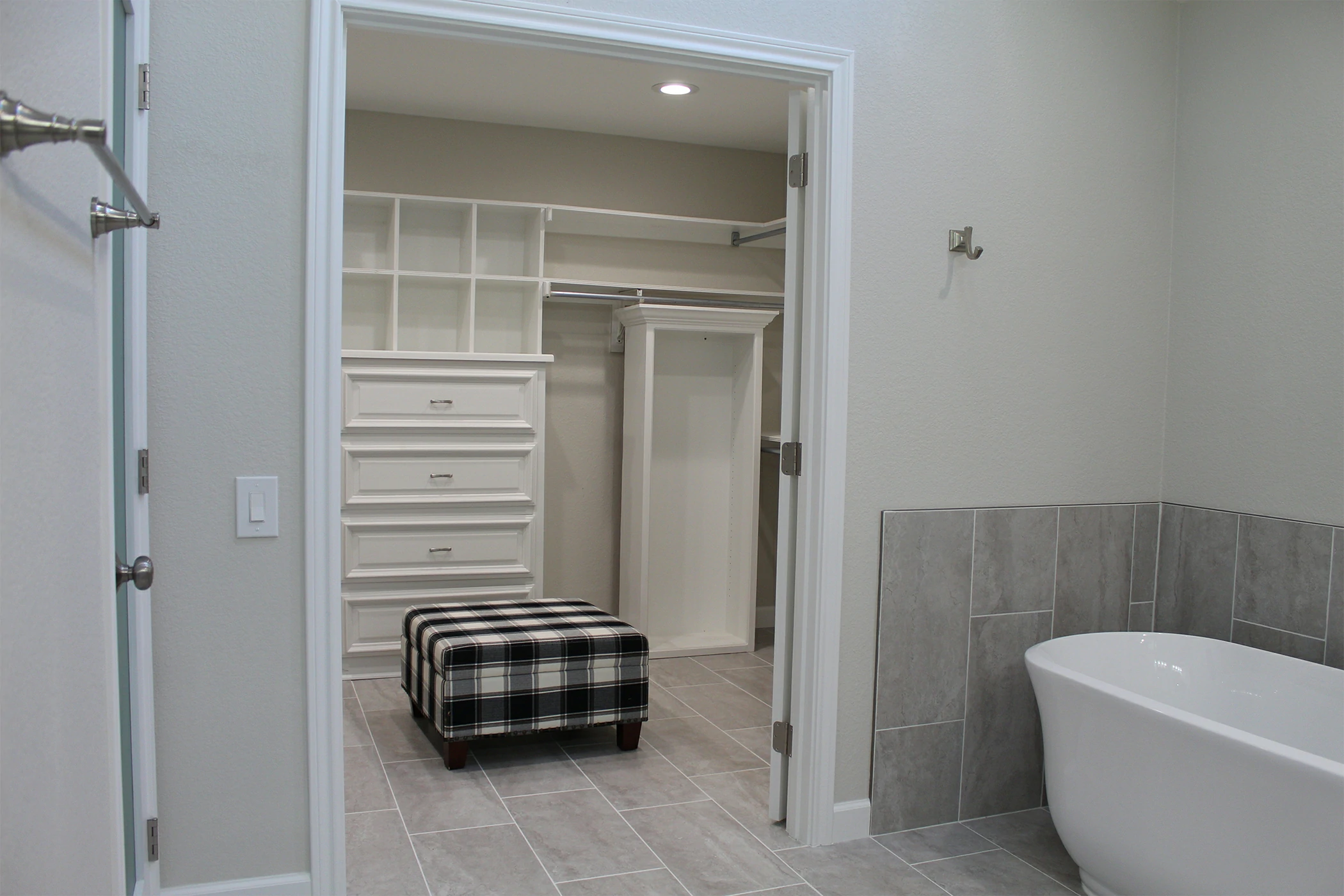
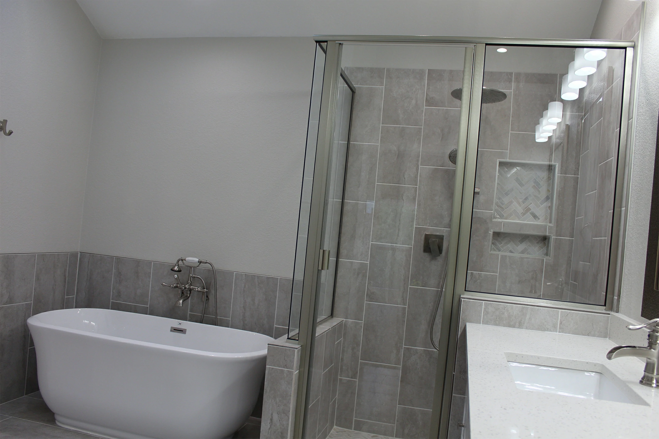
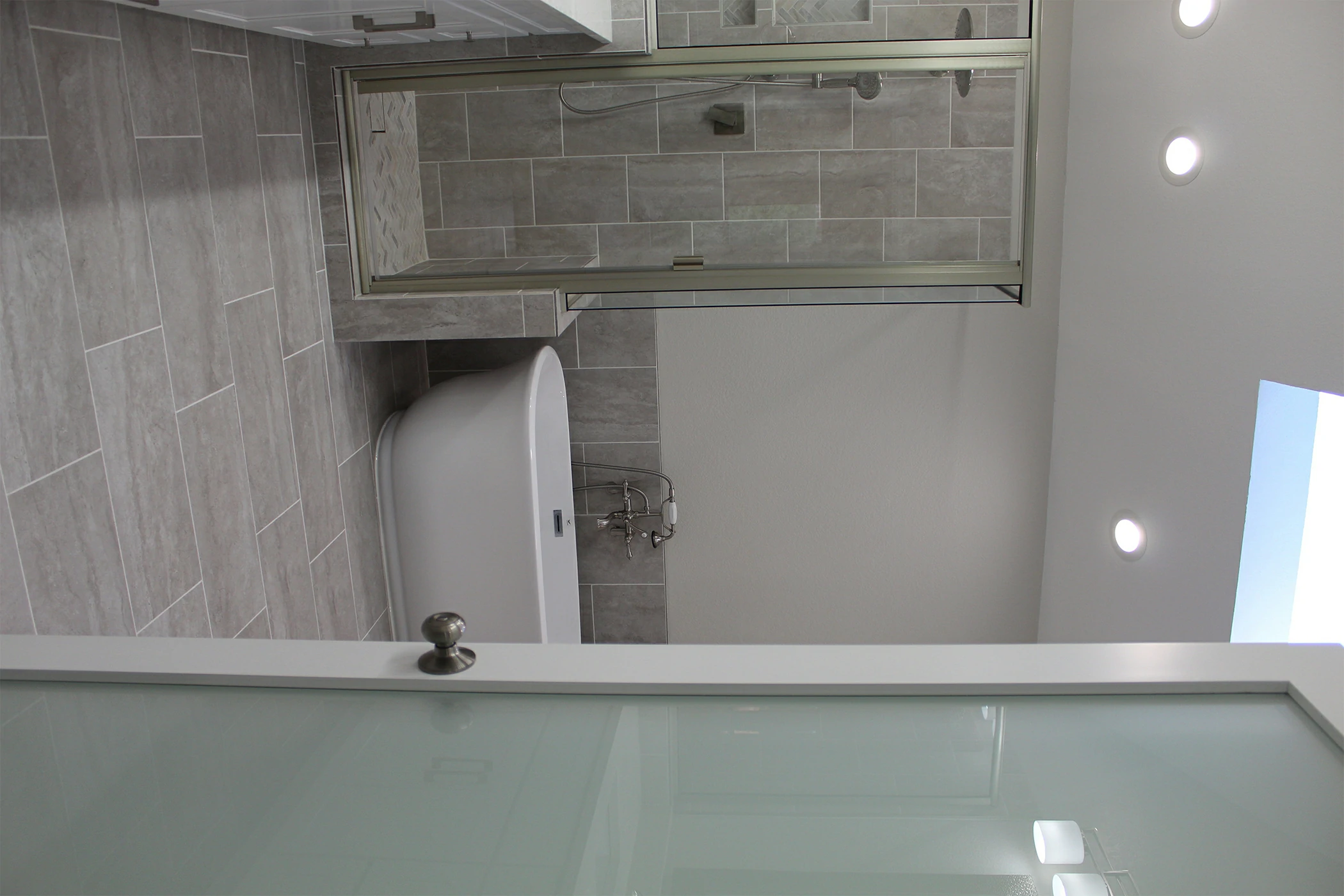
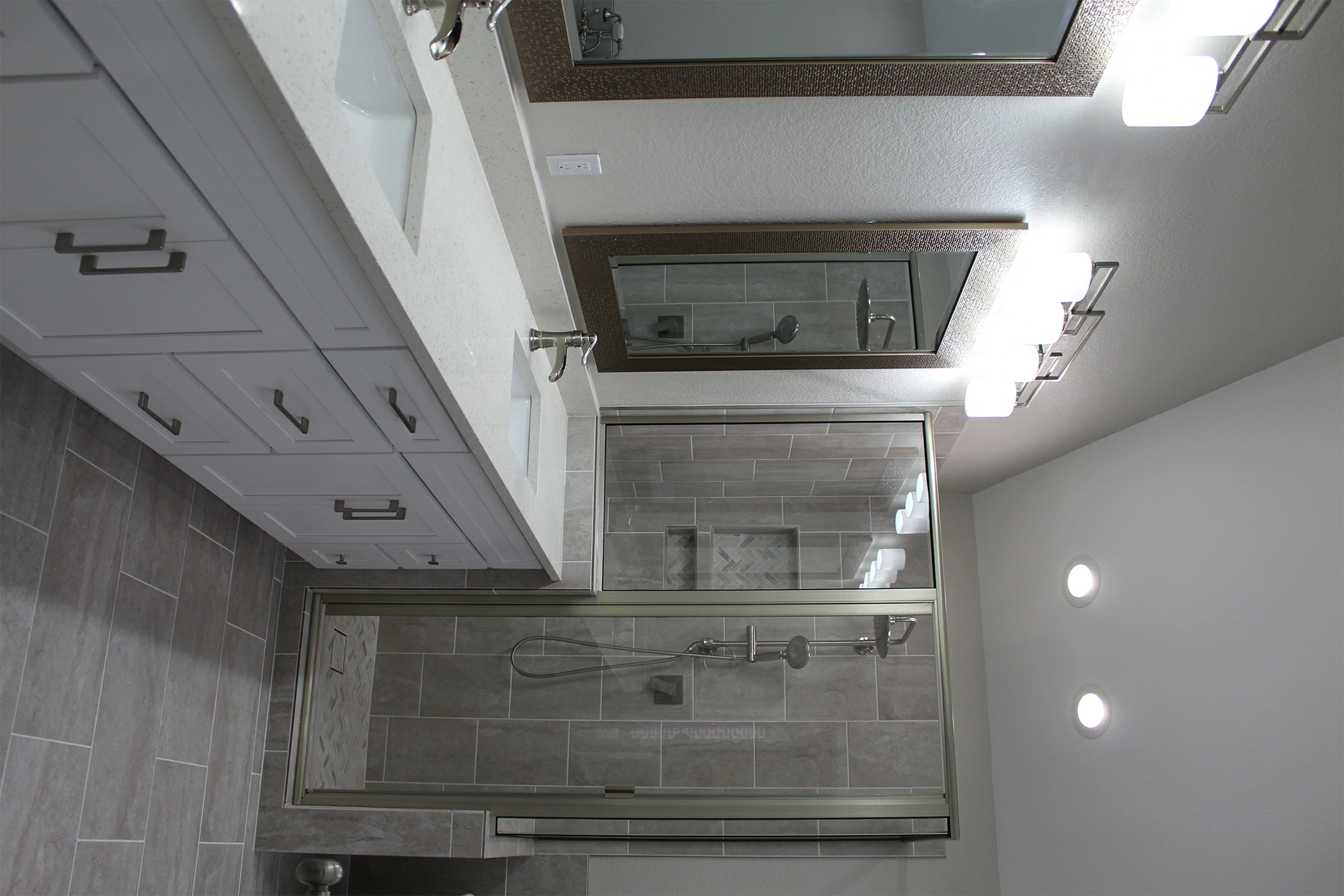
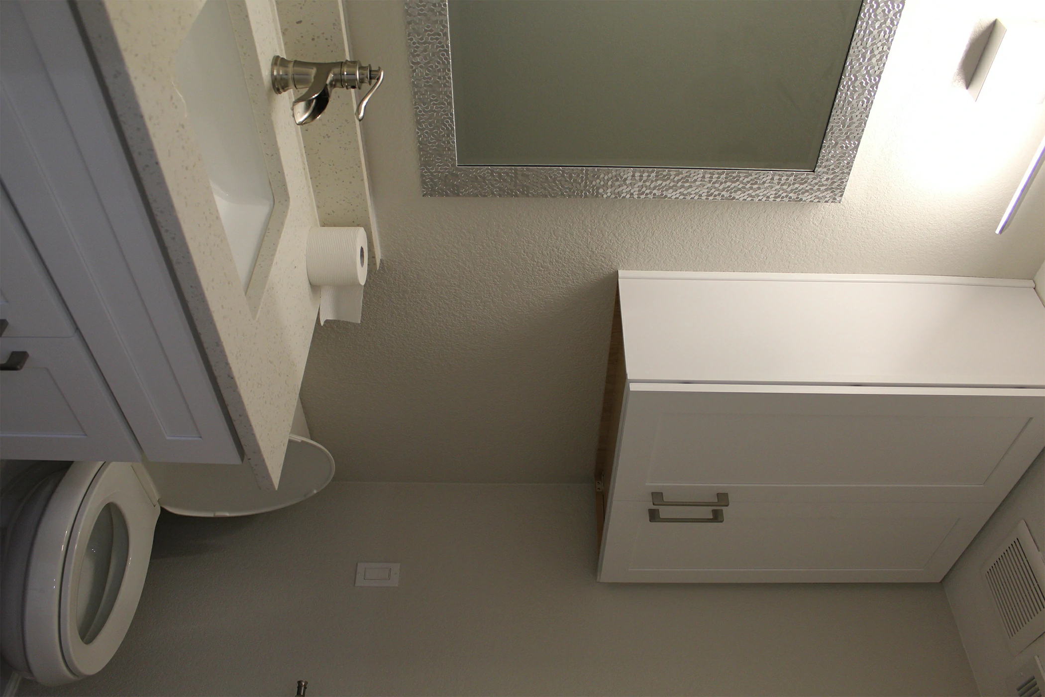
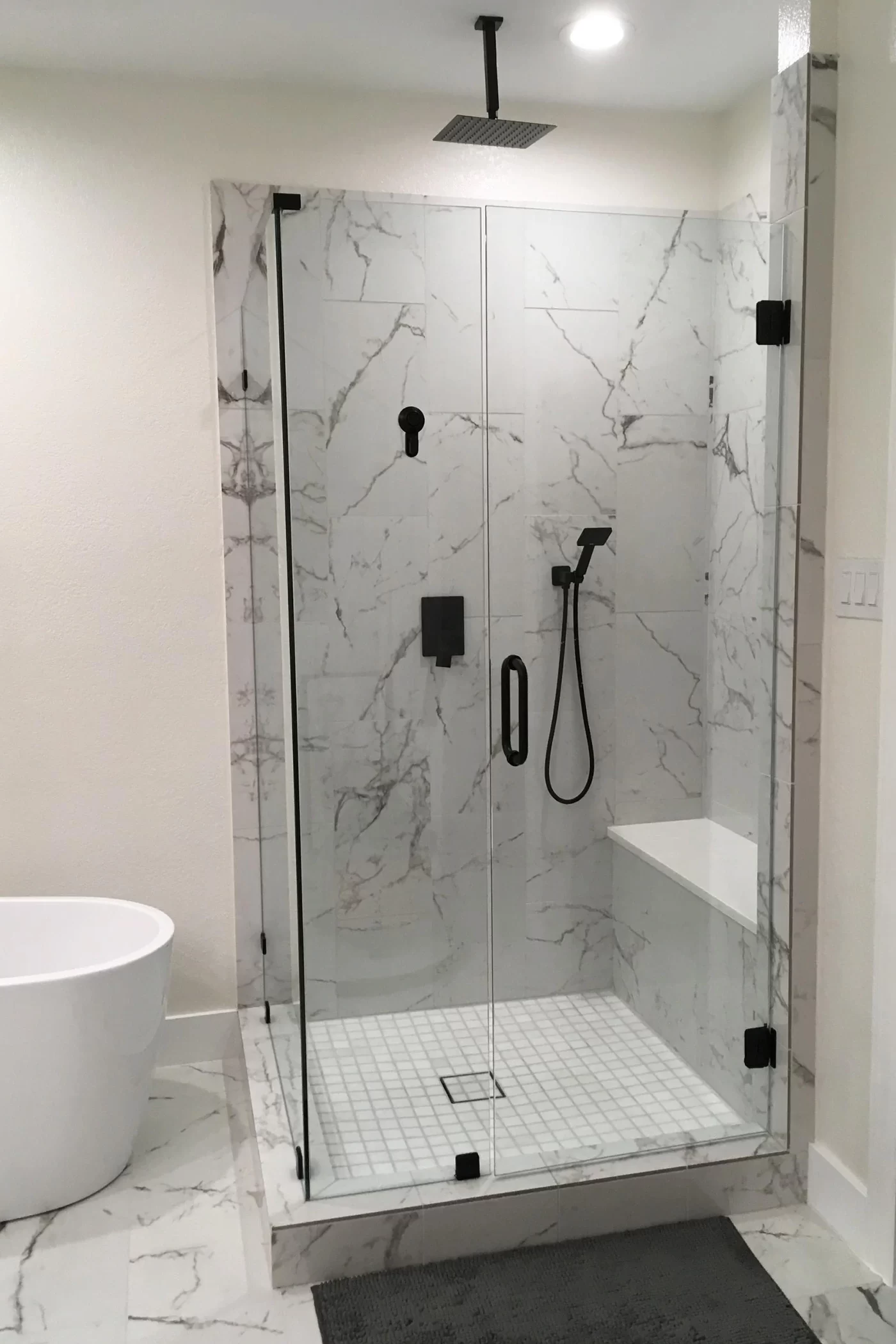
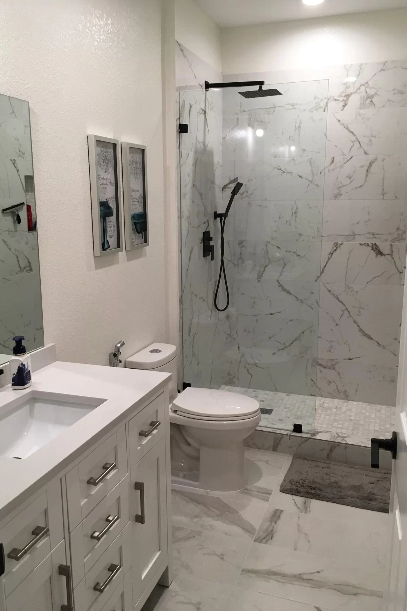
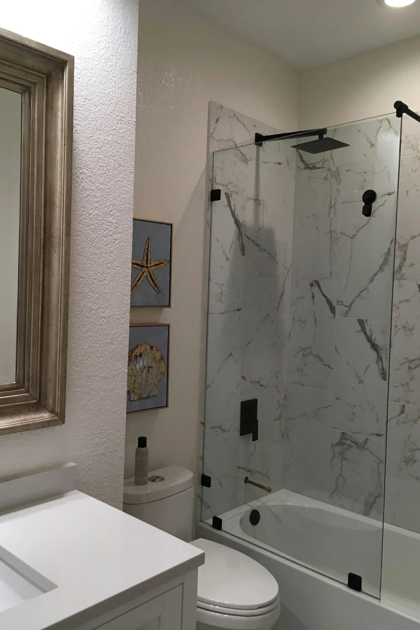
Bathroom: Light and Refreshing
Bathrooms often appear larger when painted in light tones. Crisp whites, mint greens, and aqua blues amplify light reflection and create a spa-like environment. Using glossy or satin finishes helps resist moisture while keeping colors vivid.
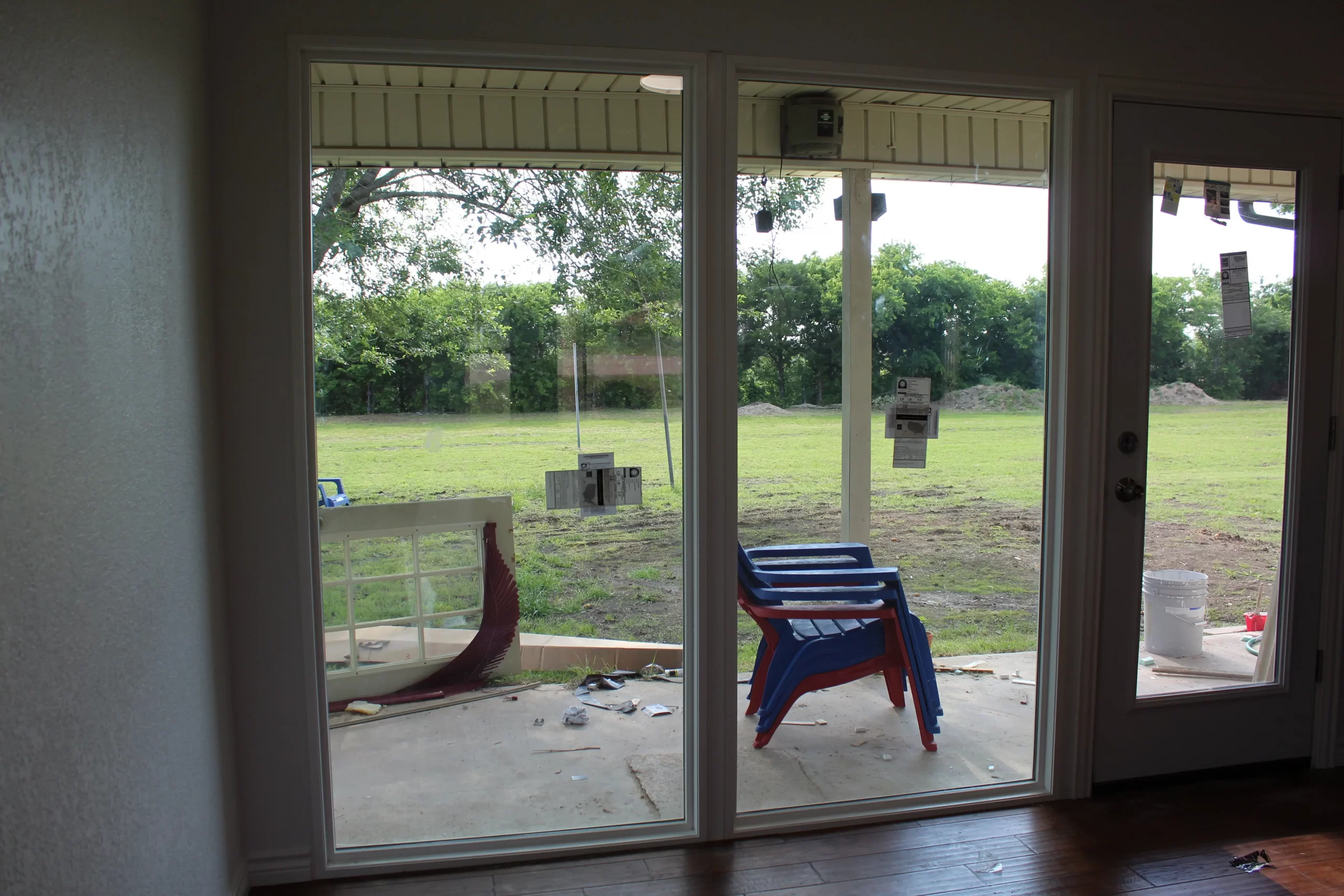
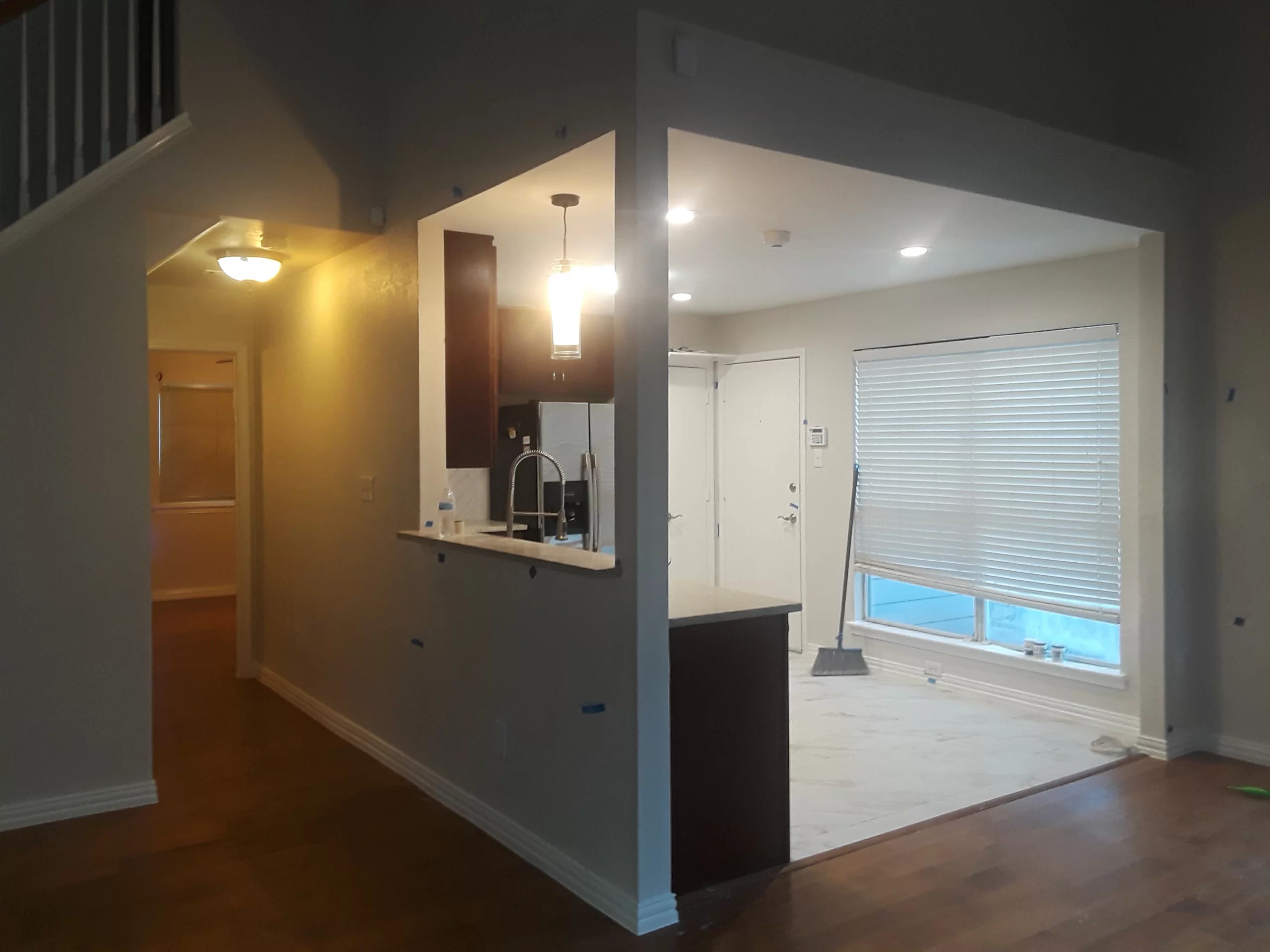
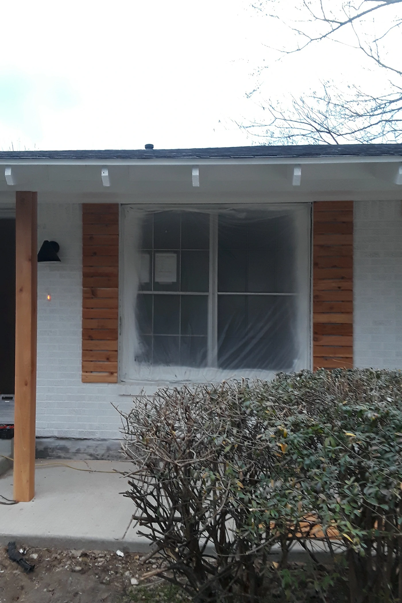
Additions: Maintaining Flow and Consistency
When planning new additions, it’s crucial to ensure your chosen palette extends naturally from the existing spaces. Echo a color from one area into another—through walls, trim, or décor—to maintain a consistent visual story. This approach ensures that new rooms feel integrated rather than separate.
Common Mistakes in Home Color Palette Selection
Many homeowners struggle with color because they underestimate how small details—like undertones or light sources—affect the final look.
Common pitfalls include:
- Ignoring undertones, which can make matching colors difficult.
- Overusing bold hues, leading to visual clutter.
- Forgetting to coordinate with existing finishes like flooring or hardware.
- Choosing trendy colors that quickly become dated.
The key is moderation and context—each tone should support your home’s architecture and personality rather than compete with it.
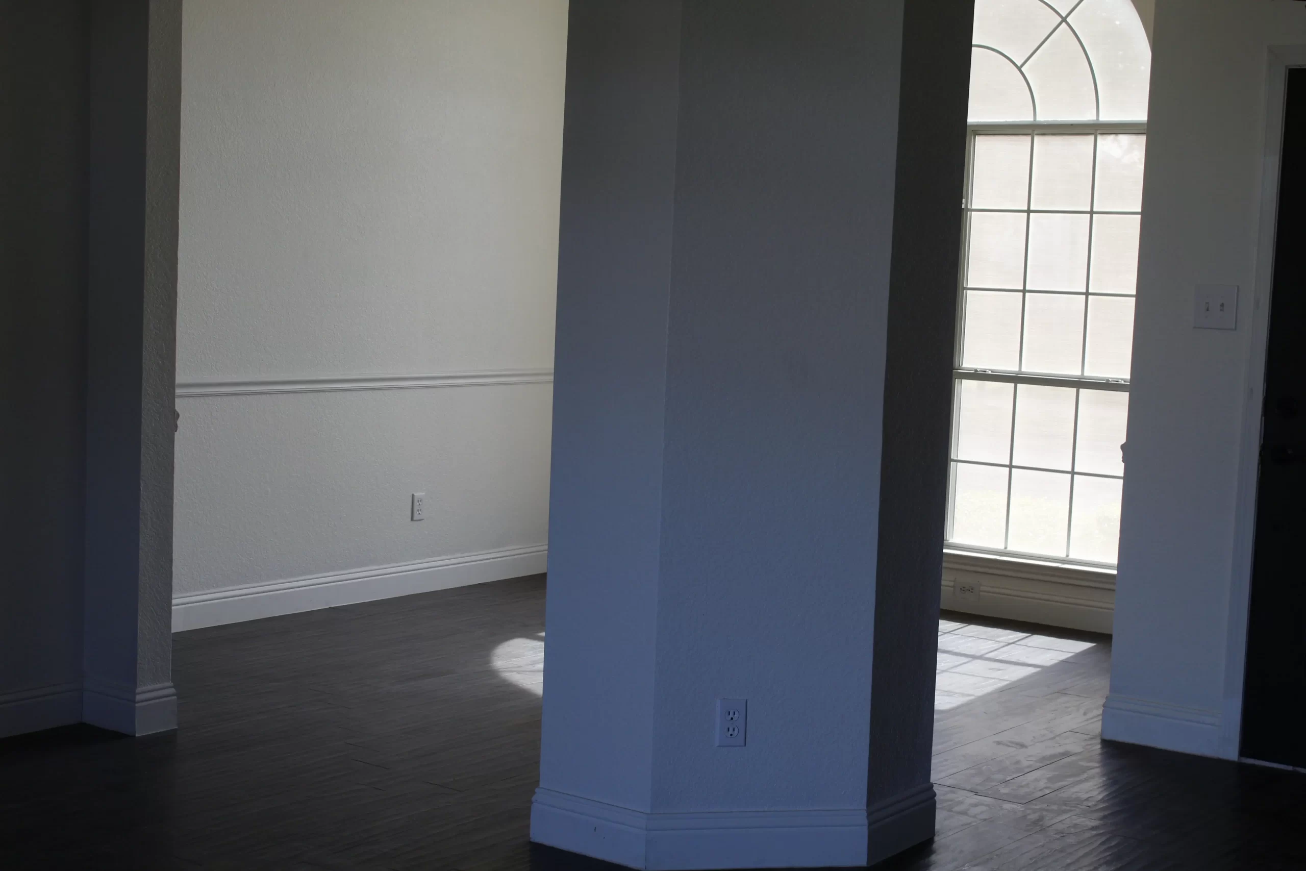
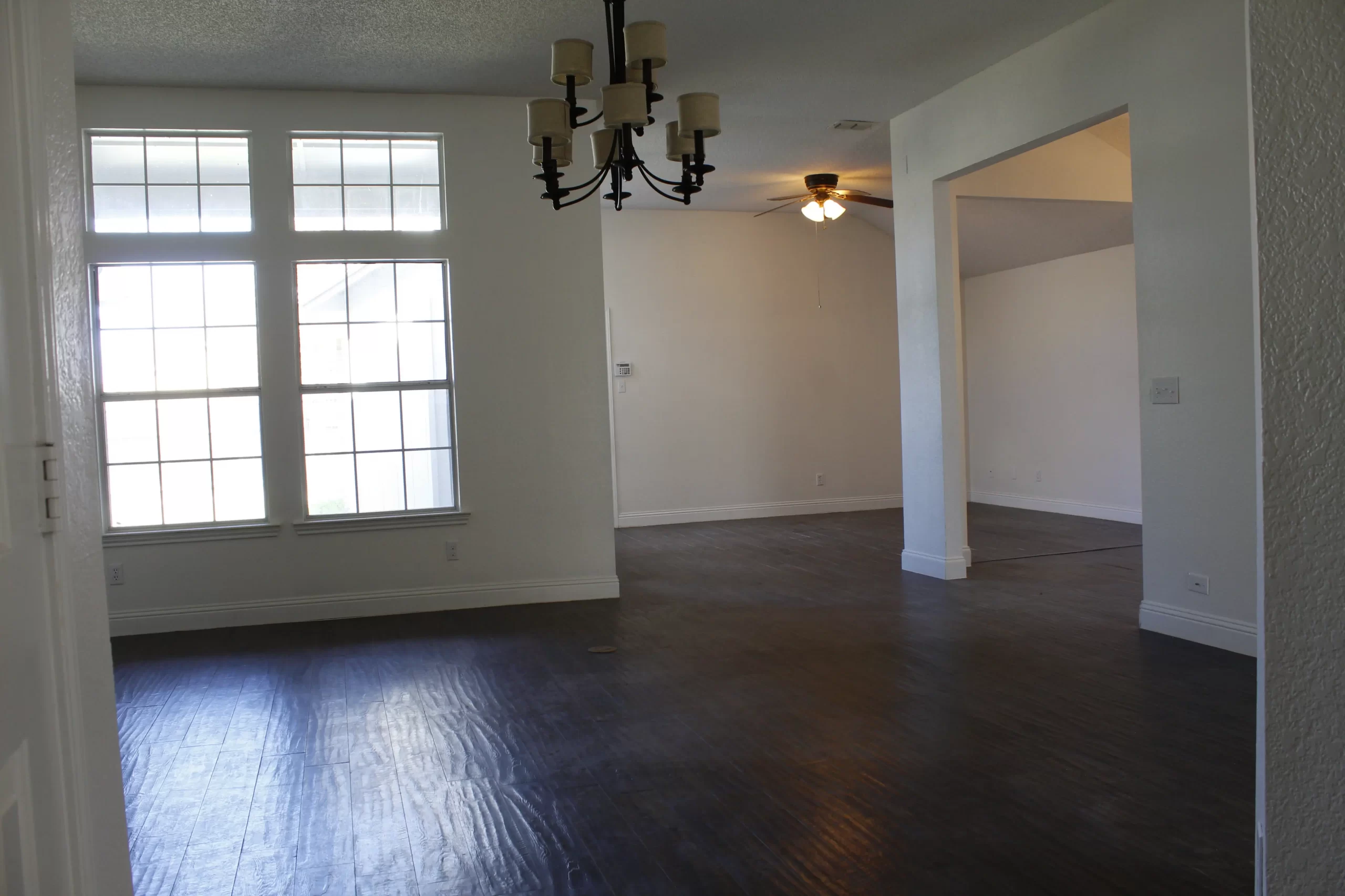
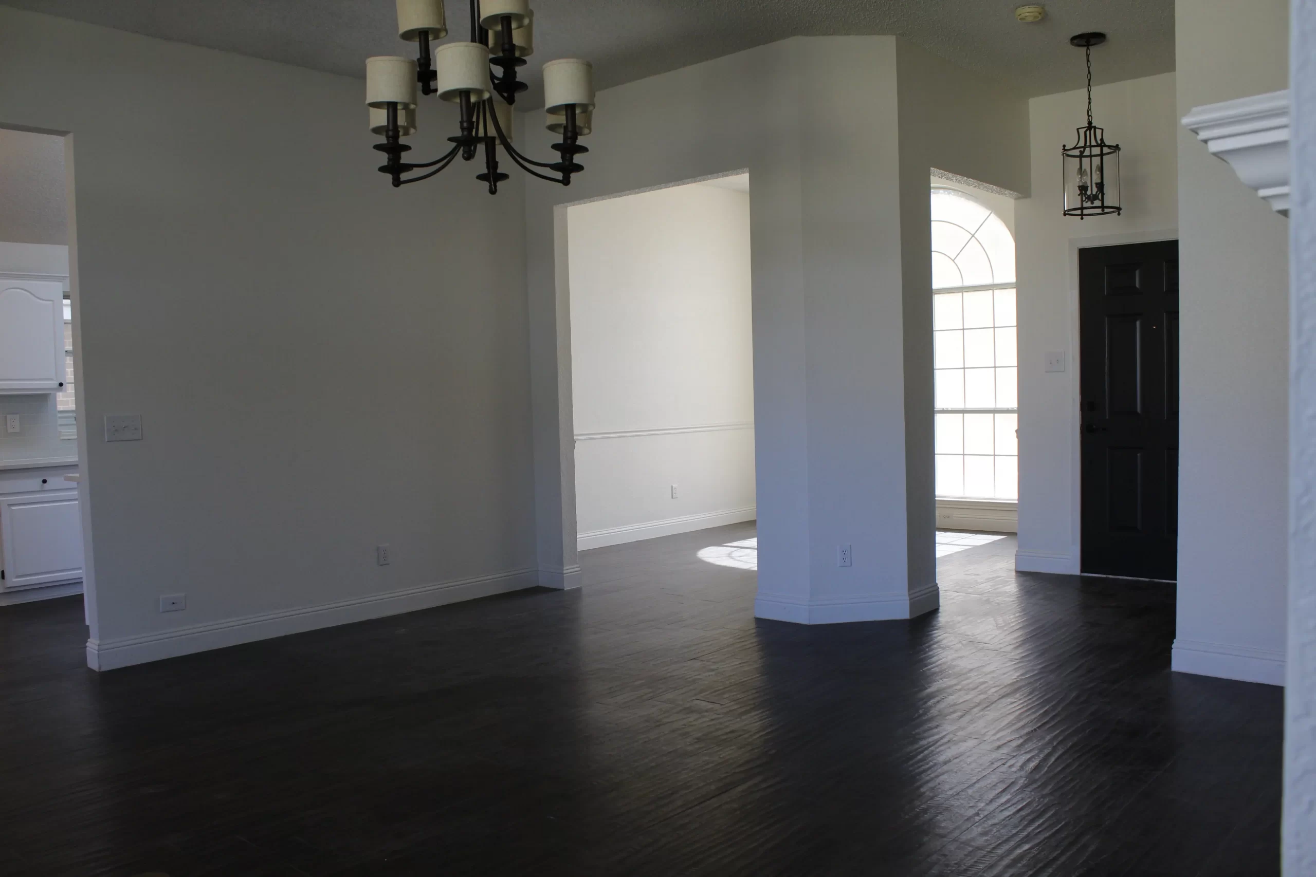
Creating Cohesion Across Rooms
A home feels balanced when rooms flow visually into one another. Cohesion doesn’t require uniformity—it means establishing a connection between spaces through tone, accent, or material.
Start by choosing a base neutral (like ivory or greige) and build variations from it. For example, your living room might feature warm gray walls, while the hallway transitions to lighter beige. Consistent trim or ceiling colors also unify your design subtly.
Adding recurring accent colors—through artwork, textiles, or lighting fixtures—reinforces this visual rhythm, giving your home a curated, intentional appearance.
Beyond Color: Considering Finish, Texture, and Sustainability
Color is only part of the design story. The finish and sustainability of your paint also matter. Modern homeowners are increasingly mindful of environmental impact, and sustainable products can make a difference both aesthetically and ethically.
Best Practices for Eco-Friendly Color Choices
- Opt for low-VOC or VOC-free paints to enhance indoor air quality.
- Use durable finishes in high-traffic zones for longevity.
- Incorporate recycled or sustainable materials in your décor and cabinetry.
At Bina Homes, sustainability and design excellence go hand in hand. Every home remodeling project we undertake prioritizes both health and aesthetics, creating spaces that are beautiful, functional, and future-conscious.
Expert Tips to Refine Your Color Palette
While guidelines help, personalization transforms a design from good to exceptional. Use these expert tips to refine your palette and bring depth to your vision:
- Test Paint Samples: Always test swatches on multiple walls and observe them under different lighting conditions.
- Balance Warm and Cool Tones: Use contrast to create visual interest while avoiding monotony.
- Think Long-Term: Choose timeless hues that evolve with your taste, avoiding overly trendy colors.
- Use Textures to Highlight Color: Combine matte and glossy surfaces to create dimension and richness.
- Layer Shades: Incorporate multiple tones of the same color family for a cohesive, multidimensional look.
When to Seek Professional Guidance
Even with strong instincts, choosing the right palette can be challenging. A professional designer understands how color interacts with architecture, lighting, and proportion. They can refine your ideas into a cohesive, functional plan that enhances every detail.
Bina Homes’ design experts collaborate closely with homeowners to define the right palette, materials, and finishes for both new builds and remodels. Whether you’re expanding your home with new additions, updating a kitchen, or redesigning your interiors, our team provides insight that bridges vision and execution.
If you’re ready to begin, contact us today to schedule a design consultation tailored to your goals.
Conclusion
Color shapes not only your home’s visual character but also your daily emotional experience. Thoughtful home color palette selection can elevate your interior design, improve cohesion, and enhance the way you live.
At Bina Homes, we help homeowners create meaningful spaces through tailored design, remodeling, and additions. Whether you’re reinventing your kitchen, adding new rooms, or simply redefining your walls’ hues, every project begins with understanding color.


